A calmer desk, and Main Apps where the work starts
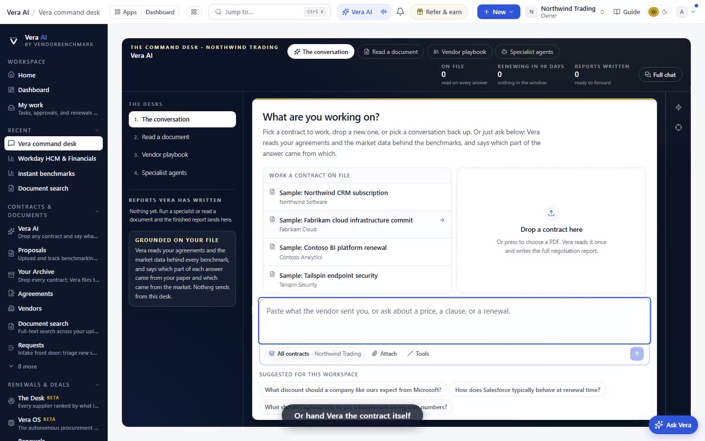
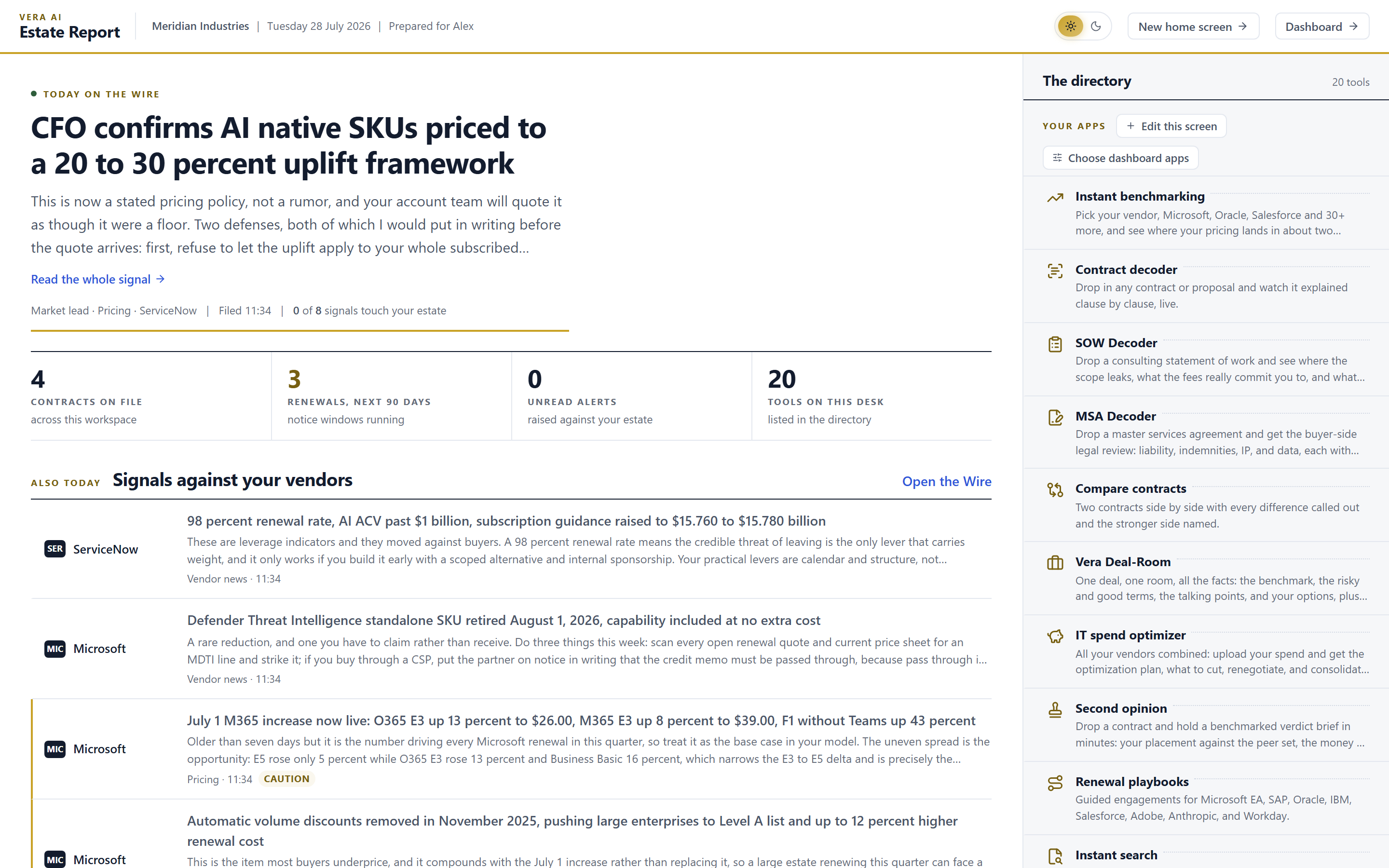
We repainted the workspace to match the desktop app and moved Main Apps under Home. Meaning colours did not move. Here is what changes for a procurement buyer, and what does not.
There is a small tax you pay every time you switch between two tools that do the same job in two different costumes. The desktop app wore warm paper and one quiet accent colour. The web workspace wore cool gray and a scatter of neon tints. Nothing was broken, but your eye had to re-learn the room each time you crossed over, and a buyer who lives in this software all day pays that tax dozens of times a session. This update ends it. The platform now wears the look the desktop app has been wearing, and two things on the desk itself have moved so the work starts where you actually stand. If you want to go straight there, Main Apps now lives inside Home.
The named problem: two rooms, one job
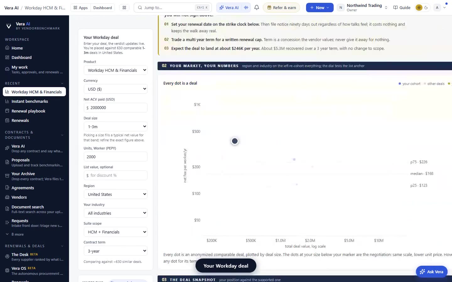
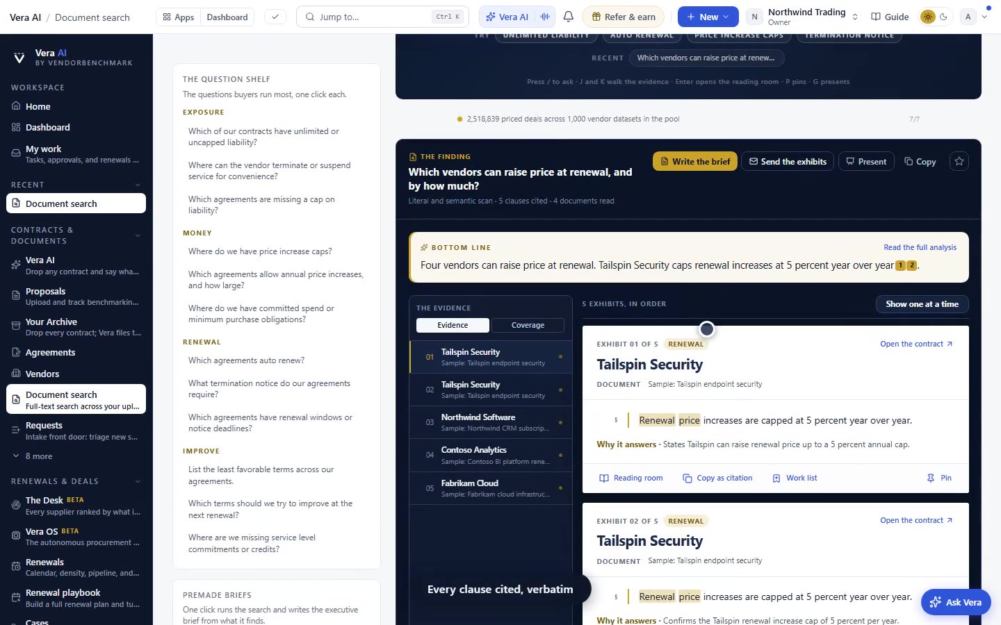
Call it costume switching. You open a benchmark in one place, decode a contract in another, and each surface asks your attention to recalibrate. Cool gray reads as cold and administrative. A palette with several bright accents makes everything look equally urgent, which is another way of making nothing urgent, a failure we have written about in the intake flag that hands the deal to the vendor calendar. The fix is not more colour. It is less. One interactive colour, the advisory green, on the primary button, the links and the active tab. Warm near black ink on warm paper. Inter in place of Segoe UI, so text reads the same whether you are on the desktop app or the browser.
What moved, and what deliberately did not
Here is the discipline that matters for a buyer. Nothing that carries meaning moved. Status pills keep their colours. Risk scales keep theirs. Every delivered report and every email keeps the exact palette it had, because those colours are data, not decoration. When a red risk pill turns amber, you need that to mean what it meant last week, whether the report is opened in the browser, saved to disk, or forwarded to your CFO. The styling of the reading surface changed. The semantics of the finding did not. That distinction is the whole reason this update is safe to ship. The same principle holds for how findings read on the page, which we covered in the decode reads on the page with your next steps beside it.
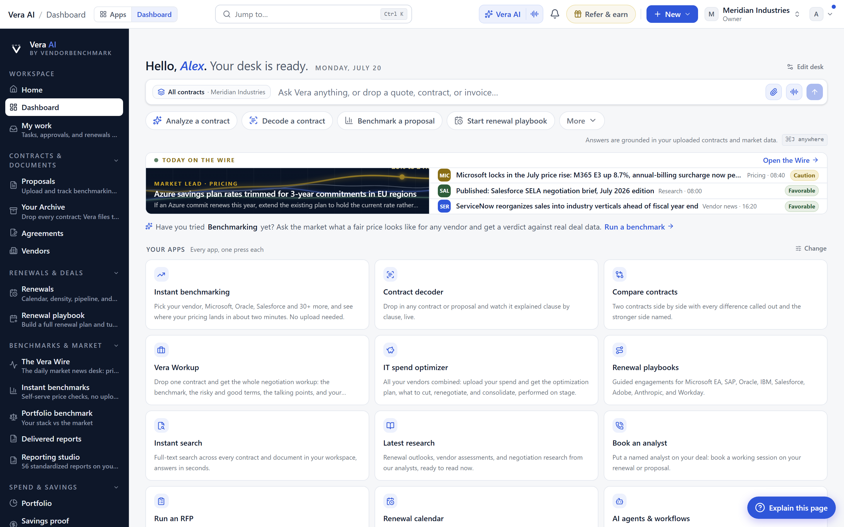
The ask bar's invitation is now set in italic serif, so it reads as a question before you touch it. That is a small cue with a real effect. It tells you the bar is for asking, not for commands, which lines up with how Vera opens as a command desk. The dark rail warmed to match, and the Learn and follow wall traded its neon tints for the muted ones the rest of the firm already uses, so the whole room finally speaks one language.
Main Apps is a place you already are
The second change is structural. Main Apps used to be a page you navigated to. Now it is a section of Home, sitting under the Learn and follow wall, with the instruments, the workflows and your recent work all where they were. Nothing was removed. The route was shortened. You no longer leave Home to reach the tools you use from Home, then come back to Home to see what you were working on. The work and the way into the work now share a screen. That is the difference between a launcher and a desk. For buyers who assemble deliverables rather than chase answers, this fits the pattern we argued in why AI reports beat AI answers: the value is in the finished artefact, and the desk should keep that artefact in reach.
A shorter rail that only points forward
The panel beside the rail is now five rows instead of eight. Three of those rows were removed because they were another way to reach a place you were already standing. A navigation element that leads back to the room you are in is not navigation, it is noise, and noise costs you the split second of deciding whether it matters. Cutting three redundant rows from eight is a thirty seven percent reduction in the choices that panel asks you to make, and every one of those choices was a false one. This is the same logic behind consolidating a stack onto a single canvas in the estate map: fewer routes to the same destination, not fewer destinations.
The honest limits
Be clear about what this update is and is not. It is a repaint and a reorganisation. It does not add a benchmark, change a percentile, or alter a single number in any of any of the benchmarks behind a typical query. If your negotiation was going to turn on the strength of the data, it turns on exactly the same data today. There is also a re-learning cost of its own, which we will not pretend away. If your muscle memory took you to Main Apps as a top level page, you will reach for it there once or twice before the new location settles. The rail rows we removed were redundant, but if you had built a habit around one of them, that habit needs a small update. We judged the one time cost worth the daily saving, and the arithmetic in the comparison above is why. Finally, none of this changes how work leaves the building. A report exported today looks and reads as it did, because the deliverable palette did not move, and that consistency is deliberate. The desk got calmer. The findings did not get softer.
Fredrik has spent more than twenty years in enterprise software, with time at Oracle, IBM, SAP, and Salesforce before moving to the buy side. He structured and priced the kind of large agreements most buyers only see once or twice in a career, which taught him where the leverage sits and how far a vendor will actually move. He started VendorBenchmark to hand that knowledge to every sourcing team.