The estate map: your whole stack on one canvas.
Every number on this platform exists somewhere in a table, and no executive has ever been moved by a table. The estate map is the picture: every vendor a tile, sized by what it costs, colored by its verdict against the market, so where the money goes and where it hurts is legible from across a boardroom.
Procurement's communication problem is chronic and self-inflicted: the discipline runs on tables, and its audiences do not. The CFO wants the shape of the problem, the board wants to know where the money and the risk concentrate, and the CIO wants to see the stack the way a portfolio manager sees a book. Hand any of them a forty-row spreadsheet and you have transferred data without transferring understanding, which is why the same estate gets re-explained from scratch at every quarterly meeting, and why the loudest anecdote in the room so often beats the best number in the table.
Cartography solved this problem for every other domain that mixes scale with judgment. A map does two things a table cannot: it shows proportion at a glance, and it lets the eye find the anomaly without being told where to look. The estate map applies that to the software stack, and the effect on executive conversations is immediate, because for the first time everyone in the room is looking at the same thing and seeing the same problem.
Reading the map: size is spend, color is verdict
The encoding is deliberately simple enough to explain in one sentence, because a visualization that needs a legend walkthrough has already failed its meeting. Every vendor is a tile. The tile's size is its annual spend. The tile's color is its verdict against the market: green where the benchmark position is at or better than market, gold where it warrants attention, brick where you are paying clearly above what comparable deals close at. Vendors without a defensible benchmark cohort stay neutral, shown honestly as unmeasured rather than painted a reassuring color they have not earned.
Three readings jump out of almost every estate the first time it is mapped. Concentration: the handful of tiles that are most of the canvas, which is where negotiation effort belongs and usually is not. The brick cluster: above-market positions that were invisible as table rows become a red patch the eye cannot skip, and a red patch with a dollar figure is a campaign, not a grievance. The confetti: the long tail of small tiles, individually trivial and collectively material, which is the consolidation and intake story told in one glance. Every tile drills through to its vendor desk, so the map is a front door, not a dead end.
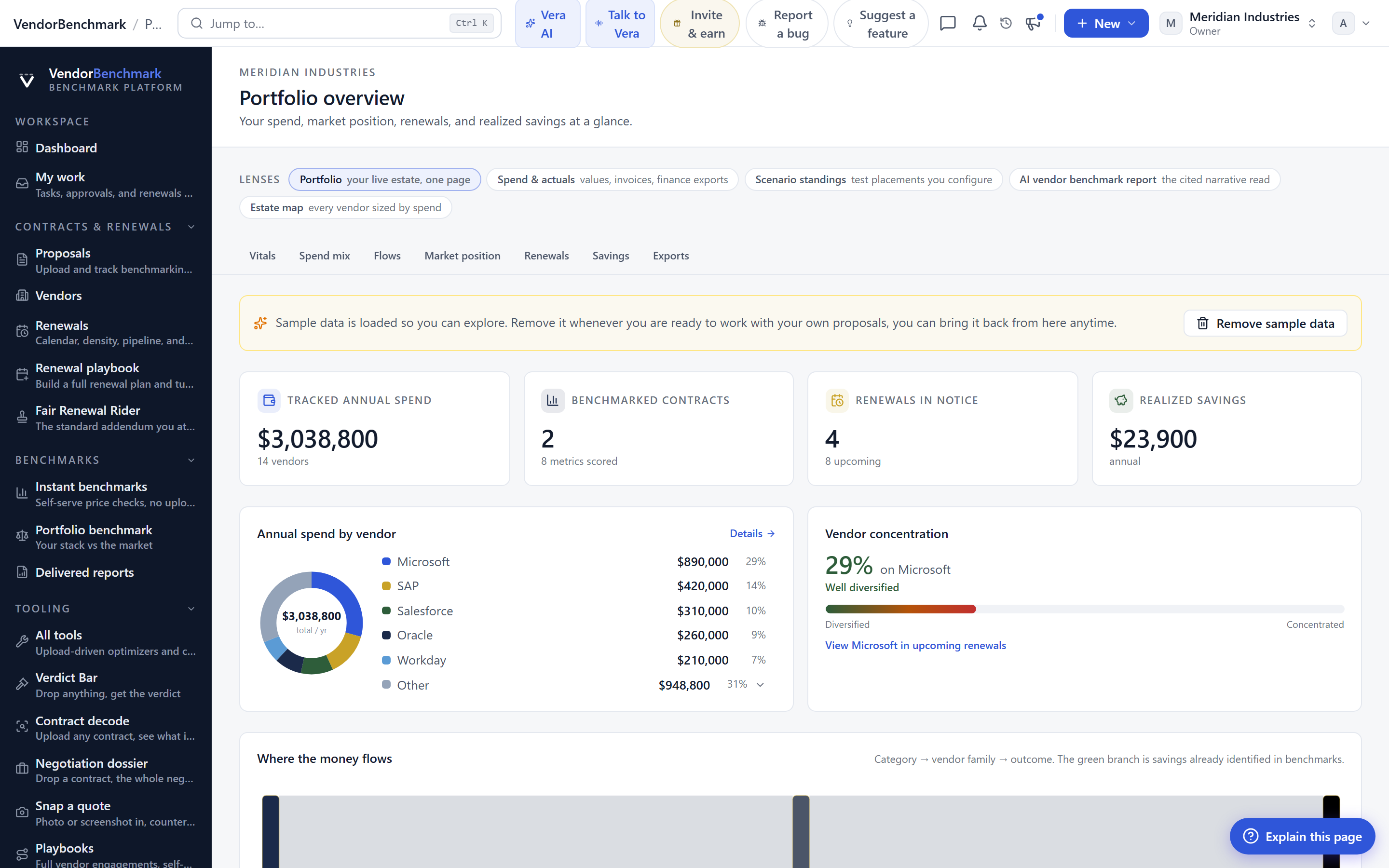
The map communicates. The ranking executes. Use both.
The map and the portfolio ranking are the same data wearing different clothes for different rooms, and the division of labor matters. The ranking, sorted by recoverable dollars and renewal windows, is the work order: it tells your team which war room to open next. The map is the mandate: it is how the CFO and the board see, in four seconds, why that work order deserves funding. Teams that lead the budget meeting with the map and keep the ranking for the follow-up get both decisions made in one session, because the picture creates the urgency and the table absorbs the scrutiny.
The map also does something tables never manage: it makes progress visible. Run the campaign for two quarters and the canvas itself testifies, brick tiles turning gold, gold turning green, the confetti thinning as consolidations land. Presenting last quarter's map beside this quarter's is the most persuasive savings report most executives will ever see, precisely because it does not look like a report. And when the meeting is a formal one, the map exports to PowerPoint in the house style, so the picture in the board pack is the same picture on the screen, generated from the same live data.
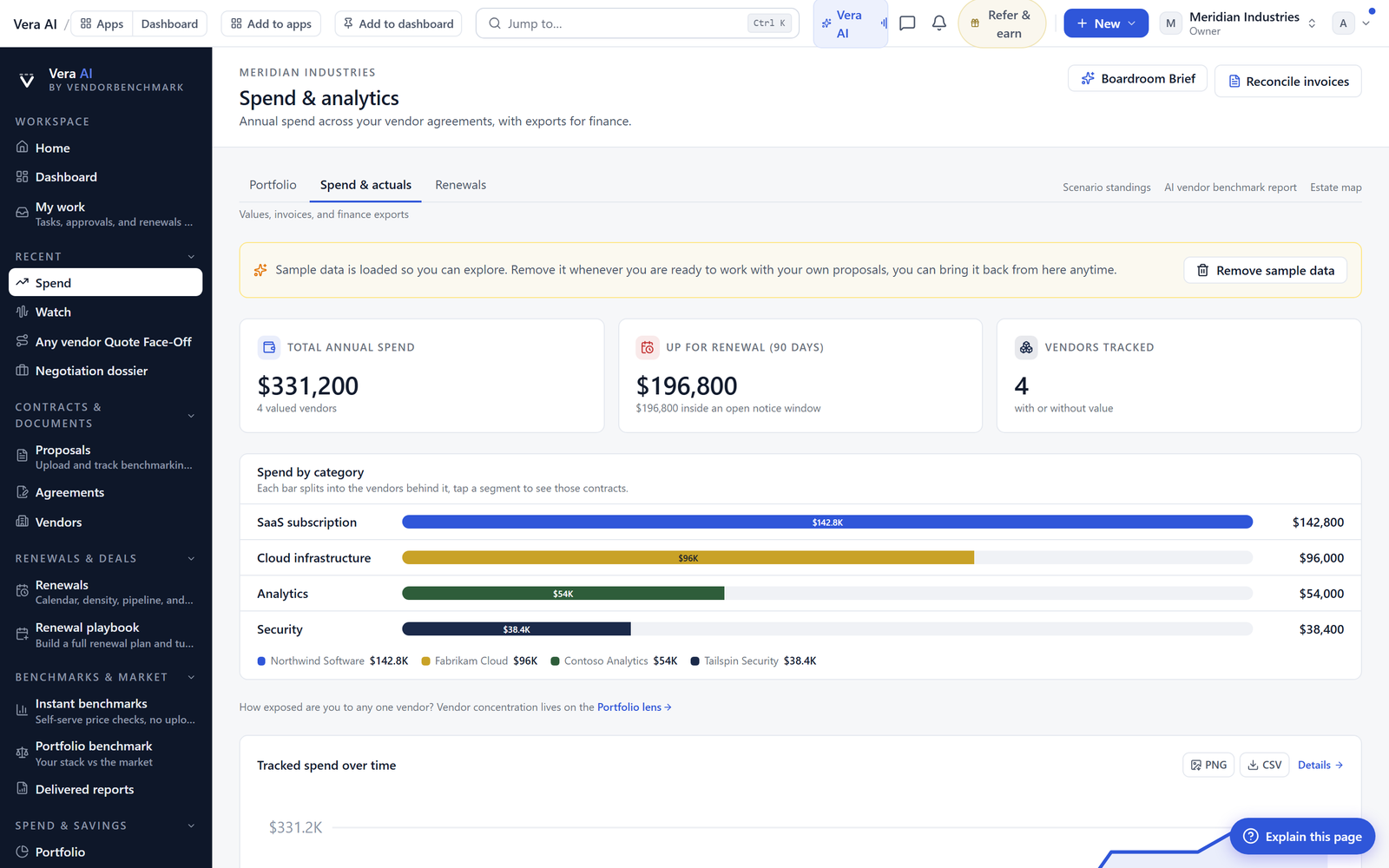
Four meetings the map was built for
The honest limit is inherited, and worth restating because a picture hides its assumptions better than a table does: the map is exactly as truthful as the benchmark coverage and spend data beneath it. A tile colored on a thin cohort is a guess wearing paint, which is why unmeasured vendors stay neutral and why the drill-through to each verdict's cohort evidence is one click away. The map does not replace the numbers. It is the numbers, arranged so a decision maker can finally see them, and in most organizations that arrangement, not any new data, is what finally gets the campaign funded.
Morten brings two decades of enterprise and software procurement, with stints across Oracle, IBM, SAP, and Salesforce shaping how he reads a deal. He has led sourcing through hundreds of renewals, from mid market order forms to nine figure global agreements, and learned that the buyers who win are the ones who walk in knowing the market. He built VendorBenchmark to make that pattern recognition repeatable.
The week in enterprise software buying, in one email.
What shipped on the platform, and the pricing and licensing moves worth knowing before your next renewal. One email a week, to your work address. Unsubscribe any time.