Every output reads like a senior analyst wrote it. Because it holds that bar.
Benchmark narratives, negotiation briefs, board reports, and vendor intel, all rendered to one firm document standard: a slate kicker over a navy title, a gold meta line and rule, numbered gold bar section headings, justified body, and data-label-first charts. Every figure grounded in your data, citation-tagged, and passed through a pre-publish QA gate.
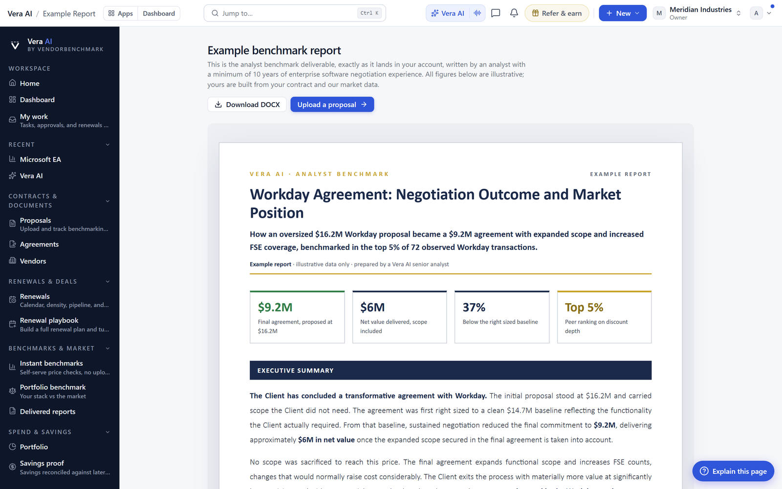
A benchmark screenshot pasted into an email does not survive contact with a CFO. The output that moves a decision reads like a senior analyst wrote it: it interprets the number, says where the leverage is, and recommends what to do first. Every deliverable here is built to that bar, not to a chart-export bar.
A report, not a metrics table with a chart on top.
The narrative leads; the numbers support it.
A slate uppercase kicker over a bold navy title, a bold gold meta line closed by a gold rule, numbered section headings on a gold left bar, justified body, and tables with navy headers and dark-gold verdict text. One rhythm for every document.
Executive summary, market position, section-by-section analysis, prioritized recommendations, and a bottom line. The report says where the leverage and the risk are and what a strong outcome looks like.
Benchmark narratives, negotiation briefs and playbooks, scenario and comparison memos, portfolio and board reports, and vendor intel briefings, all in a deliverables studio with custom templates.
Every export uses the same theme as the on-screen report, so the Word doc, the deck, and the PDF match the brief exactly, and open straight in your own Microsoft 365.
Grounded, cited, and gated before it reaches a customer.
AI-generated reports pass a groundedness check before they publish: every figure has to trace to stored data, and reports carry a grounding badge. Curated reports are verified by hand to the same bar. A bare metrics table is never the report; the analysis is.
A house style enforced in code.
The quality bar is not a guideline, it is a rendering pipeline every report goes through.
Navy, gold, verdict colors, chart series, and grid lines all come from one deliverable theme, so every report and every export is visually identical and a theme change updates all of them.
Reports render through a fixed set of primitives (masthead, executive summary, gold bar sections, recommendations, pull quotes, sources, footer), so structure is consistent across 39 report types.
Visuals are data-label-first on white, and every number on a chart also appears in the narrative, so a reader never has to squint at a bar to get the figure.
Every report renderer is registered in an internal white-paper gallery, so the standard stays reviewable and a change is caught before it ships to a customer.
Seeded reports are hand-curated to the same standard and updated whenever the metrics change, so a placeholder is never a customer’s first impression.
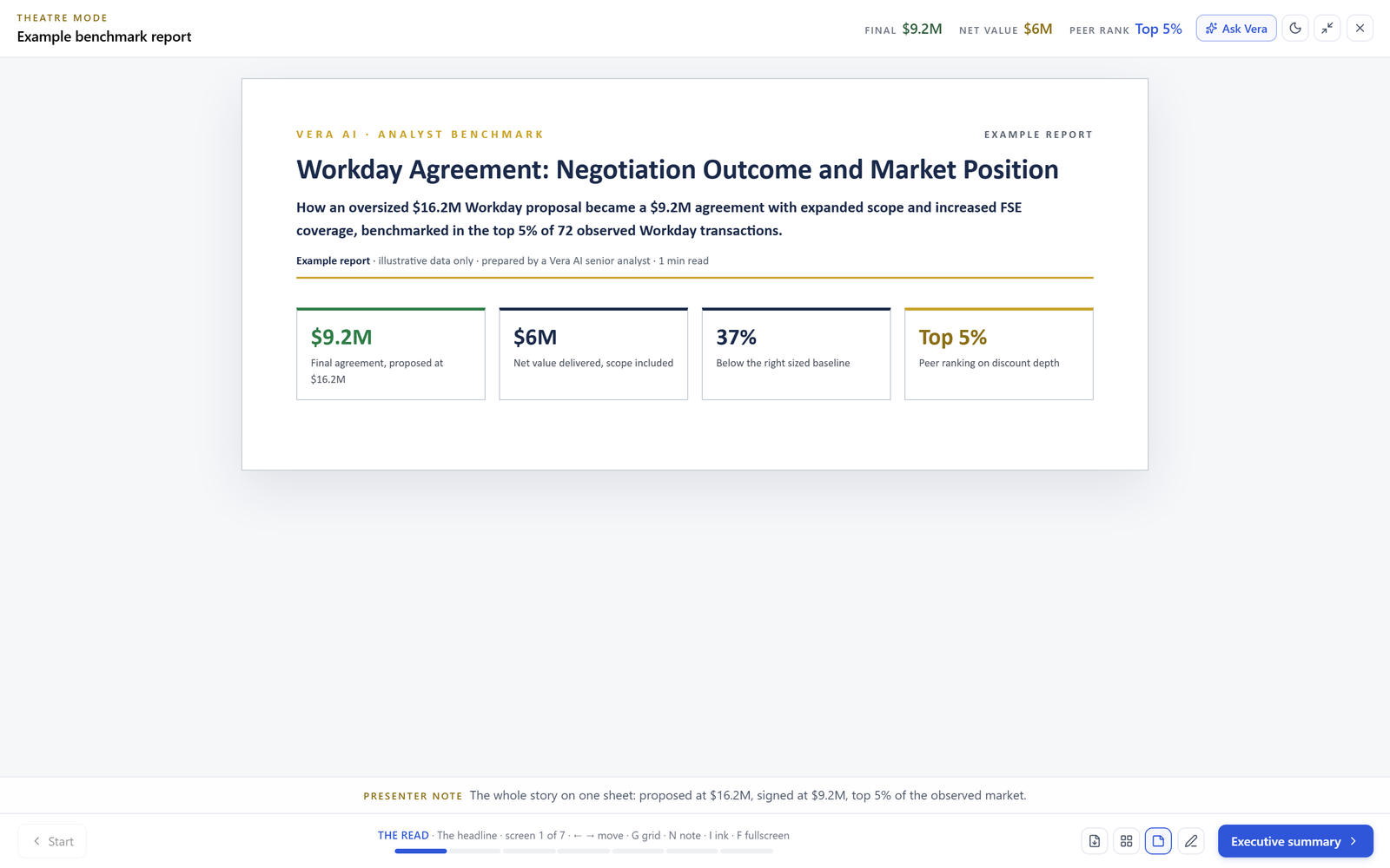
The board paper, written and formatted, not started from a blank page.
Turning a benchmark into something a CFO reads used to mean an analyst writing the narrative and someone rebuilding it in slides the night before. The report comes written to standard, and the deck and the Word doc match it.
Estimate your own hours →Written to be forwarded, not exported to be redone.
BI tools and generic AI both stop at the chart or the paragraph. This holds a senior-analyst bar end to end.
A dashboard shows the number. It does not interpret it, say what to do first, or render as a document a CFO forwards. The report does all three.
A generic model writes confident prose with no citation and no house style. Every figure here traces to your data, passes a QA gate, and renders to one executive-brief standard.
A consultancy writes one report for one fee. Here the same analyst-grade output is on demand across 25+ types, grounded in your own data, and reusable as a template.
Business value, and the operational value under it.
One line for the board paper, and the day to day the team actually feels.
- Outputs that survive contact with the board, because they read like a senior analyst wrote them.
- A consistent, on-brand voice on every deliverable a customer or executive sees.
- Trust in the numbers: grounded, citation-tagged, and QA-gated before anyone reads them.
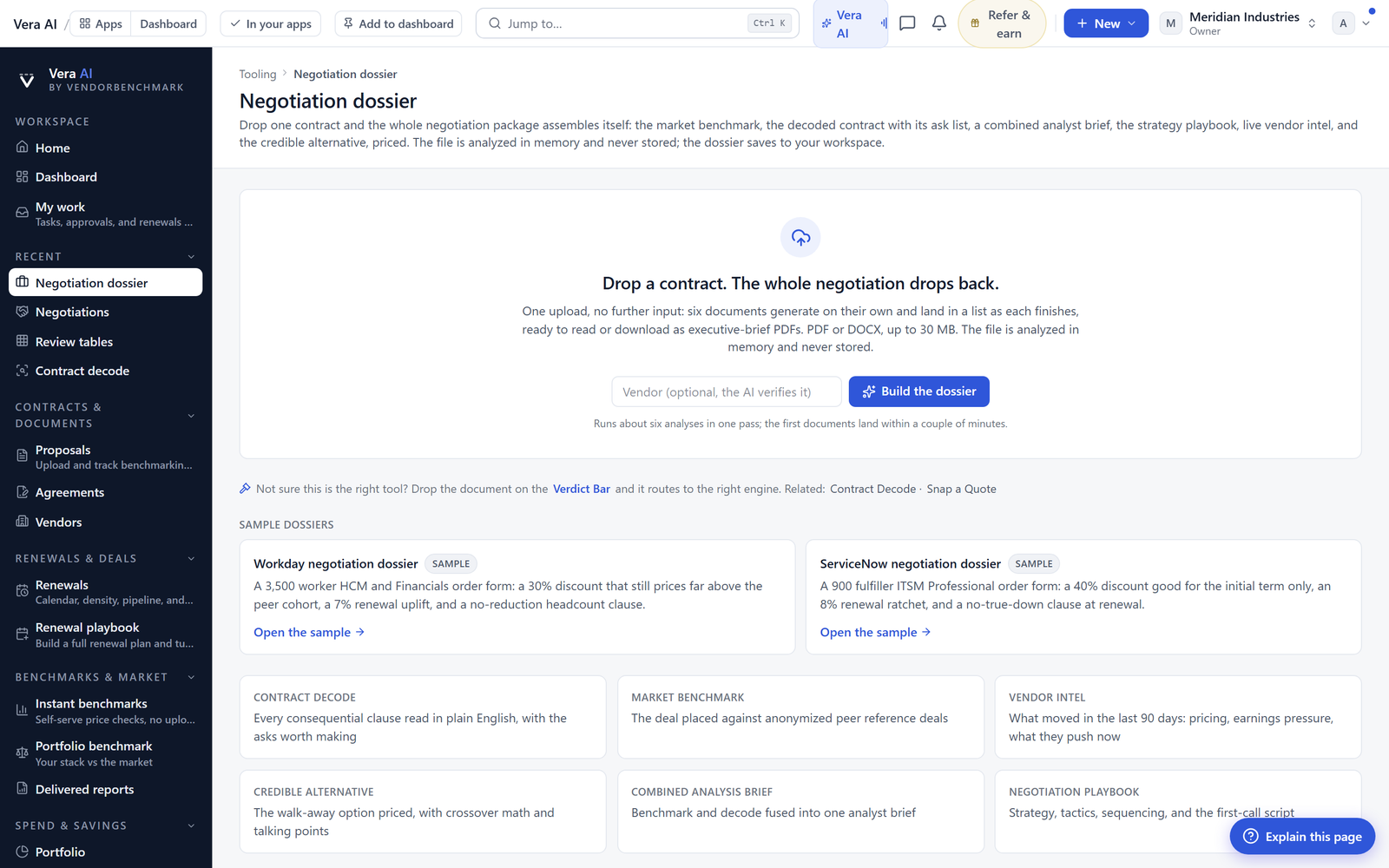
- A negotiation dossier assembled from one upload, each part a standalone PDF you can hand over.
- The narrative written to standard, not started from a blank page.
- Word, PowerPoint, and PDF exports that match the on-screen report exactly.
- A library of 39 report types with custom templates, so last quarter’s brief is this quarter’s starting point.
- Theatre mode to present the report from the platform itself, no deck rebuilt.
Hand over a brief, not a screenshot.
Analyst-grade, grounded, and on-brand every time.