A calmer ground under everything
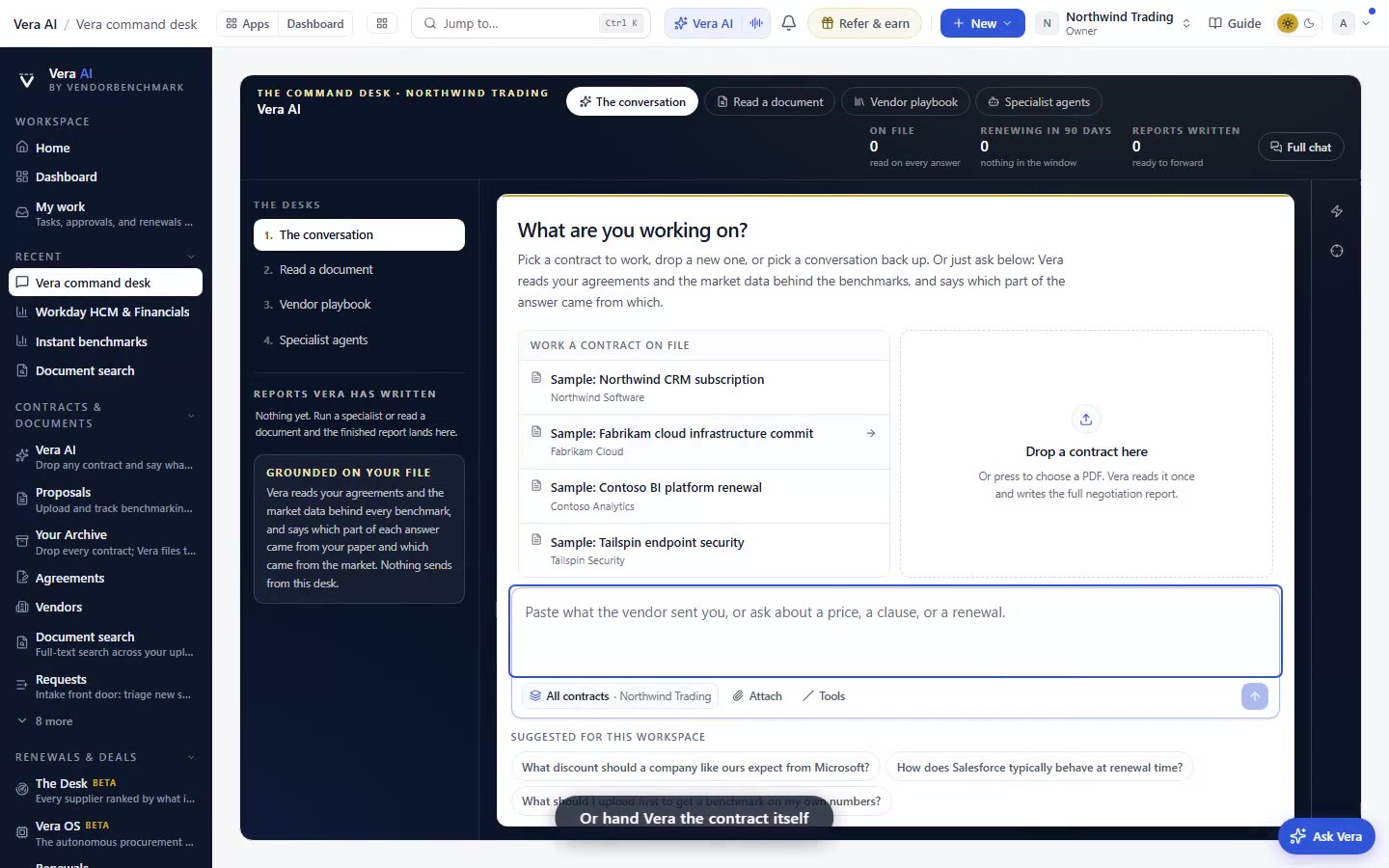
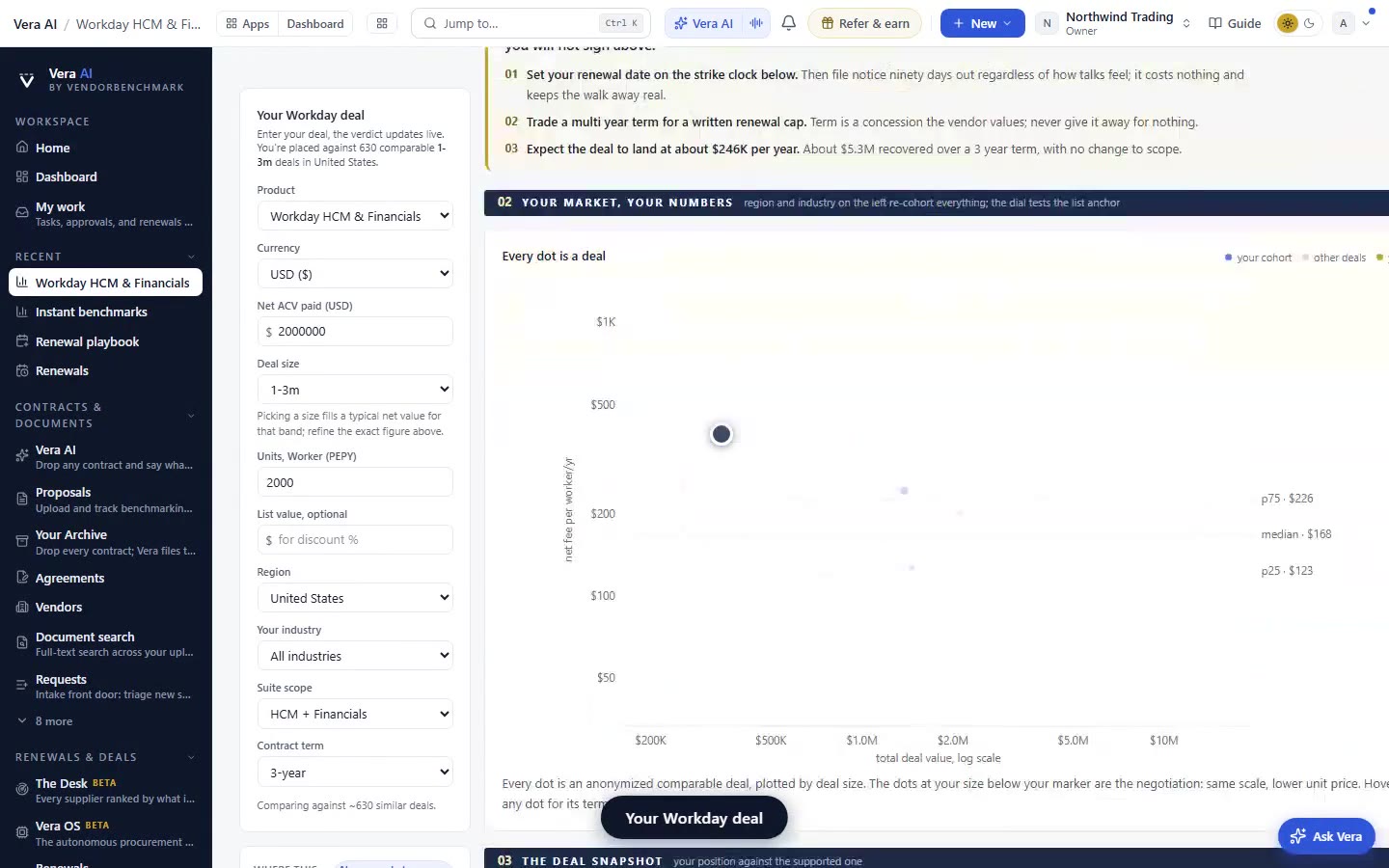
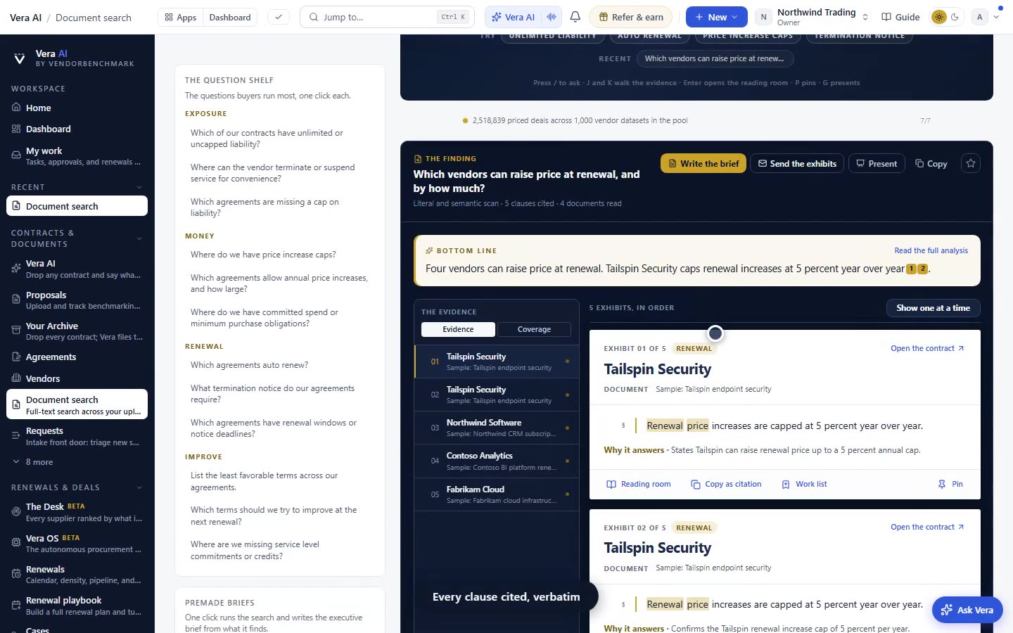
We shifted the rail, the title bars and the stage from near-black to graphite. It is the ground only. Green, gold and every status colour are unchanged.
Here is a problem you have felt without naming it. A procurement buyer spends most of a working day inside dark surfaces, the rail down the side, the title bars across the top, the stage every agent opens on. When that ground is near-black, the smallest status colour reads as an alarm. A green percentile bar, a gold flag on a clause, a red price-list change, all of them shout against a floor with no depth to it. By the fourth hour you are not reading the numbers, you are bracing against the contrast. This update is narrow on purpose. We moved the ground from near-black to graphite, and we changed nothing else. The green stays green, the gold stays gold, and nothing you read off a screen today means anything different than it did yesterday.
The named problem, contrast fatigue on a working floor
Contrast fatigue is the term for what happens when every element on a screen competes at maximum intensity. On a near-black ground, a coloured chip has nowhere quiet to sit. The eye treats the whole surface as foreground. For a buyer working across the screens that now keep your work, that means hours of low-grade strain, and worse, it means the colours that should carry meaning get flattened into the general noise. Graphite gives the ground a little depth. A status colour now reads as something placed on a surface, not something fighting the surface. That is the entire mechanism. It is a legibility change, not a redesign.
What actually moved, and what did not
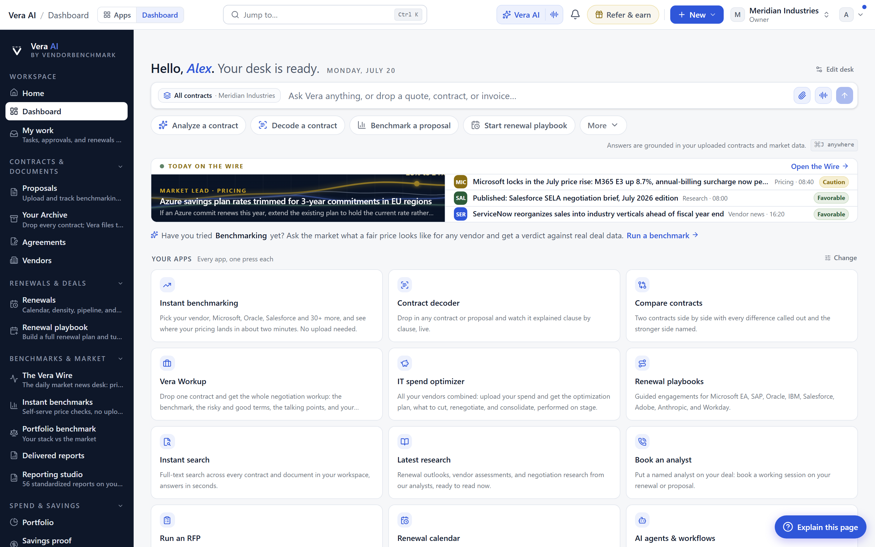
Be precise about scope. The graphite change touches structural surfaces only. The rail, the title bars, the stage backdrop. It does not touch the semantic layer. Every percentile bar, every renewal-window colour, every clause-position flag, every anomaly marker keeps its exact hue and saturation. This matters because your muscle memory is built on those colours. If gold meant a term worth challenging yesterday, it means the same today. If a red band on the verdict stage meant below-market yesterday, it still does. We did not touch the alphabet. We repainted the wall behind it.
How it fits the way you already work
The change follows the stage everywhere, so it is consistent across the platform. Whatever an agent opens on, whichever of the six specialist agents or ten inbox agents you called, they all open on the same graphite ground. That consistency is the point. If you learned the stage once, as we described when theatre mode went everywhere, you did not have to relearn anything. You noticed, at most, that the room felt calmer. The conversations rail carries the change too, which pairs naturally with the ability to name, pin and share those conversations. The renewal calendar sits on the same ground, so when you plan a quarter of expiries the density colours read cleanly against it.
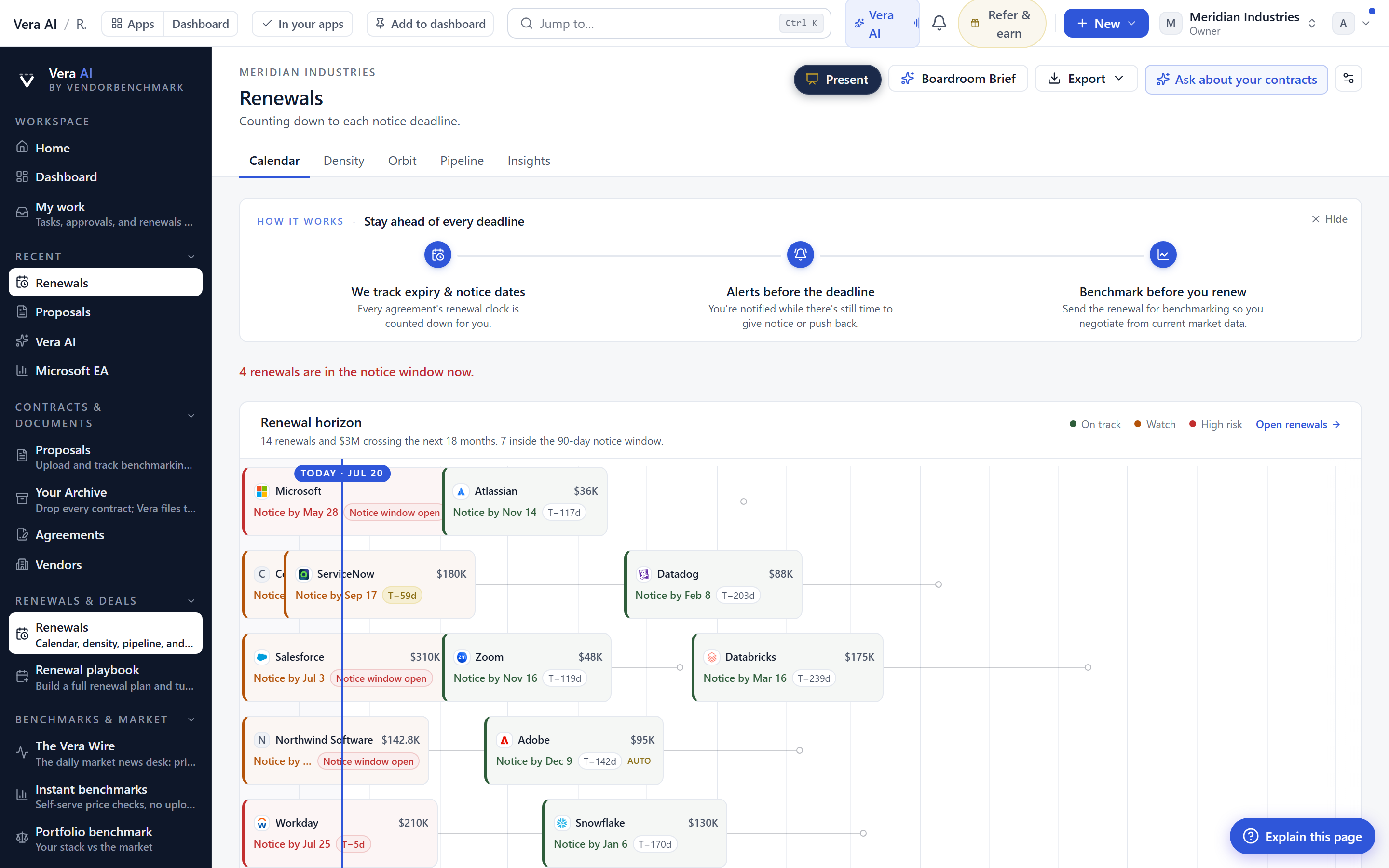
If you plan renewals in blocks, and most buyers do, the payoff shows up over at renewals, where a quarter of expiries laid out at once used to be a wall of competing colour. On graphite, the urgent windows separate from the routine ones without you squinting.
The honest limits
This is a small change and it is worth saying so plainly. It will not find you a better price, it will not read a contract for you, and it will not close a negotiation. Those are the jobs of the benchmark library, the decode tools and the war room, and they are unchanged by the colour of the floor. If you were hoping for a feature that shifts your leverage, this is not it. What it does is reduce the friction of every hour you already spend on the platform, and it does that reliably. There is also a light mode for buyers who prefer it, and this update does not alter that path. Some people will not consciously notice the graphite at all. That is an acceptable outcome. The best interface changes are the ones you stop thinking about. If the ground is calmer and the colours still mean exactly what they meant, then the work gets a little easier and the numbers stay exactly as honest as they were.
Fredrik has spent more than twenty years in enterprise software, with time at Oracle, IBM, SAP, and Salesforce before moving to the buy side. He structured and priced the kind of large agreements most buyers only see once or twice in a career, which taught him where the leverage sits and how far a vendor will actually move. He started VendorBenchmark to hand that knowledge to every sourcing team.