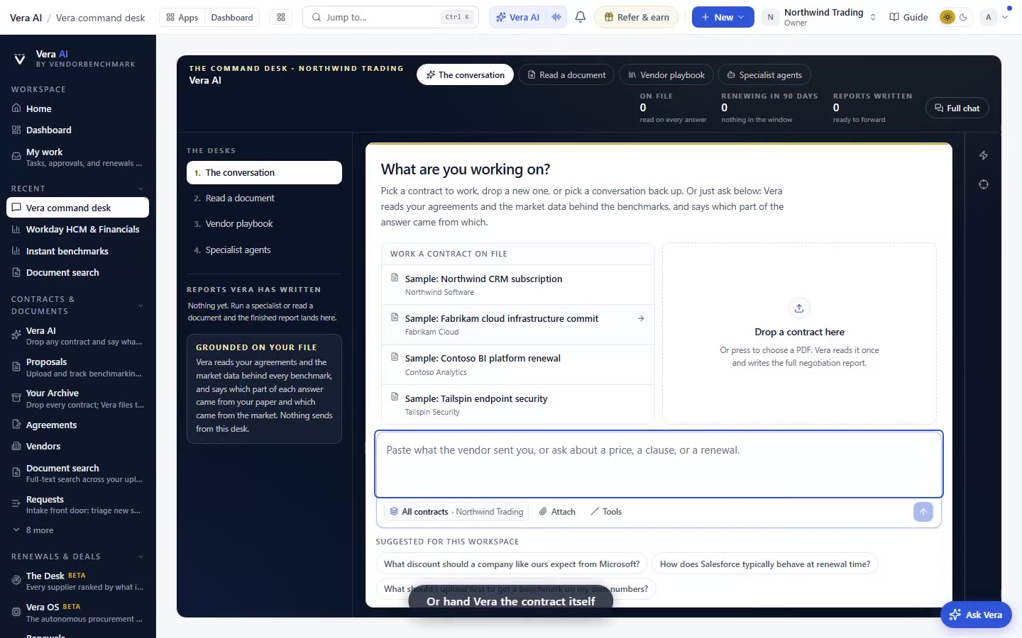
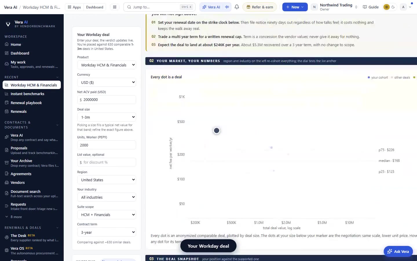
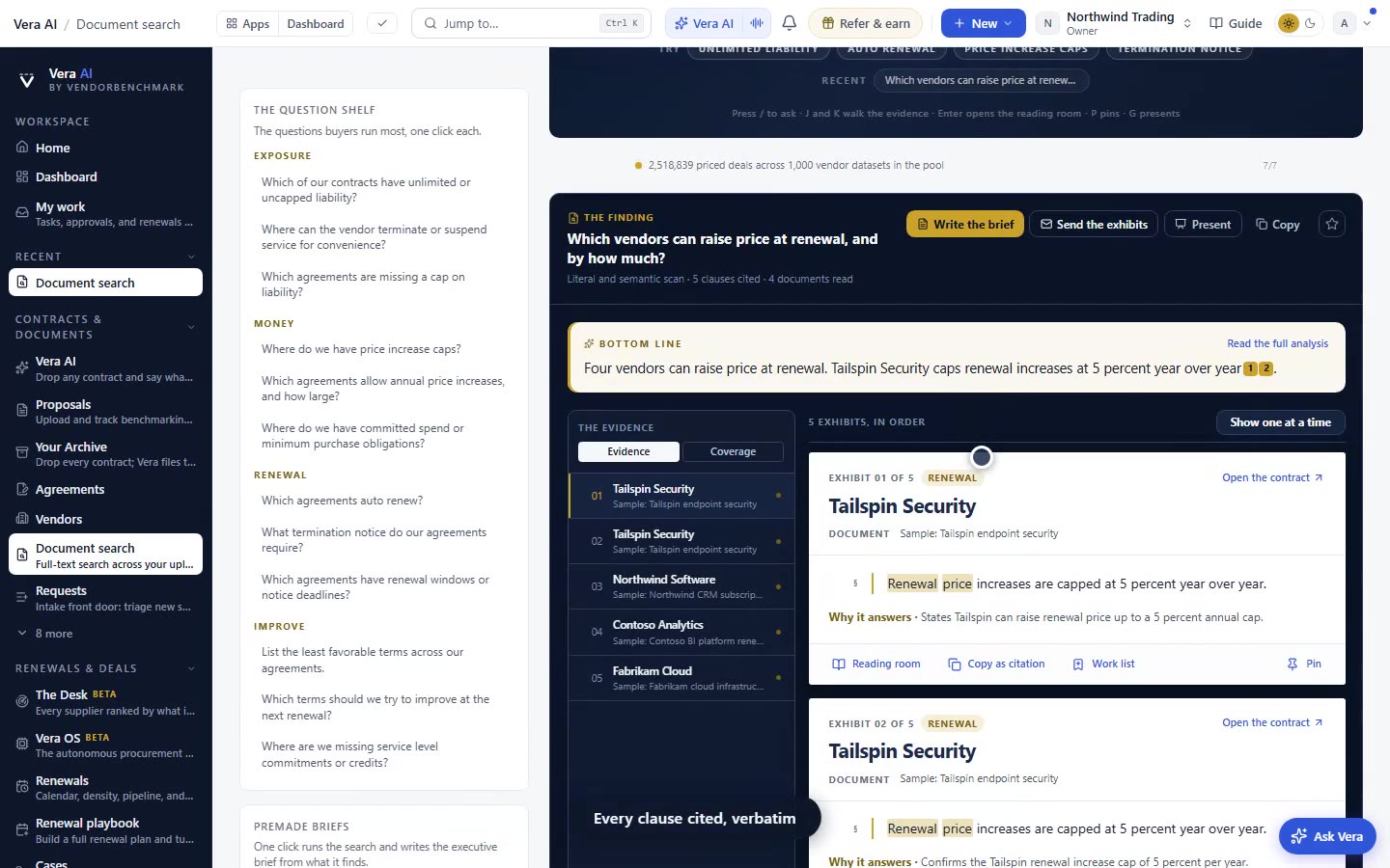
The app window, simplified: one titlebar, the whole page
The application window is now chrome only. Here is what changes for a procurement buyer working benchmarks, contracts, and renewals under deadline.
You know the moment. You are three clicks into a live renewal, the vendor rep is waiting on your counter, and you are scanning a benchmark chart that is boxed in by a side menu on the left and a tool rail inside it. The data you need is real. The frame around it is not. Today we shipped a change that removes the frame. The application window is now chrome only. The side menu and the tool rail are gone, and the tool you open runs edge to edge under a single navy titlebar that names exactly where you are.
The named problem: the window was arguing with the work
Procurement work is dense by nature. A percentile bar, a clause position, an invoice line that does not reconcile. Each of these wants width. The old window gave that width away to navigation furniture that you looked at maybe twice an hour and then ignored. Worse, the side menu created a second question every time you opened a tool: where am I, and how do I get somewhere else. Two questions the window should answer for you, not pose to you.
So we cut it. The titlebar now carries three things and nothing else: the destination's icon, its group named in gold, and the page name. That is the whole location. When you open the coverage verdict stage or a single benchmark, the chart owns the full width of the glass. The chrome tells you where you are. The page does the work.
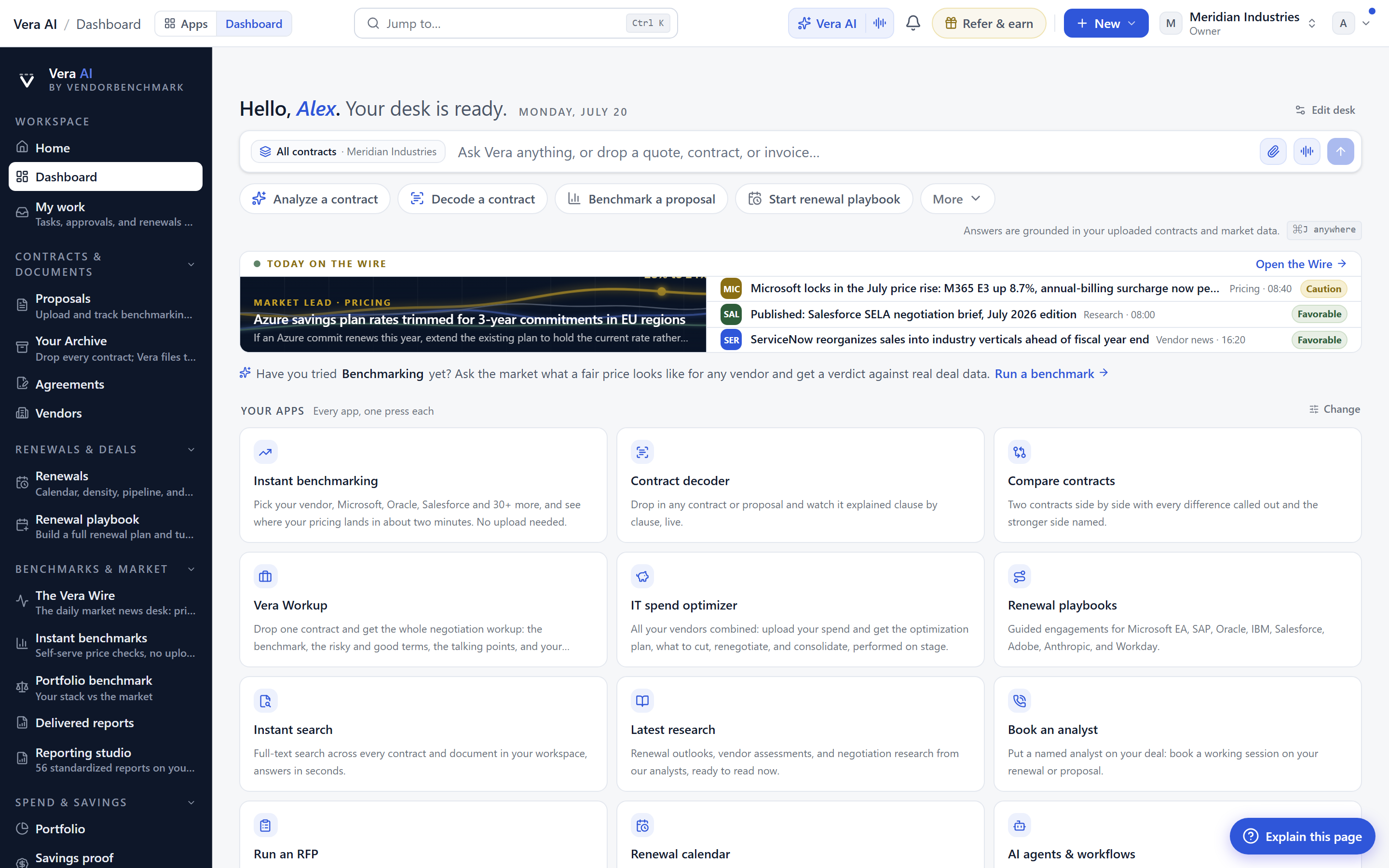
How you move now: Jump to is the one way through
With the side menu gone, movement between tools runs through one door: Jump to, on Ctrl or Cmd K. You type the name of where you want to be and you are there. No scanning a tree of nested links, no remembering which group a tool lives under. This is deliberate. A single, fast, keyboard-first path beats a persistent menu you have to visually parse every time. It is the same pattern that makes Vera's command desk quick to work: name the thing, arrive at the thing.
There is a real trade here and we will be honest about it in a moment. But for the buyer who lives in three or four tools a day, benchmarks, contracts, renewals, the negotiation room, Jump to is faster than any menu once it is in your fingers. It rewards knowing the names of your tools, which is a reasonable thing to expect of the person doing the work.
Ask Vera lives on the titlebar now
A new Ask Vera button sits on the titlebar. It opens the same assistant dialog you already have everywhere else, right over the window you are looking at. That matters because the question you want to ask is almost always about what is on screen. You are reading a benchmark and you want the percentile in plain language. You are in a contract and you want the renewal clause explained. The assistant now sits one click from that context, and it answers with cited figures rather than opinion.
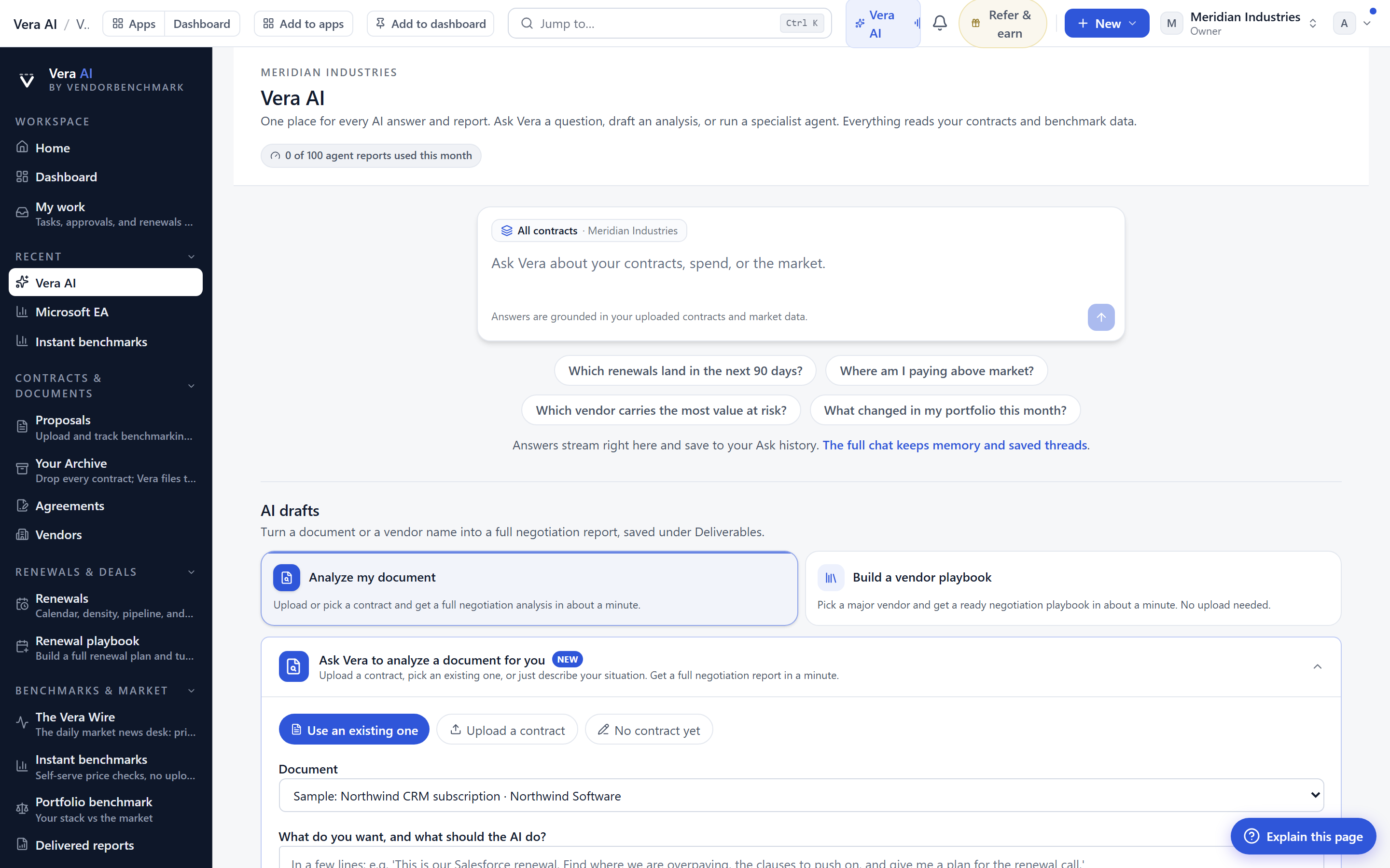
This is the same assistant behind the six specialist agents and the thirteen inbox agents, so the answer you get on the titlebar is the answer you would get anywhere. What changed is proximity, not capability. You do not leave the page to ask. You do not lose the chart to read the answer. See how the assistant is meant to sit at the center of the work on our front of desk walkthrough.
Everything else about the window is unchanged
We want to be clear about the blast radius here, because a good product update should not surprise you with side effects. The window controls you already rely on are exactly as they were. The amber control docks the window to a chip at the bottom of the screen, so you can park a benchmark while you take a call and bring it back untouched. A copied link restores the window for a colleague, so handing off a live view to your SAM manager or a legal reviewer is still one paste. Esc closes in layers, so a dialog closes before the tool, and the tool closes before you lose the window. None of that moved.
If you have followed our other window changes, this fits the same direction of travel: the watchtower opening as an application and peer intros becoming a full-screen workspace both traded chrome for room to work. This change applies that idea to every tool at once.
What changes for you, in order
Where this trade costs you something
A single door is faster once you know the names, and slower the day you do not. If you are new to the platform, or you only open a tool once a quarter, the old side menu was a map you could browse. Jump to assumes you know roughly what you are looking for. We think that is the right default for daily buyers, but it is a genuine trade, and if you discover tools by wandering, this will feel narrower at first. The names in Jump to are the same as the group labels in the titlebar, which shortens the learning, but it does not remove it.
Second, Ask Vera on the titlebar is proximity, not omniscience. It answers from what the platform can cite, the benchmarks, the closed deals, the contract record in front of you. It will not invent a figure it does not have, and you should not want it to. If the data is not there, the honest answer is that the data is not there, and you will get that answer rather than a confident guess.
Third, edge to edge is a gift on a wide monitor and a smaller one on a narrow window. The layout adapts, but if you keep the window docked to a thin column, you lose some of the width we just handed back. That is your call to make per tool, and the amber chip makes it cheap to change your mind.
Want to be updated when major licensing and pricing changes land? One analyst brief a week: the price rises, metric changes and audit campaigns that move software costs. Work email only.
Morten brings two decades of enterprise and software procurement, with stints across Oracle, IBM, SAP, and Salesforce shaping how he reads a deal. He has led sourcing through hundreds of renewals, from mid market order forms to nine figure global agreements, and learned that the buyers who win are the ones who walk in knowing the market. He built VendorBenchmark to make that pattern recognition repeatable.