Which tool do I use? One answer, everywhere you ask
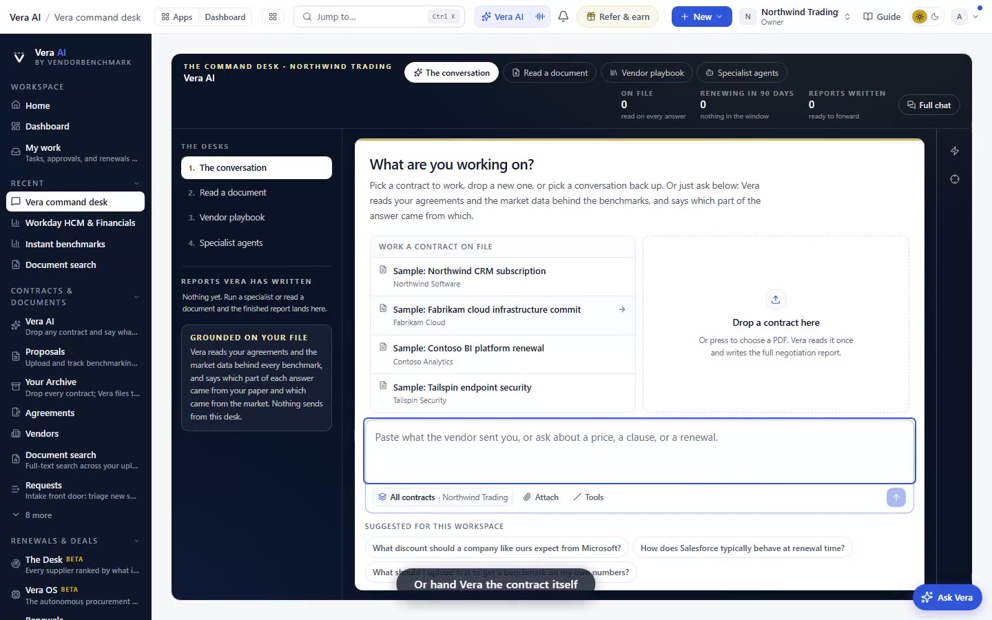
We shipped a single use-case index that maps 111 features to 217 real situations, phrased the way a buyer would say them. Ask Vera, open the palette, read the Verdict Bar or jump to chapter 14, and you get the same one answer with the exact link.
Here is a failure mode we see in almost every account review, and it has nothing to do with whether the software works. A procurement lead has a renewal landing in nine days. Somewhere in the platform there is a tool that does exactly the job in front of them. They do not find it. They export a spreadsheet instead, spend an afternoon on it, and get a worse answer than the product would have handed them in ninety seconds. The capability was never the constraint. Recall was. This release is about recall. The platform now carries one use-case index behind every door: 111 features mapped to 217 situations, written the way a buyer would actually say them out loud.
The discovery tax, and who pays it
Enterprise tools accumulate surface area faster than anyone can learn it. That is not a criticism, it is arithmetic. Every quarter adds screens, agents, report types and jobs, and every one of them is useful to somebody. The result is a discovery tax: the gap between what a platform can do and what any individual user knows it can do. The tax is paid in the worst possible currency, which is the buyer's time during a live negotiation.
The tax falls unevenly. Power users pay almost nothing because they built their own mental index over months. New joiners pay all of it. So does the occasional user, the finance business partner who touches procurement four times a year, the engineering manager who owns one renewal. We wrote about the shape of this in from first login to first saved deal: the distance between arriving and doing useful work is almost entirely a navigation problem, not a comprehension problem. People understand what a benchmark is. They do not know which of twenty screens produces one for the vendor in front of them.
The usual fixes make it worse. Search returns twelve plausible results and asks the least informed person in the room to rank them. Menu trees organise by internal architecture, so a buyer looking for help with an unexpected uplift has to guess whether that lives under contracts, spend, or terms. Documentation organises by feature name, which only helps if you already know the feature name. All three answer the question the product wants to be asked. None answer the question the buyer actually has, which is a plain sentence: I need to know if this quote is fair before Thursday.
One index, not four opinions
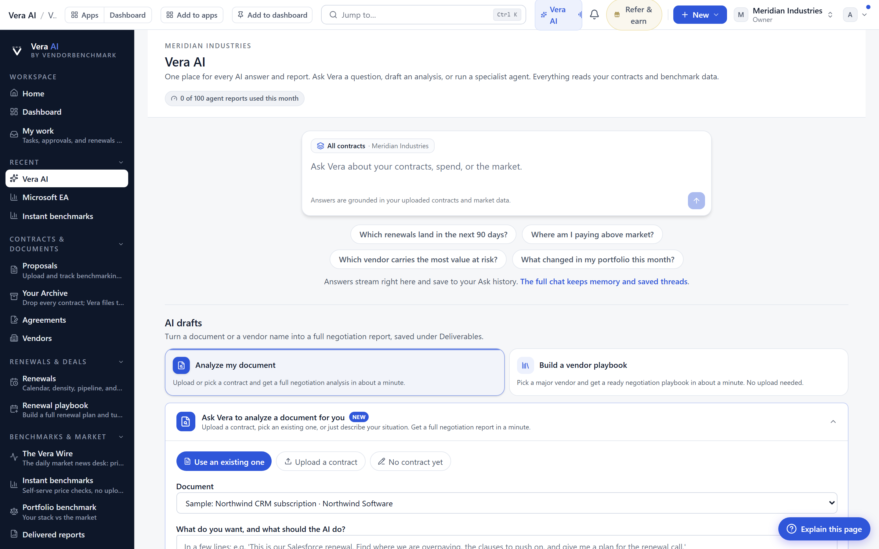
The design decision that matters here is singularity. There is now one use-case index, and every entry point reads from it. Vera reads from it. The command palette reads from it. The Verdict Bar reads from it. The manual reads from it. That means the answer you get in Slack at 8am is the same answer the manual gives your colleague at 4pm. Nobody is maintaining four differently stale maps of the same territory.
The index has two sides. On one side, 111 features, each described by the job it does rather than the screen it lives on. On the other, 217 situations, phrased in buyer language. Not "clause extraction" but "the MSA is forty pages and I need to know what I am exposed to". Not "variance analysis" but "the invoice is higher than the order form and I want to know why". The mapping between them is deliberately many to one on the answer side. A situation resolves to a single named tool, not a ranked list. If you are asking which tool, you want a tool, not a shortlist to evaluate.
The manual gained chapter 14, the tool finder, which lists every feature under the job it does. It is worth ten minutes of reading even if you never use it as a lookup, because it is the clearest single statement of what the platform actually does, organised by outcome. Several of the teams who reviewed it in advance told us the same thing: they found four or five capabilities they had been doing by hand for months.
Four routes, chosen by where your hands already are
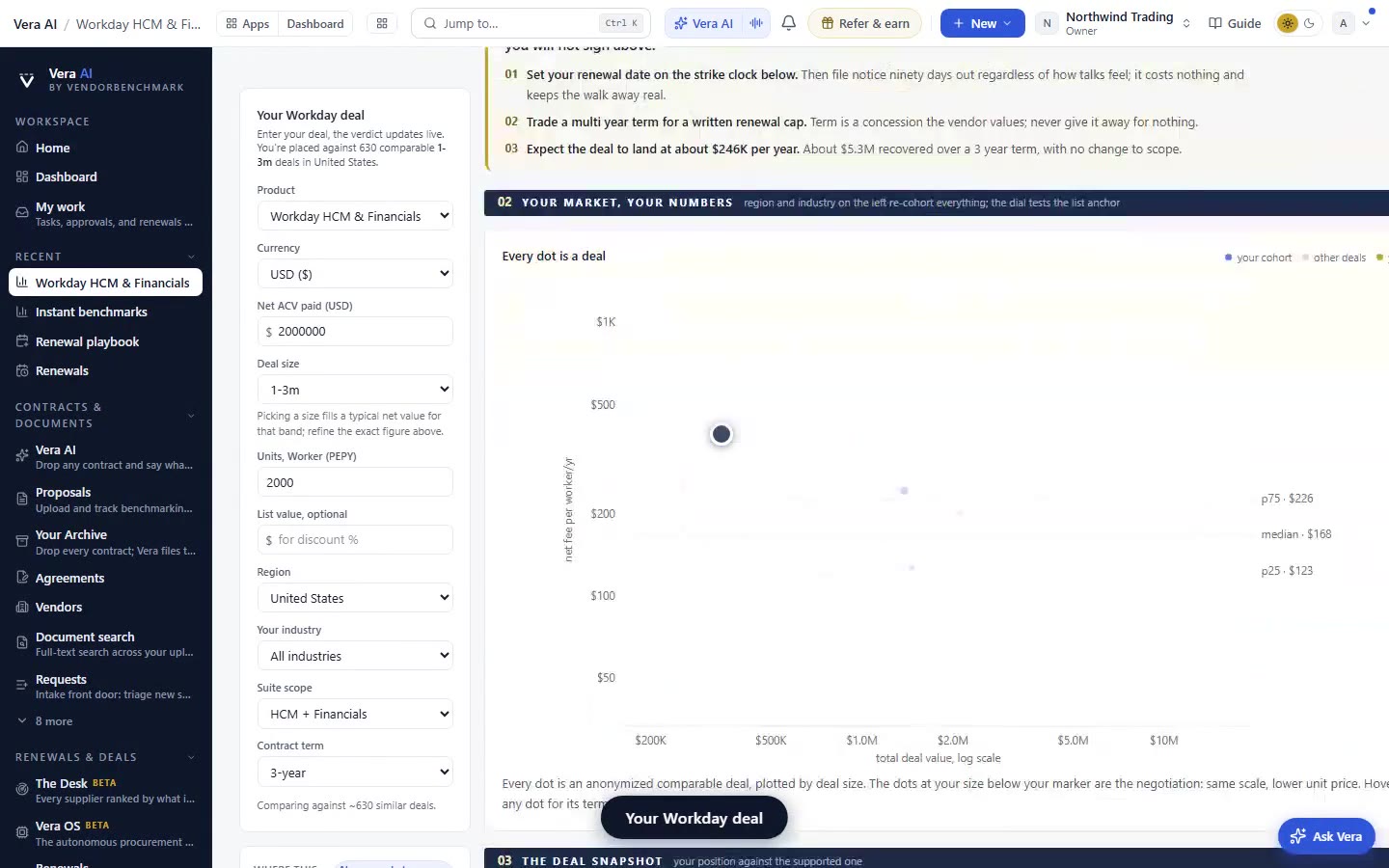
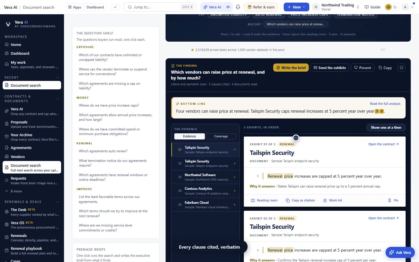
The Help page's first guide now shows the four fastest routes to the right tool, and they exist because buyers work in four different postures. Vera is for when you can describe the situation but not name the thing, which is most of the time. The command palette is for when you half know the name and want to keep your hands on the keyboard. The Verdict Bar is for when you are already looking at a vendor, a contract or a quote and want to know what to do next about this specific object. Chapter 14 is for when you want to read the whole map rather than query it.
The Verdict Bar route is the one we expect to change behaviour most, because it is contextual. You are on a contract record, the bar knows what that record is missing, and the suggested tool is the one that closes that specific gap. This is the same logic behind the coverage grid: the platform already knows what is absent, so the useful move is to name the tool that fixes it rather than wait for you to work out that a gap exists. Vera also carries the index into the places where the conversation already happens, which we covered in Vera in Slack and Teams. Asking in a channel and asking in the app now return the same named tool and the same link.
What changes for a buyer, specifically
The honest limits
The index is finite and it is curated by hand. 217 situations is a lot of coverage, but it is not every sentence a buyer could type. If your phrasing sits well outside the mapped situations, Vera will fall back to a general answer rather than a named tool, and that fallback is noticeably less useful. We would rather it say so than confidently route you somewhere plausible and wrong. If you hit a gap, the phrasing you used is worth reporting, because that is how situations get added.
It is a router, not an analyst. Naming the right tool does not do the job. You still have to run the benchmark, read the decoded contract, or work the negotiation. The finder shortens the distance to the starting line and nothing more. Related to that, the index is deliberately opinionated: it names one tool. For genuinely ambiguous situations, where two tools would both be defensible, the single answer will sometimes be the lighter one when a heavier workflow would have served you better. Experienced users should feel free to override it.
It does not know your permissions or your entitlements. The index maps situations to features across the whole platform. If your role does not have access to a given tool, or your organisation has not enabled it, you will be routed to something you cannot open. That is a rough edge we intend to close, and in the meantime the honest workaround is to ask your administrator rather than assume the tool is missing. Finally, the index lags the product by a release cycle. New features are mapped in the release after they ship, so the very newest capability may not answer to a plain language question yet. If you want the complete current picture, including how outputs are produced and where they land, the pieces on why AI reports beat AI answers remain the better read.
None of this is glamorous work. It is an index, and indexes do not demo well. But the gap between a platform's capability and a buyer's recall is where most enterprise software value quietly evaporates, and closing it is worth more than another screen nobody can find.
Fredrik has spent more than twenty years in enterprise software, with time at Oracle, IBM, SAP, and Salesforce before moving to the buy side. He structured and priced the kind of large agreements most buyers only see once or twice in a career, which taught him where the leverage sits and how far a vendor will actually move. He started VendorBenchmark to hand that knowledge to every sourcing team.