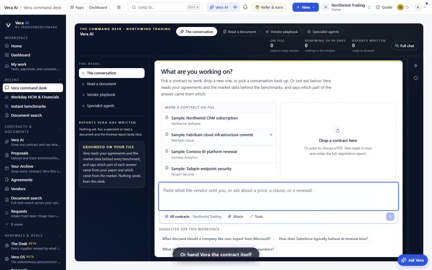
Every vendor benchmark now opens as a window
The library wore the window dress since August. The vendor tools behind it did not. Now they all open the same way, so moving between a vendor's product lines no longer sends you back to the shelf.
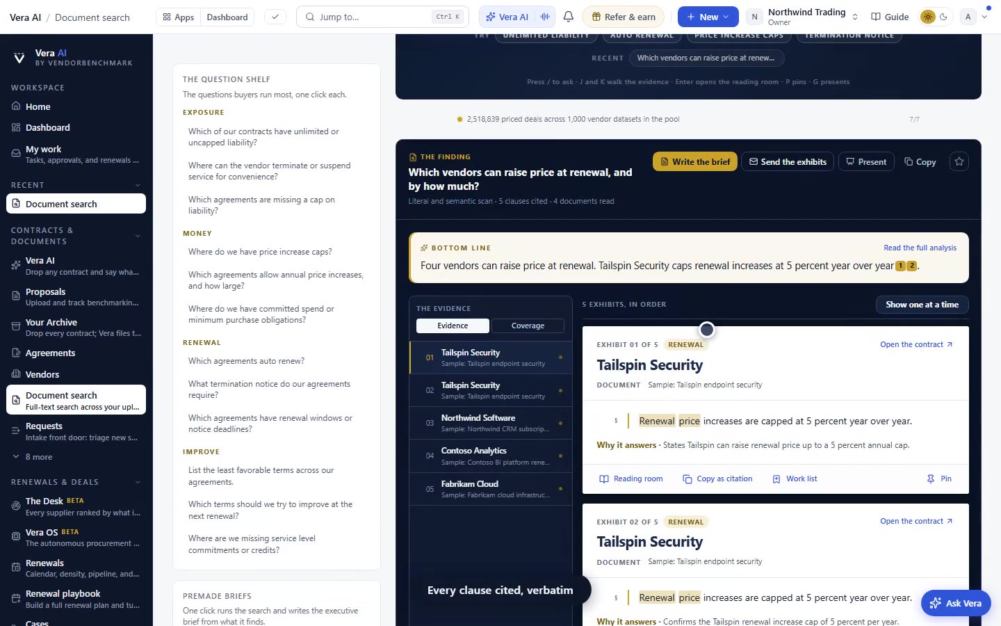
PRODUCT UPDATE - FROM THE ANALYST DESK. If you buy software for a living, you have felt the small friction of inconsistency. You open a vendor in the Benchmark Library and it arrives as a window: a titlebar that names it, a rail that lists its neighbours, a shelf you can close back to. Then you click through to the vendor tools behind that library and the frame changes underneath you. A vendor with a documented curve stayed in the window. Every other vendor handed you a plain page inside the application frame, with a heading and a breadcrumb doing the work the window should have done. That inconsistency is now gone. All of them open the same way.
The problem you recognise
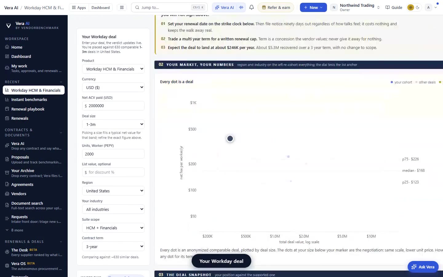
The tell was the breadcrumb. When a screen needs a breadcrumb to tell you where you are, the frame has failed to. We shipped the one titlebar model for exactly this reason, and the Benchmark Library adopted it in August. But adoption stopped at the library shelf. Behind it, the per vendor tools were a mixed estate. A vendor Salesforce, say, that had a fully documented curve got the window treatment. A vendor without that curve got a plain page: same information density, different chrome, a heading and a breadcrumb repeating what the window title already said, and content sitting on an opaque sheet instead of the window material.
For a buyer working a portfolio, that is a tax on movement. You do not evaluate one product line in isolation. You evaluate Nonprofit Cloud, then Sales Cloud, then Tableau, because they land on one paper and often one renewal. When each line makes you return to the shelf and re enter, you lose the thread. This is the same argument we made when the library first opened onto the verdict reading: the frame should carry you, not stop you.
What the window actually holds
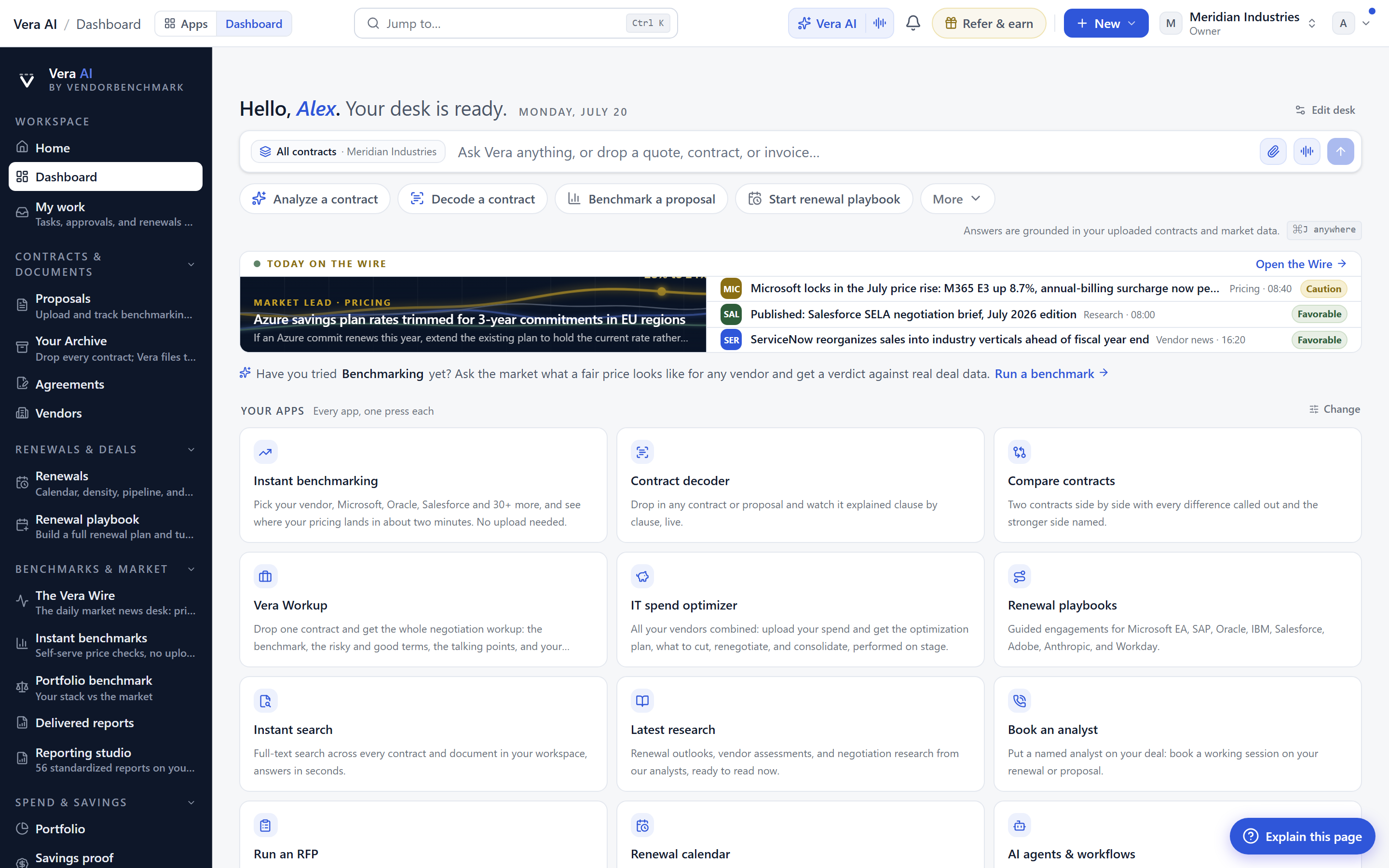
The titlebar names the vendor and the product line, so the page never has to. The rail on the left lists that vendor's other product lines. That is the move that matters most: from a Salesforce window you step across Nonprofit Cloud, Sales Cloud, and Tableau without going back to the shelf. Under those product lines the rail carries the Benchmark Library, the Portfolio benchmark, and Vendor Intelligence for the same vendor. Everything a single negotiation needs is in one frame, one click apart.
The cleanup is deliberate. The heading and breadcrumb are gone because the window already states both, once, in the titlebar. The content now sits on the window material rather than an opaque sheet, so the panel reads as part of the window rather than a document pasted inside it. Closing returns you to the shelf, the same shelf you came from, in the same state. This is the same reading discipline we applied when research papers stopped being embedded files and started being styled pages.
The five flagship tools moved with the rest
This was not a partial migration. The five flagship tools moved into the window model alongside every other vendor tool, so there is no remaining island of the old frame to trip over. Whether you arrive at a heavily documented vendor with a full curve or a thinner one, the door is the same shape. That consistency is the entire point. A buyer should never have to relearn navigation halfway through a decision, and should never have to wonder whether the sheet under the numbers is different because the vendor is different.
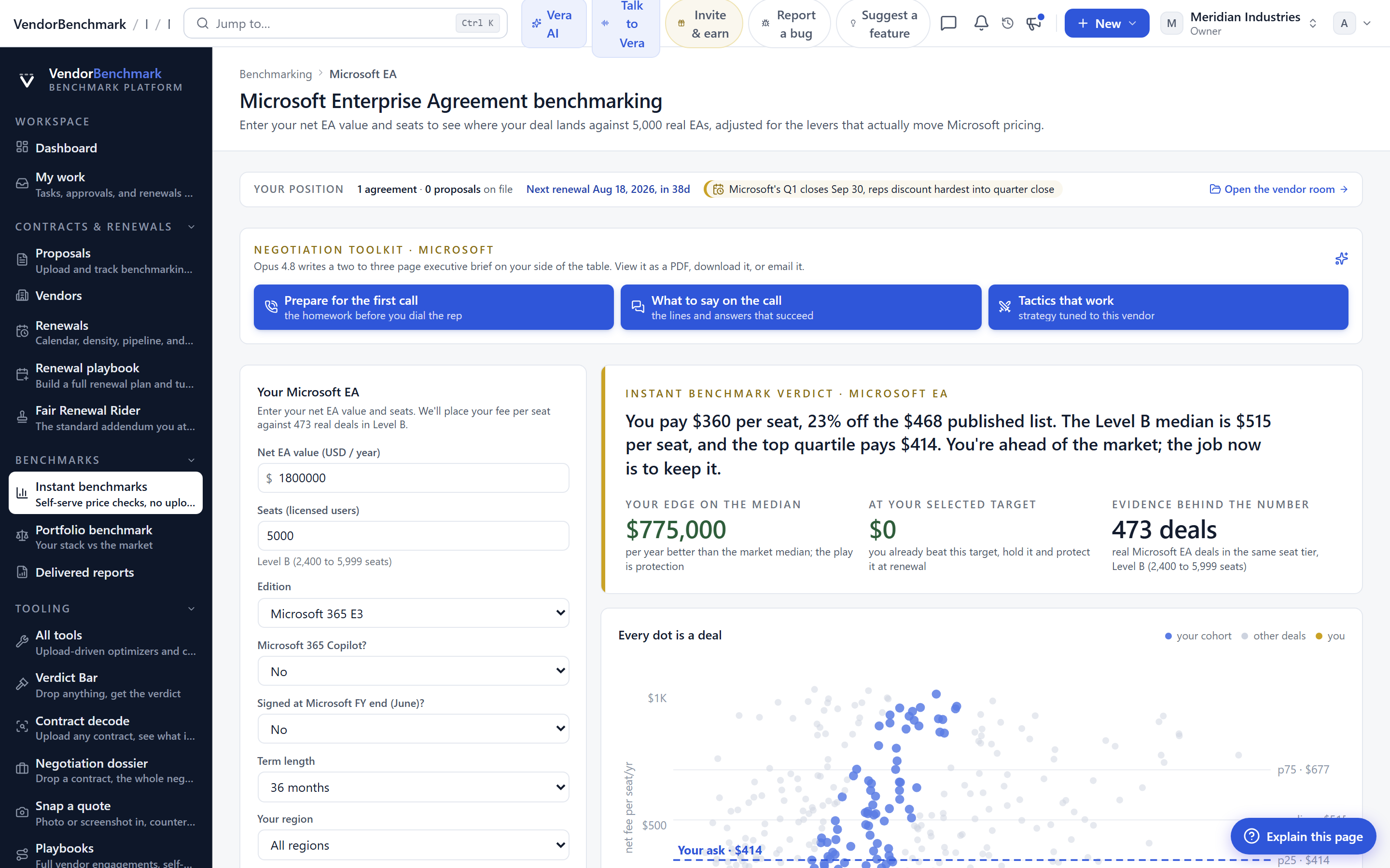
The workflow effect compounds when you are assembling a position across a multi line vendor. You read the curve on one line, cross to the next line in the rail, drop to the Portfolio benchmark to see where the whole vendor sits against market, then step into Vendor Intelligence, all without the shelf resetting your place. That is the sequence a second opinion on the vendor's own curve depends on, and it is now uninterrupted.
How it fits the buyer workflow
Most decisions do not start at the library. They start when the intake ticket names the vendor, and you open that vendor to inherit a position. The window is where you build that position. You arrive knowing the vendor and product line from the titlebar, you widen to the vendor's other lines from the rail, and you drop to the Portfolio benchmark to see the vendor as a whole. From there the path into a negotiation, a playbook, or a Fair Renewal Rider is unbroken. The window is not a nicer page. It is the surface a whole vendor argument is built on.
For teams pooling leverage across accounts, the same consistency matters. When several buyers open the same vendor in the same window to compare notes before forming a buying bloc, everyone is reading the same frame. Nobody is looking at a plain page while someone else looks at a window and quietly reaching a different mental model of what the tool holds.
The honest limits
Be clear about what this is and is not. This is a frame change, not a data change. The window does not add curve where a vendor has none. If a product line was thinly documented before, it is thinly documented inside the window too, and you should read it that way. The consistent door does not equalise the quality of what is behind each door, and treating the frame as evidence of depth would be a mistake.
It is also a navigation improvement, not an analysis. The rail lets you move between a vendor's lines without friction, but the judgement about which line to press on, and how far the curve supports your ask, is still yours to make. The window shortens the distance between the numbers and your decision. It does not make the decision. And in fast repricing categories, where the curve itself moves under you, the window is a better reading surface but the same caveat applies: read the date on the curve, not just the shape.
Finally, this is a floor, not a ceiling. Landing every vendor tool in one consistent window is the baseline the rest of the estate should meet, and where a screen still repeats itself or still sits on an opaque sheet, treat that as a defect to file, not a feature to accept. The whole point of a consistent frame is that the exceptions become visible. Open a vendor from the Benchmark Library and the door should be the same shape every time. Now it is.
Want to be updated when major licensing and pricing changes land? One analyst brief a week: the price rises, metric changes and audit campaigns that move software costs. Work email only.
Morten brings two decades of enterprise and software procurement, with stints across Oracle, IBM, SAP, and Salesforce shaping how he reads a deal. He has led sourcing through hundreds of renewals, from mid market order forms to nine figure global agreements, and learned that the buyers who win are the ones who walk in knowing the market. He built VendorBenchmark to make that pattern recognition repeatable.