The studio layout: a slim icon rail, a contextual panel, more room for the work
Studio is a second layout for the workspace. It keeps the same navigation, shortens the menus, and hands the extra pixels back to the work in front of you.
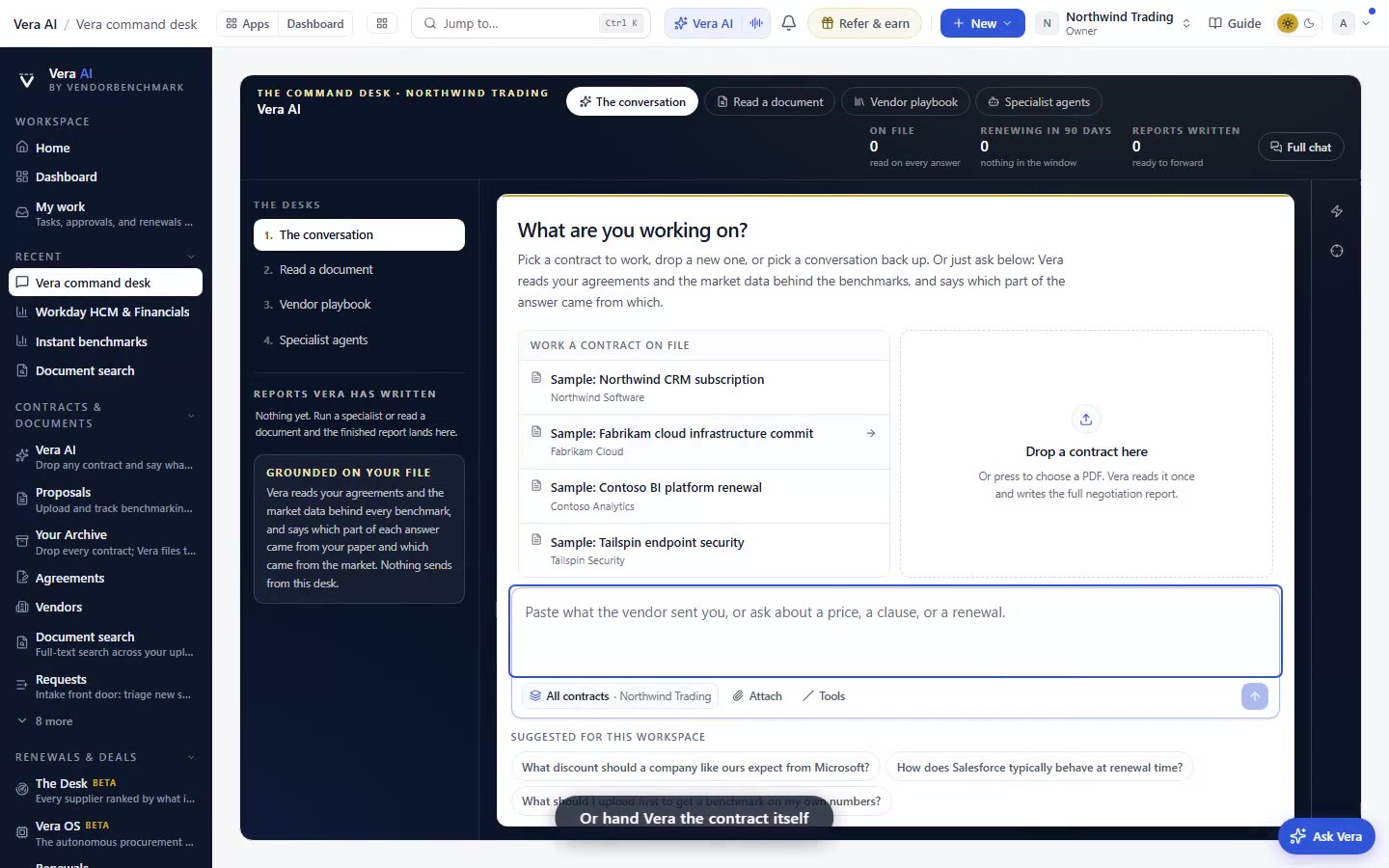
Here is a problem most buyers stop noticing because they have trained around it. The navigation eats the screen. A wide rail down the left, every group spelled out, every destination listed at once, and the actual thing you came to read, a clause table, a percentile bar, a redlined SOW, squeezed into whatever is left. You scroll horizontally, you shrink the font, you close the rail and lose your bearings. The menu was never the work. It was the map to the work, and it had grown large enough to obscure the territory.
So we shipped a second layout for the workspace, called studio. It does one honest thing. It shortens the map and enlarges the territory. Classic stays the default, nothing is taken away, and the two layouts draw from exactly the same navigation. If you have used the way the decode reads on the page with your next steps beside it, you already know the instinct here: keep the reference close, give the content room to breathe.
What studio actually changes on the screen
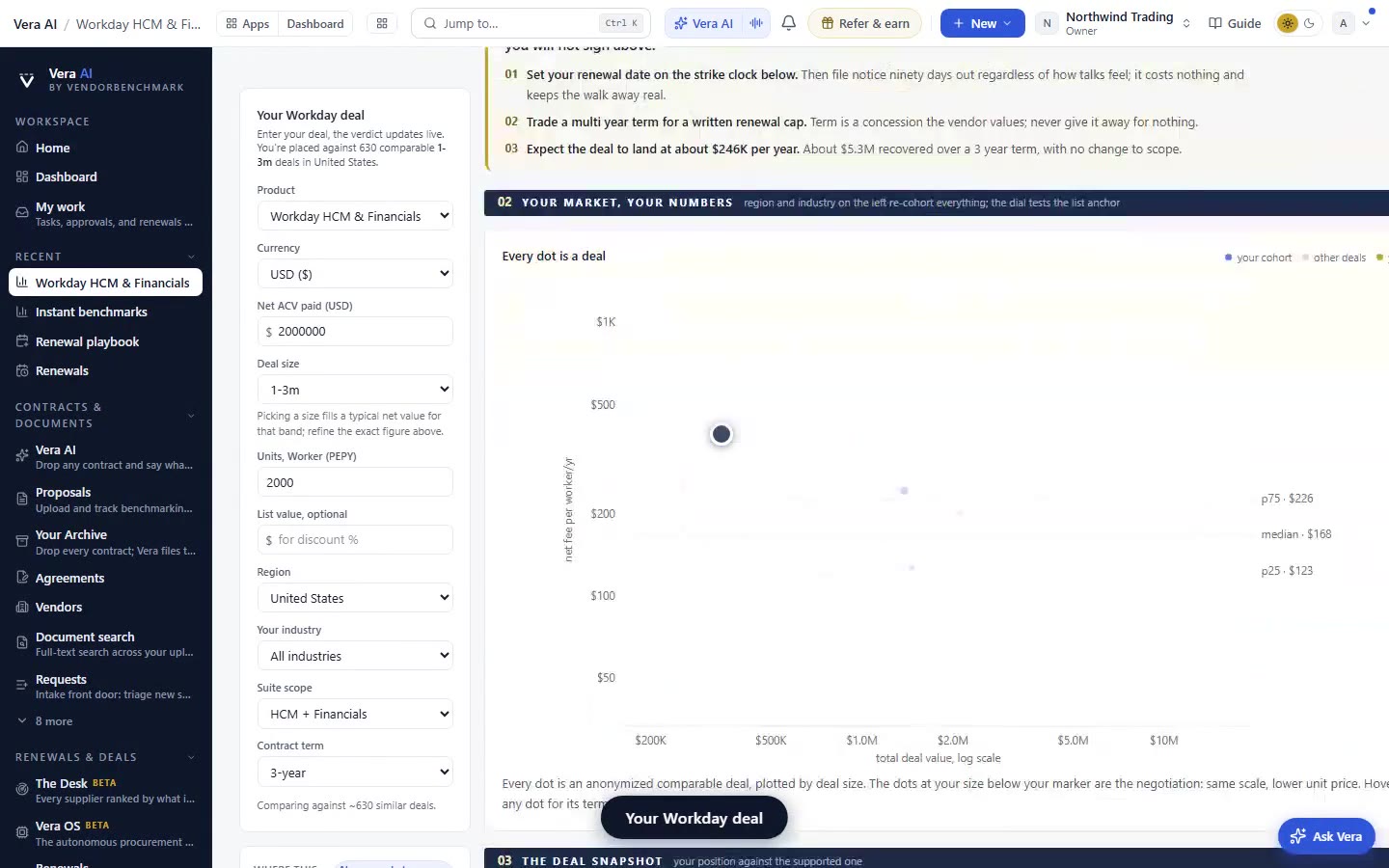
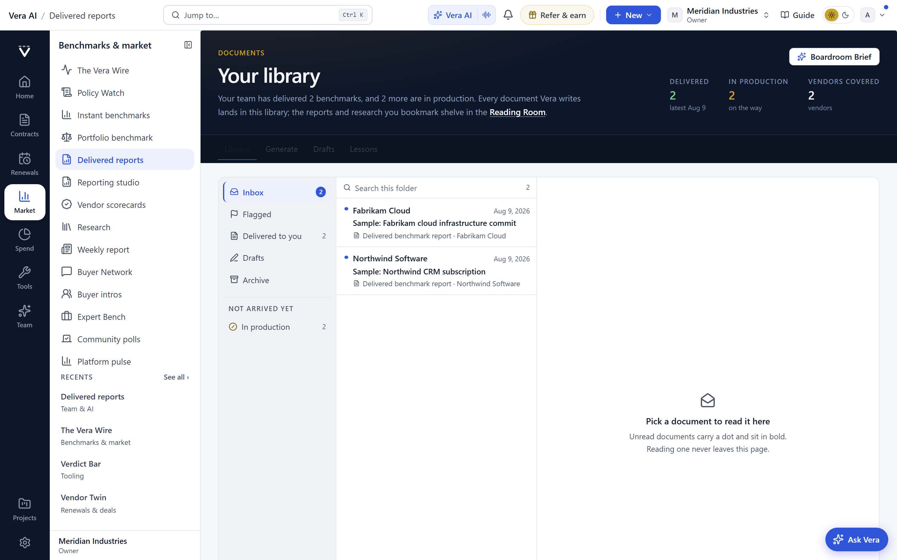
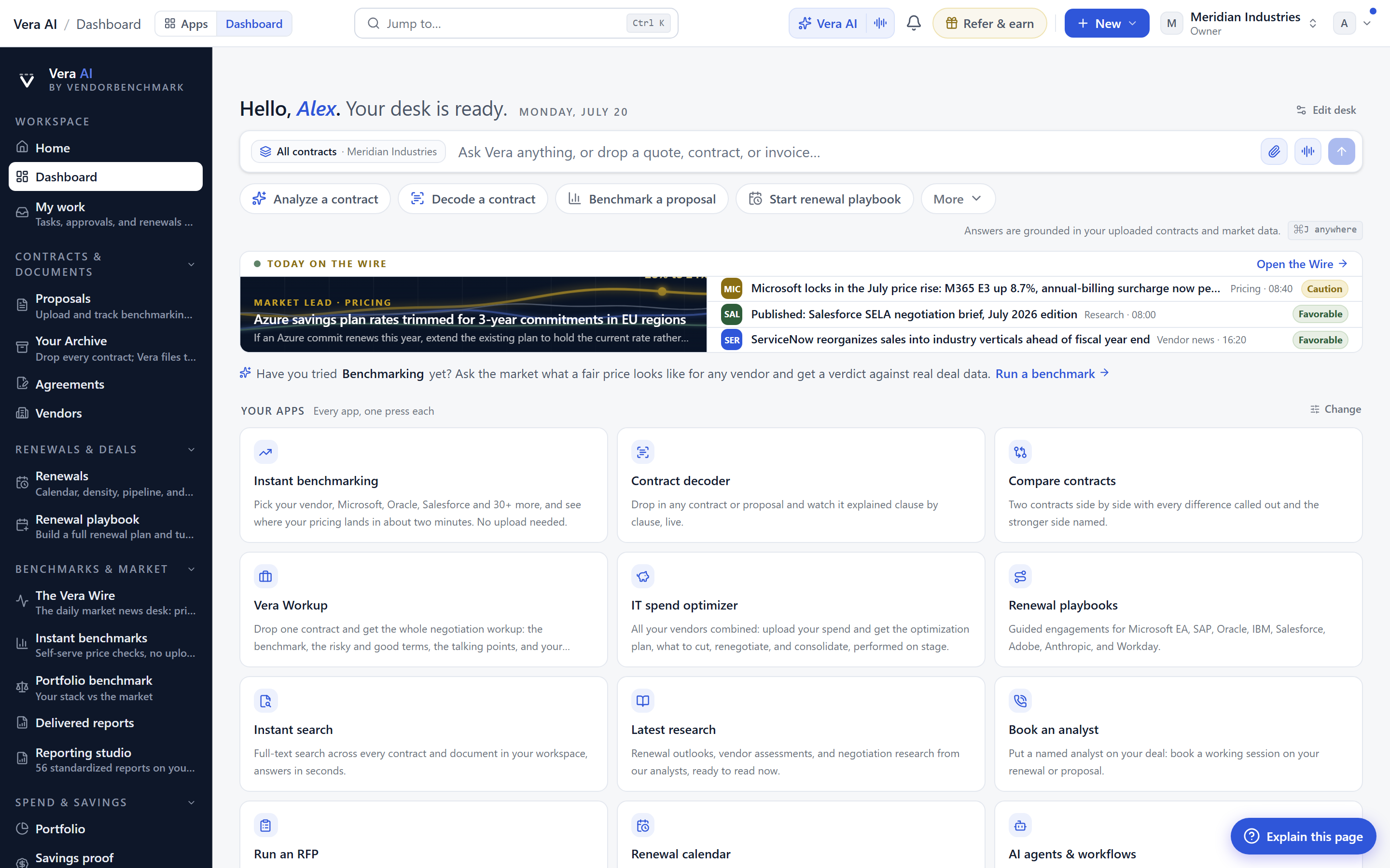
In classic, the left rail is wide and grouped. Every group label is written out, and the destinations under each group are visible at the same time. It is complete, and it is heavy. Studio replaces that with a slim icon rail, one icon per group, and nothing else on the rail itself. When you land on a group, a white panel opens beside the rail and lists that group's destinations. Only the active group. The panel is short because it is scoped, and the rail is slim because it carries icons rather than sentences.
The result is measurable in pixels. Where the classic rail might claim a fifth of a laptop screen, the slim rail and its panel together give a large share of that width back to the page you came to read. On a contract record or a benchmark detail, that difference is the gap between reading a table whole and reading it through a keyhole.
The window button, and why it matters mid-review
Hover any row in the contextual panel and a window button appears. Click it and that destination opens as an app window floating over the page you are already on, rather than replacing it. This is the small feature that changes how a review session flows. You are reading a contract record, you need to check a clause position, you open the clause library as a window, read it, close it, and you are still on the contract record where you left off. No navigate-away, no lost scroll position, no browser back button roulette.
For anyone who has watched Vera AI open as a command desk, the pattern will feel familiar. The reference layer comes to you, sits over the work, and leaves when you are done. Studio brings that same overlay logic to ordinary navigation, so a cross-check does not cost you your place.
You can set this up from your analyst desk and see the difference immediately on the views you use most, the renewal calendar, the spend estate, the negotiation war room.
What it does not change
Be clear about the scope. Studio is a layout, not a new information architecture. Every destination that exists in classic exists in studio, in the same groups, because both layouts read from one navigation definition. Nothing is hidden, nothing is renamed, and no destination is reachable in one layout but not the other. If your team knows classic, they know studio the moment they switch, because the only thing that moved is where the labels live.
The choice follows your account. Set studio once and it travels with you across devices where the full workspace renders. It is a personal preference, not a tenant setting, so one buyer can run studio while a colleague stays on classic, and neither affects the other's view of the same contracts and benchmarks.
How it fits a procurement workflow
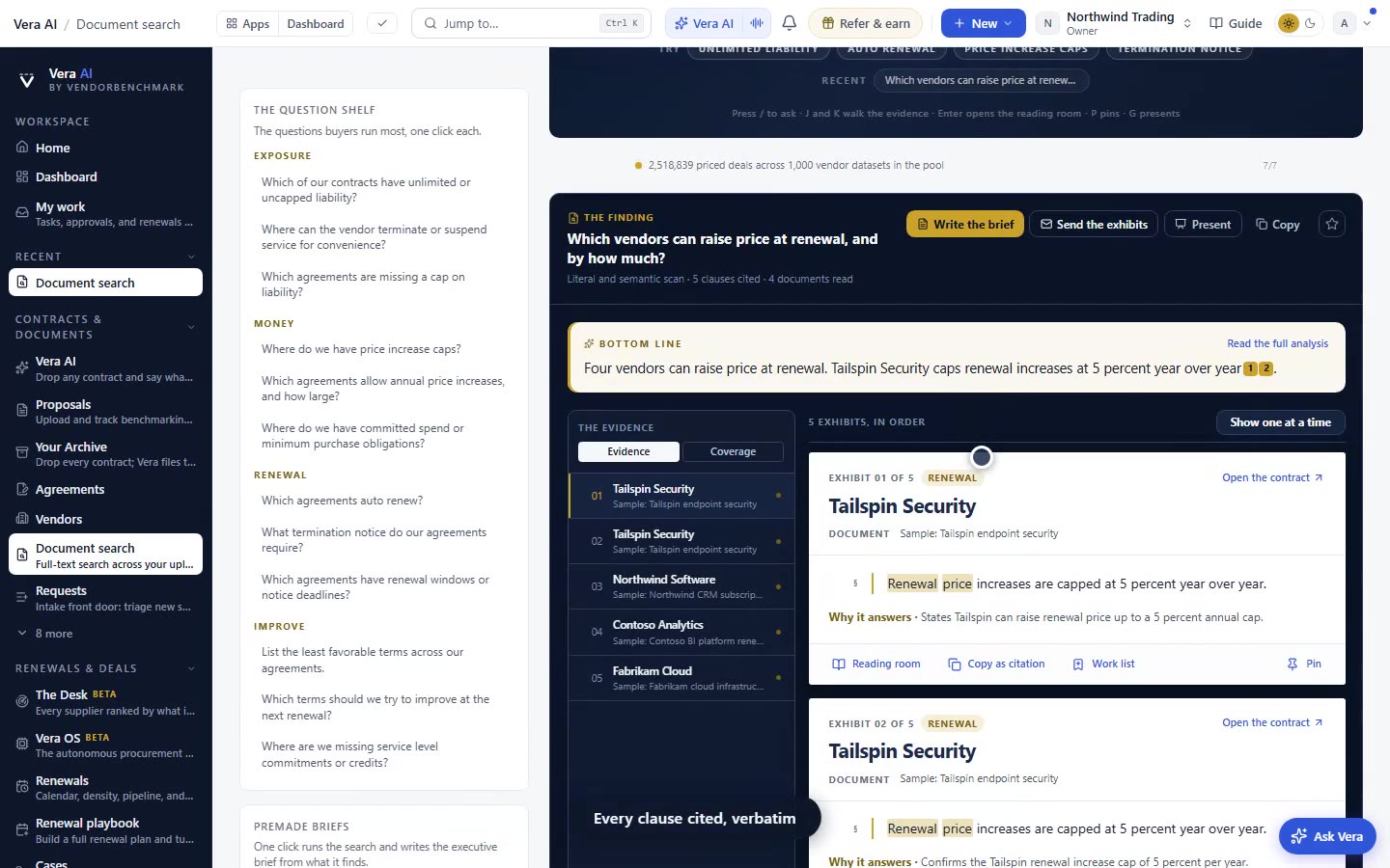
Most of the width you gain lands on the views where reading is the job. A benchmark detail with percentile bars reads cleaner at full width. Ask-across-all-contracts review tables, which are wide by nature, stop truncating columns. A negotiation war room, where you want the vendor's position and your counter side by side, finally has room for both. The window button then lets you pull in a clause position or a peer cohort without abandoning the war room, which is close in spirit to how a vendor agent gives you an Agent Room to work inside rather than a report to file away.
The honest limits
Studio helps least where you already ignore the rail. If you live in a single view all day and never navigate, the layout gains you little beyond the width, which is real but modest on a large monitor. The window button is a convenience, not a workspace manager. It opens one destination at a time over your page, so it is not a tiling system for reading four things at once. And on phones there is no studio at all. The classic drawer stays because a one-icon rail and a floating panel are laptop and desktop conventions, not phone ones, so a buyer who does most reviews on a phone will not see any of this.
There is also a small learning cost the first day. Icons carry the group meaning that words used to carry, so for a session or two you will hover to confirm what an icon means before muscle memory takes over. That settles quickly, and it is exactly why classic remains the default rather than a forced migration. Turn studio on when it suits you, the same way you would adopt any workflow change, deliberately and per person. The same restraint sits behind how peer intros becomes a full-screen workspace: give the work the room it needs, and let the buyer decide when to take it.
Want to be updated when major licensing and pricing changes land? One analyst brief a week: the price rises, metric changes and audit campaigns that move software costs. Work email only.
Morten brings two decades of enterprise and software procurement, with stints across Oracle, IBM, SAP, and Salesforce shaping how he reads a deal. He has led sourcing through hundreds of renewals, from mid market order forms to nine figure global agreements, and learned that the buyers who win are the ones who walk in knowing the market. He built VendorBenchmark to make that pattern recognition repeatable.