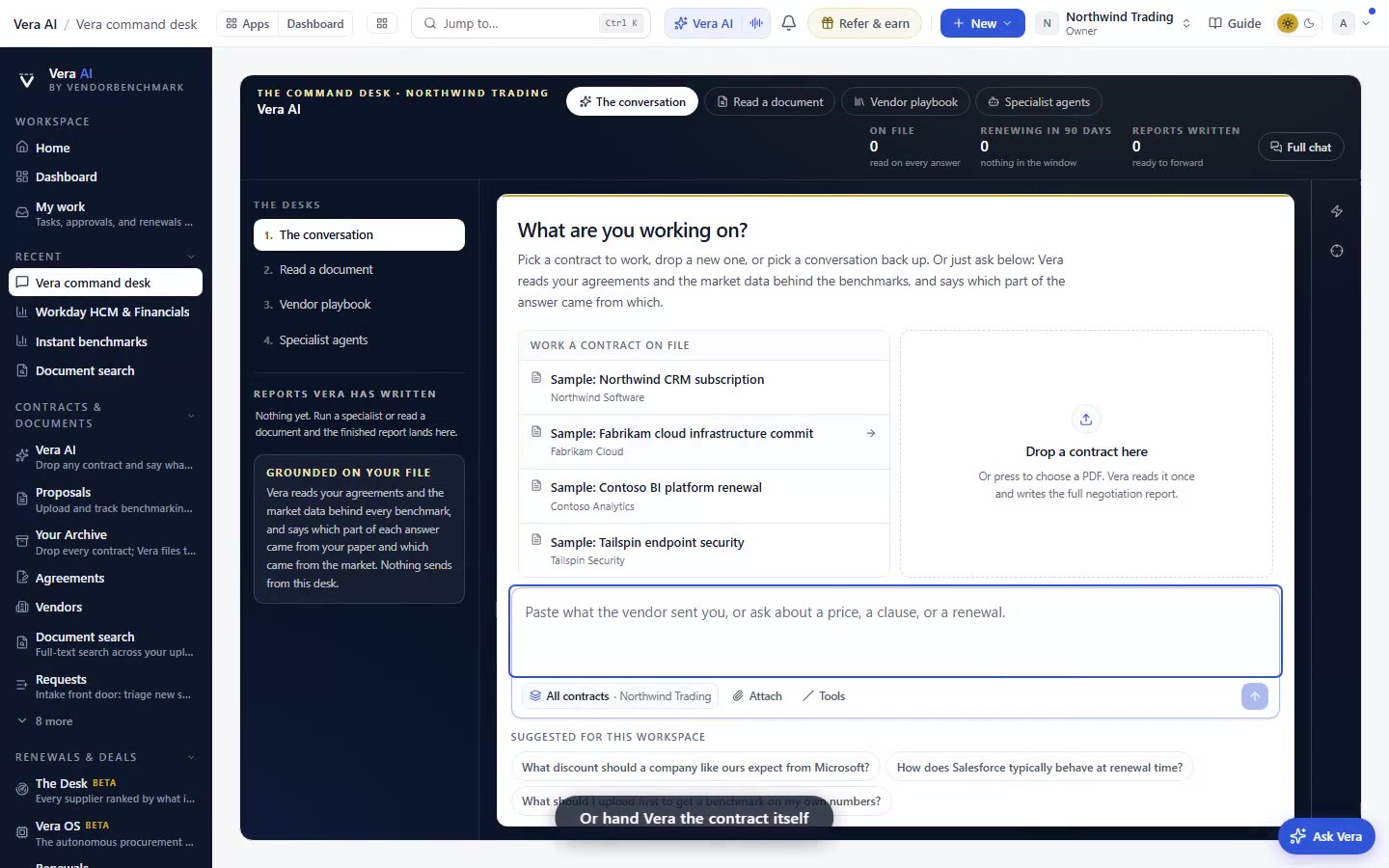
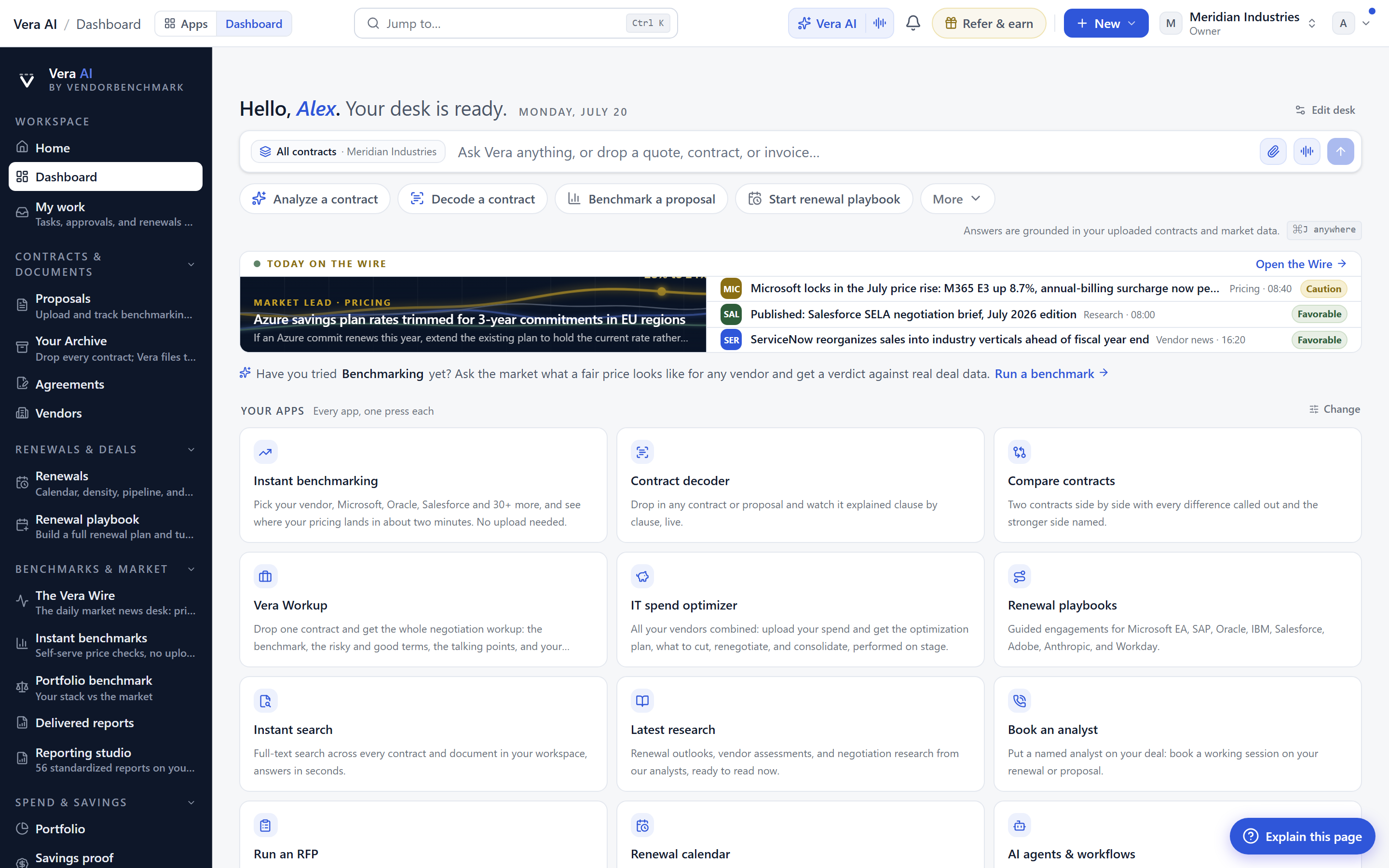
Vera's chat reads like the rest of the app
The conversation with Vera used to read like a poster. Now it reads like a page. Here is what that changes for a procurement buyer, and where it stops.
Here is a problem you will recognise if you have ever pasted a vendor's redline into a chat box and asked for a read. The answer arrives, and it is technically correct and physically unreadable. Oversized type, edge to edge, buttons crowding every paragraph, a strip of controls under a one line reply. You get a poster, not a page. A poster is fine for a slogan. It is a bad shape for the kind of answer procurement actually needs, the paragraph that walks through what the cap on liability really means, or where a given discount sits against the market. This update fixes the reading surface. Vera's conversation now sets at the app's own text size on a centred reading column, and the controls around it step back until you want them. It is a small change that pays off every time you ask a long question.
The column, and why size is the whole point
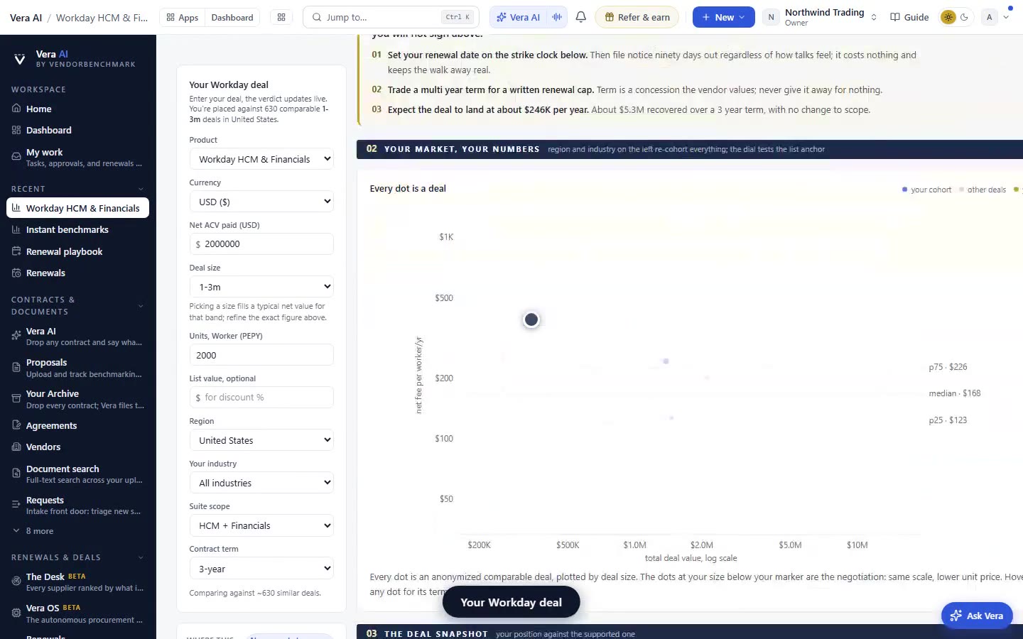
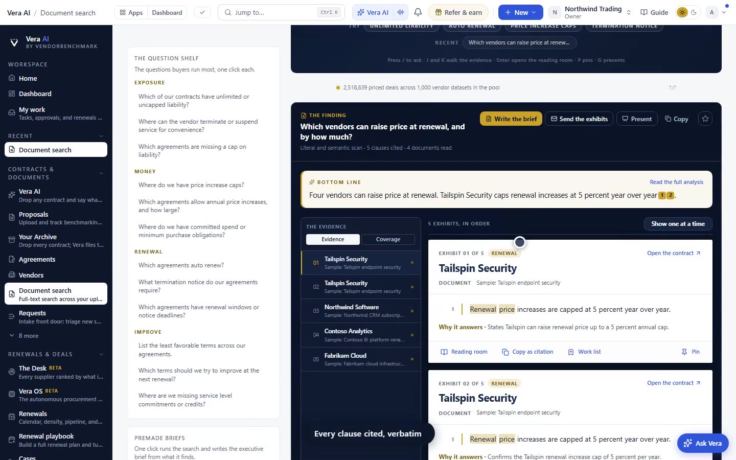
A reading column has a measure, a line length the eye can track without losing its place. Set text too large and edge to edge and every line becomes a scan across the monitor. Set it at the app's own body size on a centred column and a long answer reads the way the rest of the product reads, like a document you can absorb. That is the core of this change. Vera now inherits the same type scale as your benchmark verdict pages and your contract records, so moving from a chat answer to a benchmark to a clause library entry no longer feels like changing rooms. The same discipline we brought to research papers reading as styled pages now applies to the conversation itself.
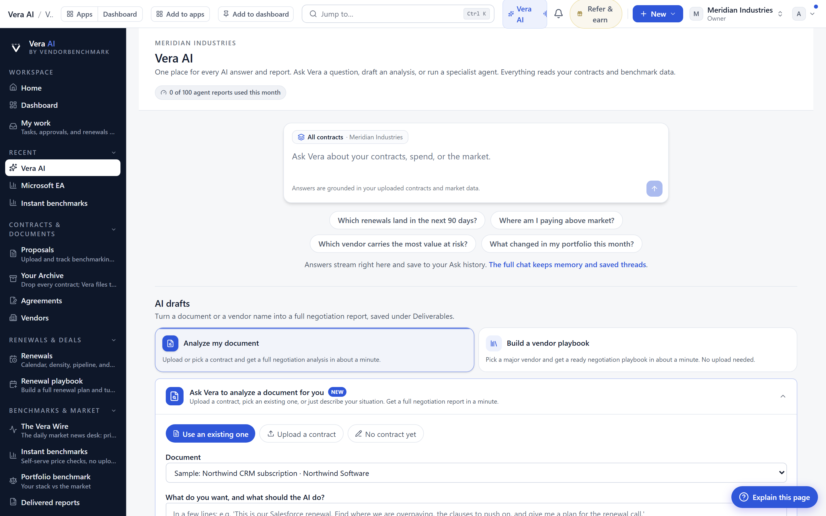
The chrome stepped back with it
A reading column only works if the controls stop shouting. So the chrome moved out of the way in specific, deliberate ways. Each answer shows Copy and a quiet three dot menu only when you point at it. Until then the answer is just the answer. Ask again and the feedback thumbs live on the newest answer alone, because rating an answer from four turns ago is noise, and the newest one is the only one you are actually reacting to. The closers, save as a document, file as a task, open the case, sit under the newest substantive answer only. That last word matters. A one line acknowledgement does not earn a row of buttons. A full analysis does. This is the same window logic we applied when we cleared the frame in the app window, simplified.
Openers, verified lines, and links that behave like links
Not every message from Vera is an answer, and the design now says so. Vera's own morning openers, the nudge that a renewal is close or a price list shifted, arrive as a small note card rather than a full dressed answer. You read it as a note, not as a verdict you have to act on. When an answer is backed by verified data it wears one quiet line instead of a strip, so the provenance is present without dominating the paragraph it belongs to. The way verification reads here mirrors how the Outcome Network shows benchmarks with skin in the game, one clear signal rather than a badge parade. Guide addresses now render as named links you can press, so when Vera points you to a clause library entry or a benchmark, it is a link, not a wall of raw URL text you copy by hand.
Clear conversation asks twice
A transcript is a record. It holds the questions you asked about a vendor's MSA, the numbers Vera returned, the reasoning you will want when you draft the counter. Losing it by a stray click is a real cost, so Clear conversation now asks twice before it costs you a transcript. This is a small guardrail, but it protects the artefact that makes chat useful after the fact. If you want the transcript to become something durable, the closer to save as a document turns it into a deliverable, which is the argument we made in why AI reports beat AI answers. A saved document survives the session. A cleared transcript does not.
The honest limits
Be clear about what this is and is not. This update changes how the conversation reads and how its controls behave. It does not change what Vera knows or how she reasons. A cleaner column will not turn a thin answer into a strong one, and the quiet verified line is only as good as the data behind it. If you ask a question the benchmarks do not cover, you will still get a hedged answer, only now it will read more comfortably while it hedges. The reading column also assumes a reasonably wide window. On a narrow split screen the measure compresses and some of the benefit shrinks, which is a trade off we accept rather than a bug we hid. And the closers are still tied to the newest substantive answer, so if you want to act on an older answer in a long thread, you scroll to it and use its own Copy rather than a persistent action bar. None of this touches the substance of the work. For that, start from the question, ask Vera what is covered and what a good discount looks like on the chat page, and let the reading column do its quiet job. See also the fuller walkthrough of asking Vera about coverage and discounts for how the substance holds up under real questions.
Want to be updated when major licensing and pricing changes land? One analyst brief a week: the price rises, metric changes and audit campaigns that move software costs. Work email only.
Morten brings two decades of enterprise and software procurement, with stints across Oracle, IBM, SAP, and Salesforce shaping how he reads a deal. He has led sourcing through hundreds of renewals, from mid market order forms to nine figure global agreements, and learned that the buyers who win are the ones who walk in knowing the market. He built VendorBenchmark to make that pattern recognition repeatable.