00 · Getting started & orientation
This chapter gets you signed in and oriented: how to log in securely, how the app is laid out, and the handful of screens you will return to every day. If you read only one chapter first, read this one.
What Vera AI is for. Vera AI, by VendorBenchmark, helps you buy software at the right price: upload vendor proposals for expert benchmarking, run instant price checks, track your agreements and renewals, and work negotiations to a close. Everything else in this manual is a specific way of doing one of those four things.
The six ideas behind the platform
Watch: Vera AI: the three minute demo (3:12)
The platform is large, but it is not complicated: nearly every screen is one of six ideas applied somewhere specific. Read these once and the rest of the manual becomes navigation rather than learning.
- Analyst Benchmark turns proposals into delivered reports. You upload a vendor quote or contract as a proposal; our analysts benchmark it against the market; a delivered report comes back that you can forward. This is the expert loop, and it is the platform's oldest promise.
- The Benchmark Library answers the three questions every buyer has. What discount you are being offered, what comparable customers get for the same deal as a range, and where your deal ranks. Benchmark Library answer them self-serve in minutes, for 1,483 vendors and their product lines, no upload needed.
- Your estate is watched, not stored. Agreements carry expiry dates and notice periods; Renewals sorts every deadline; Contracts reads whole folders and files them by vendor. The point of filing paper here is that dates get watched and windows never shut silently, on the alert terms you choose.
- Vera is the analyst on call. Press Ctrl/⌘ J on any screen and ask about a price, a clause, or your own portfolio. Vera's answers are grounded in your data and the benchmark evidence, and cited, so a number she gives you is a number you can stand behind.
- The market comes to you. Terms watch diffs every tracked vendor's price list and prices the change at your seat counts; the Monday Research Agent files the week's licensing and pricing news; the Vera Wire carries the signals in between. You should not have to hunt for the fact that changes your renewal.
- Deals are worked to a close, not just analyzed. The Renewal playbook builds the plan, a tracked Negotiation holds the mandate and the concession ledger, and Cases let Vera run a negotiation under decisions you approve. Analysis that never becomes a position is a report; the platform is built to close.
When you cannot place a feature, ask which idea it serves, or ask the direct question in Which tool do I use?
Creating your account
Two doors into the platform, both free to start, and both reviewed by our team. Access is always granted by a person, never automatically: whichever door you use, an analyst approves the request and sets up your workspace, usually within 1 business day.
Quick request (self-serve form). On /get-started, enter your name, corporate email, and organization, and tick the Terms of Service. That files a request for review; we email you a confirmation right away, and your sign-in link and temporary password follow once an analyst approves it (usually within 1 business day). A free 7 day trial with the sample portfolio loaded is waiting when you sign in, and answering the survey we send when it ends adds another 30 days (see Plans and limits).
Guided request. Prefer to add context, or want a specific plan? Request access on /request-access and a named analyst reviews the request and sets the workspace up for you within 1 business day. It is the same review, with room for a note.
While your request is reviewed. After you confirm your email, the waiting screen says plainly that your workspace is being prepared, and it is not a locked door. One click on Explore the live demo drops you into a working demo workspace immediately: delivered benchmark reports, renewals on the clock, and the AI analyst, all on a seeded sample portfolio. The demo is shared with other visitors and nothing you do in it is saved: the session runs for 30 minutes, a countdown at the bottom of the screen shows how long is left, and at the end you are signed out and the whole demo workspace is deleted and rebuilt from scratch for the next visitor. Click anything, and keep your own contracts out of it. Your approval continues unchanged in the background: when the invitation email arrives (typically within 1 business day), sign back in with your own credentials and your real workspace opens. The waiting screen also shows the dossier our analysts are preparing from your request, a get-ready checklist, and a preview of the benchmark catalog waiting inside.
One request per address. Both doors accept one request per email address. If you have already asked, the form tells you your request is with an analyst rather than filing a second one, and asking again does not move you up the queue. If the address already has a workspace, the form points you at the sign-in page instead. Where a request has been reviewed and turned down, it cannot be resubmitted from either form: only our team can re-open it and send an invitation, so write to [email protected] if your situation has changed.
Tips
- If your company already runs Vera AI and has domain capture on, either door routes you to your team's workspace admin instead of creating a second workspace. A workspace owner turning down a join request is their decision about their own workspace, and it does not stop you asking us for a workspace of your own.
- Personal email domains (Gmail, Outlook, Yahoo, and the like) are not accepted; use your work address. That covers regional webmail, addresses from internet providers, and temporary or disposable inboxes. Corporate domains of the software vendors and resellers we benchmark are declined too: the platform is licensed to software buyers only (Terms of Service, Section 2).
- Every signup includes ticking agreement to the Terms of Service: the platform is licensed to software buyers only, you register with your real identity and corporate email, and benchmark data and playbooks are confidential to your organization. Teammates tick the same box when they accept an invite or finish account setup, and accounts created before the Terms shipped are asked once at their next sign-in.
Signing in
You sign in with your work email. The screen asks for your email first, then for the credential your account uses:
How to use it
- Go to the sign-in page and enter your work email, then choose Continue.
- If two-factor authentication is on for your account, you are asked for the six-digit code from your authenticator app; that code is your sign-in, no password step. Otherwise, type your password, or choose Email me a link to get a one-time magic link instead.
- Remember this device for 30 days is ticked by default: this device stays signed in for up to 30 days. Untick it on a shared or borrowed machine and your session ends as soon as the browser closes.
Tips
- Invited by a teammate? Your invite email links to
/signup, where you set your name and password once, then land in your organization already set up. - Forgot your password? Use Reset password on the sign-in page; you will get a link to set a new one.
- Lost your authenticator? Choose Email me a link, sign in with the link, and use one of your recovery codes at the two-factor prompt.
Two-factor authentication
Two-factor authentication registers a rotating six-digit code from an authenticator app (Google Authenticator, 1Password, Authy, and the like) against your account. Once it is on, the sign-in page asks for that code in place of your password, and sign-ins that arrive another way (a magic link, single sign-on) are asked for the code at the /mfa challenge before the workspace opens. This protects your account even if your email inbox or password leaks. You turn it on and register your device in Settings › Security.
Your first session
Knowing what the first sign-in does, and deliberately does not do, makes it calmer. In order:
- You land on Home, and nothing is imposed. A brand-new account opens on the welcome stage: the doors into the product, the contract drop that turns your own paper into a verdict, and the example report if you want to see what a deliverable contains before uploading anything.
- The welcome film plays once, then the offers wait. Your very first sign-in opens the welcome film, three minutes from the advisory desk, skippable at any moment. After that, Home offers the desk survey (six questions that arrange the rail around your work) as a link, never a gate: skip it and it waits; take it whenever you like.
- You name your advisor, once, or skip and do it later. After the film, your first visit to Home opens the naming ceremony: six faces, a name, a language, and two small dials. Finishing it lands you on Home with them already at the door. Skipping changes nothing; Home keeps one quiet line until you feel like it.
- Sample data is there if your workspace is empty. Load the sample portfolio from the dashboard so every screen has something to show while you explore, and remove it before real data lands. A trial workspace starts with it already loaded.
- The workspace asks its questions once. Where money-critical alerts should reach you, and whether you want the weekly briefings by email: asked one time each, strictly opt-in, always adjustable later under Settings › Notifications.
- Three keys are worth learning in the first minute. Ctrl/⌘ K jumps to any page, tool, or vendor. Ctrl/⌘ J opens Vera over whatever you are looking at. The Guide door in the top bar opens this manual at the section for the screen you are on.
From here, Chapter 15 turns the first session into a first month.
Naming your advisor
One person on the platform works for you and nobody else: they hold every contract you upload, answer with sources, and sit beside you on vendor calls. The naming ceremony, at /companion, is where you introduce yourselves. It opens once, on your first visit to Home after the welcome film, and stays reachable forever under Settings › Your advisor.
What is on the page.
- The stage. The face you chose stands large on the navy stage with the name you are typing on its nameplate. Press the portrait to open it up close, where the arrow keys walk the six and *This one* chooses.
- The six faces. In a row beneath the stage. Press one to bring it up, or double press to open it up close. The face carries its own voice on the line.
- The name. Any name you would use for a colleague, up to two words and twenty four characters, letters only. The advisor answers to it everywhere: asks, chat, and live calls. It never renames a bench specialist; Marcus stays Marcus.
- Their language with you. Leave it on *Match whatever I use* and they follow you; set one of the six languages and they default to it until you switch.
- Two small dials, in the open under the name: warm or formal, headline first or reasoning shown. Both are about manner, never about substance.
- What they will do for you. On the stage, under the introduction: the six things your advisor does for you: meet you every morning, read every contract you upload, answer anything with sources (in the Ask bar, on a call, or about the screen you are on), sit beside you on vendor calls, hold you to the goal, and learn how you work.
- Skip for now. A real choice. The platform works identically unnamed; Home keeps one quiet line, an invitation, never a gate.
- Leaving, once named. The close control at the top of the stage and *Back to Home* beside Save both leave with nothing changed. Nothing saves until you press *Save changes*.
- Rename. Once named, *Rename* under the portrait takes you straight to the name, selected and ready to type over; the field is a plain box you can type in any time. Press *Save changes* and the new name lands everywhere at once. The page uses the whole width of the screen.
Step by step.
- Pick a face, and press the big portrait if you want to see them up close. Type a name, and choose a language if you want one.
- Press Off we go. That is the whole ceremony: you land on Home with their card already open in the dock, and the first word is yours. A missing face or name is said on the button in words, never refused silently.
- Change anything later, name, face, language, or dials, from Settings › Your advisor. The same page saves in place and carries Talk to their name beside Save.
The morning open. Once named, your advisor meets you at the door. On Home, press their portrait on the stage and they say the morning on a live line; on the chaired stage it is the What needs you panel; and on the advisor page (Settings › Your advisor) it is printed as a card with, in one breath, *one real thing today* (the nearest notice deadline, with its money and its clock, linked to the record), *one nice thing* (the latest saving that landed), and the one or two open items that carry your name from your own conversations. Press their face and they say it on a live line. Papers that landed since yesterday are reported as news with the honest count of any whose dates could not be read, your standing goal steers which deadline leads (prefixed *the thing you care about*), and a landed saving is celebrated exactly once, with credit where the record carries your name. The whole card speaks the language you chose at the ceremony, money staying in USD as everywhere. It is derived from your own data, capped on purpose, and never a notification; a quiet morning says so in one line.
Talking to them. They are one press away wherever their name appears: Talk to their name on the morning open and on the advisor page, the docked tab on the right edge of every page, *Ask them about this screen* in every window's Team menu, and the Ask bar itself, which is them in text whenever no bench specialist is chosen. How they hold the relationship is a written standard, the bond: they open with what changed since you last spoke, never with *how can I help*; they bring one specific thing back from your last conversation and check it rather than assert it; what you tell them about your week is held as you said it and comes back only when it bears on the advice; a three word message gets a one line answer; when you are wrong they say so in the same warm sentence, with what they would do instead; and they are never needy. The first week after naming is for learning you. Underneath it is the same Vera, with the same memory and the same limits; the standard changes how you experience the person you named, never what they know or whose data they can read.
The sit-down about your goals. The morning open on the advisor page offers it once: *ten minutes, no screens, what does good look like this quarter*. Type it in your own words, pick the date it should be judged by, and press Hold me to it. From then on your advisor serves that goal in every ask and every call, and when the date arrives they bring it back themselves, quote it accurately, and ask how it landed. Close it with *We landed it*, or talk it through on the line; retiring the identity clears the goal with everything else.
Once named, they look like themselves everywhere. The docked tab on the right edge of every page, mid screen, wears their face and their name (one press opens the same panel as before, with the full bench one row below), and every workspace window's Team menu reads *Ask, then their name, about this screen*. Since 2 September 2026 the same holds on the Home stage, on the first face of the bench under it, and in the call window itself: the seat card that opens on Talk to their name carries their face, their name and *Your chief of staff* as the role, its two choices read Agent Driven Experience with them driving and Talk to them, and the live head, the ended view and the minimised foot all wear the same. Until then the docked tab said their name and the card behind it said Vera. The bench specialists keep their own names; only your advisor wears yours.
Video on the line, in beta since 3 September 2026. Every call with your advisor starts with audio. Press Video on the line and they appear on screen for that call, where the portrait stood, lip-synced to the voice you already know. It is the same line with a face on it: the same memory, the same tools, the same voice, because the video is rendered from the audio they are already speaking, so it never hears you and never answers on its own. While it connects, the portrait holds the frame with *Video connecting* under it; if video cannot be had, one plain sentence says so and the call carries on by voice. Press Video off and the face goes with nothing else changed. Nothing is remembered between calls: the next one starts with audio too. The look they wear is yours to choose under Settings › Your advisor › On video: the catalogue face nearest your portrait, or any of fourteen professional looks with a still of each, saved to your profile. Until a video is trained from the portrait itself, that catalogue face carries the line. The bench specialists keep their portraits; only your advisor can be on video.
Retiring the identity. At the foot of the advisor page, behind a confirm: the name and the face are deleted for real, and what remains is Vera, generic, full strength. Your memories and conversations are untouched and keep their own controls under Settings › Memory. You can always name someone new.
In your pocket. The phone app's Rooms tab carries Your advisor at the top: the same person, same name, same face, same memory, voice first. The room opens on your morning with the advisor's card already waiting, and one press starts the spoken line; every other room on the phone shows the same advisor at the bottom right, exactly as the desk does.
Yours, provably. Your advisor is stored per person: colleagues each meet and name their own, and neither can read the other's conversations. Anything you share with the team travels the team's own channels, and a shared document never carries the name you chose; there, the assistant is Vera, in the organization's neutral voice.
The name you choose is treated as a name, nothing more: it is screened on the way in (a sentence, a symbol, or an instruction word is refused with a friendly line), and it never changes what the advisor knows, what it may do, or the honesty rules it works under.
The app shell
Every screen shares the same frame: a dark navigation rail on the left, a white utility bar across the top, and your content in the middle. One behavior rides every screen: any chart, and in the playbooks any card of text, enlarges on click into a near full screen reading view, with hover tooltips giving the exact figure under the pointer (see the note in Tooling for the details).
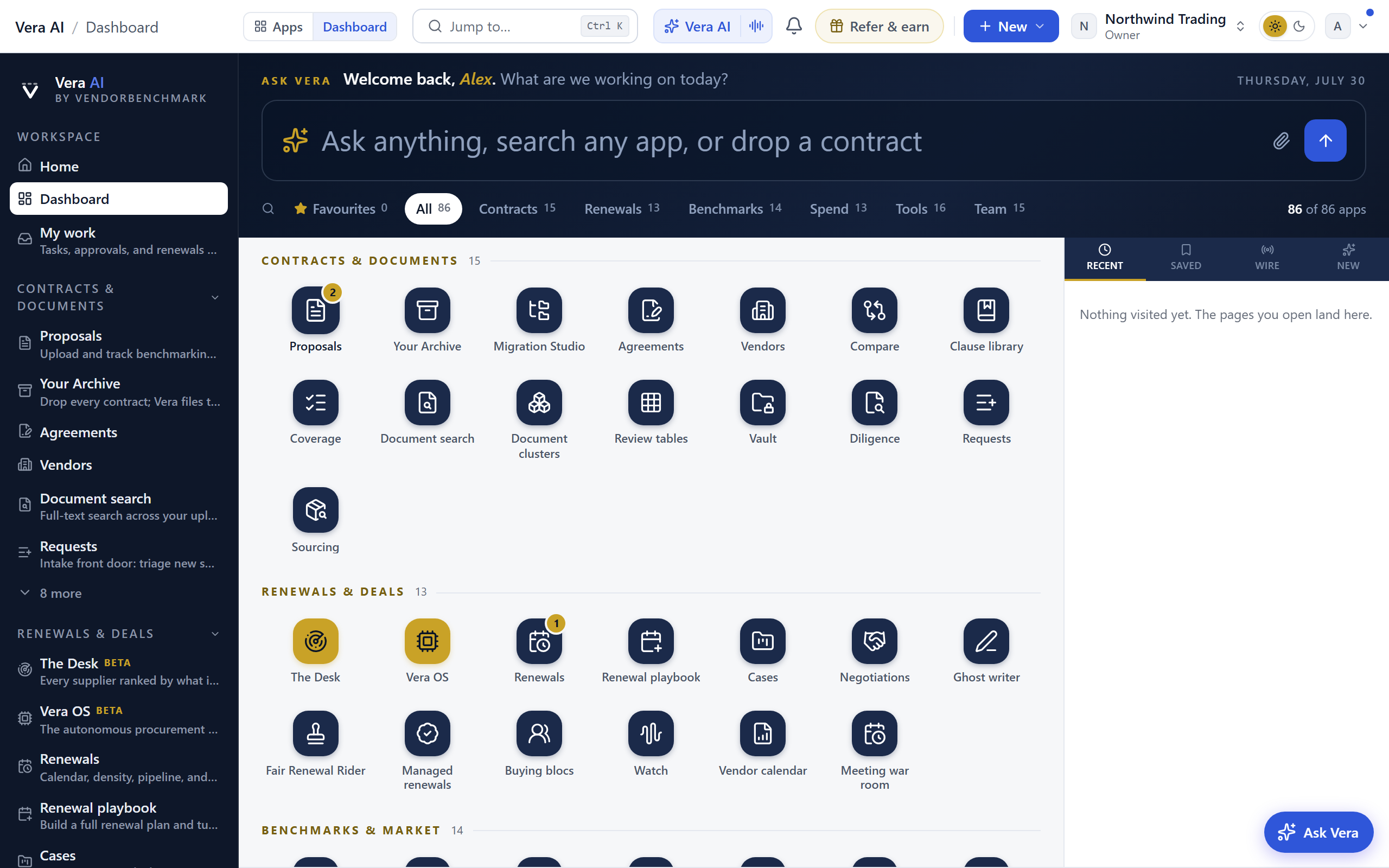
The left rail
The rail is your main map of the product. It groups destinations by the job you are doing:
- Contracts & documents — the paper itself: proposals, agreements, clauses, and document search.
- Sourcing — future spend: intake, the RFP, scored bids, and the award.
- Renewals & deals — the deal calendar: renewals, the deal rooms, the rider, and the watchdogs.
- Benchmarks & market — price checks, delivered reports, research, and the tools: All tools and the Tool finder open the whole optimizer and calculator wall from here, and the buyer community rooms are listed with them.
- Spend & savings — the money: Portfolio with its six lenses, invoices, anomalies, and data health.
- Team & AI — tasks, approvals, and Vera, the AI analyst.
Six groups, two icons. The rail is the map, not the work: since August 2026 it draws Home, Benchmarks & market and Team & AI only. The two operating paths (Contract lifecycle and the Negotiation Workflow) and the four working groups (Contracts & documents, Sourcing, Renewals & deals, Spend & savings) moved to a quiet Workflows row under Your apps, one link each. The tool wall holds no icon either: open a tool from Benchmarks & market › All tools or the Tool finder, and the tools panel appears beside it while you work.
Nothing was removed by the move. Each of those six still opens its own panel beside you the moment you are on one of its pages, still answers to Ctrl/⌘ K, and still has its own browse page.
On the screen
- The icons — the rail carries the brand mark, the panel button under it, Home, an icon for Benchmarks & market and Team & AI, and Reports and Settings at the foot. The active section wears a white pill. Pressing an icon opens that group's panel and lands its group page.
- The panel — the white column beside the rail lists the active group's destinations in full, so nothing in a group is hidden from you unless you fold it away yourself. A dense group is cut into titled categories, and the group's browse page mirrors the same sections. Four groups read as an ordered path with numbered phase headings, the same shape as the Contract lifecycle rail: Sourcing runs Define, Go to market, Vera analyzes, then Decide and award; Contracts and documents runs Bring it in, The estate, Understand it, then Hold the line; Renewals and deals runs See it coming, Plan the deal, Run the deal, then Hand it off; Spend and savings runs See the money, Reconcile it, then Watch it. The other two groups carry small phase headings of their own: Benchmarks & market reads The market wire, Benchmarks, Research, then Tools, and Team & AI reads Ask Vera, Your team, Vera's staff, then Advisory & support. Two browse pages differ from their panel: Team & AI opens as its own application window (a rooms rail, a photograph on every door, and a Delivered room; see The Team & AI desk), and Benchmarks & market opens as a photographic stage of the group's nine apps, each starting as its own window, with the tools and buyer community rows keeping their doors in the panel and one line at the page's foot saying where they live. The tools panel (shown while a tool page is open) is grouped by what you are holding rather than by which part of the product owns the tool, because choosing between two dozen tools was the hard part. It reads You know what it is, Comparing two things, Planning the negotiation, Lowering the run rate, and Sizing a commitment. Not sure which tool fits your paper? Drop it anywhere on the window and the chooser asks what you want done with it. No tool moved, was renamed, or was merged; the calculator long tail still lives on the All tools wall and in the Tool finder rather than as rail rows. Hover any row for a window button that opens that destination as an app window.
- The Home panel — pressing Home opens the panel that holds the whole shape of a working day, eight rows: Home, then the rooms most work happens in, the Contract Management Portal and the Negotiation Agent, then the Benchmark Library, the Contract Reader (one contract open in the reader window), Vera AI, AI agents and More. Main Apps left the panel because it is the Home page now, and Reports left it because it is the door at the foot of the icon rail; both are one press away either way. The Contract Reader and Vera AI joined it in August 2026, for the same reason as the two rooms above them: a person is in those rooms all day, so they sit one press from every screen rather than two groups deep. The Benchmark Library joined the same month as a shortcut: pressing it opens the library as its own window, so a price check never costs you your place. Those rooms are listed here as well as in their own groups (Contracts, Renewals & deals, and Benchmarks & market), so getting back into the room you were in yesterday is one press from the panel that is already open rather than two groups away. Opening one still lights its own group's panel, so you keep the phase you were working through.
- Fold a category — every category heading in the panel is a control. Press one to fold that category away and press it again to bring it back, so a long panel can be cut down to the categories you are working in. A folded heading shows how many destinations are inside it, and each category is remembered on its own, so the panel opens the way you left it.
- Recents — your last four screens ride at the foot of every panel with a See all link, so the pages you actually use stay one click away. Recents folds like any other category.
- The More catalog — the More row on the Home panel opens the full catalog: every tool and page, searchable. A section in this manual whose destination sits outside the group panels carries a "via More or Ctrl/⌘ K" marker on its Where line, so you know where to find it.
- Workspace summary (foot of the panel) — your organization and your role are always shown here, so you know which tenant you are in.
- Collapse — the panel opens folded since 25 August 2026, so the workspace greets you with the icon rail and the full width for content. The panel button sits at the top of the icon rail, directly under the brand mark: press it to bring the panel out and press it again to fold it away. Pressing any rail icon opens the panel too, and the collapse control at the panel's head still folds it. Expanding lasts your visit, and the next sign-in opens quiet again.
- On the phone — the menu button opens the same navigation as a grouped drawer. Groups fold and unfold there, each keeps its long tail behind a quiet N more row, and as you build a habit the drawer adds Used often and Recent sections below the workspace sections, so the map stays on top and the drawer still opens short instead of scrolling the whole catalog.
The top bar
The bar keeps to a handful of controls; everything less frequent lives in your account menu.
On the screen
- Breadcrumb — shows where you are (Vera AI › current view).
- Waiting on you — the count each home carries beside your greeting: tasks assigned to you, approvals pending in the organization, and unread mentions. It is the same figure as the badge on My work in the left rail, and it links there. Renewals are not part of the count.
- Jump to… (Ctrl/⌘ K) — the command palette. Start typing any page, tool, or vendor and jump straight to it, and now run actions from the same box too: new proposal, start a benchmark, generate a negotiation brief, start a playbook, or ask Vera, each one keystroke away. This is the fastest way to move around; you rarely need to hunt in the rail. A query that matches nothing always ends in an Ask Vera row carrying your exact words, so a dead end still gets an answer. Every word you type has to land on a real word of the result, so a phrase narrows instead of widening: "deal studio" returns the handful of studios rather than every page whose text happens to carry those letters. Typing go in front of a destination is understood, so "go renewals" finds Renewals rather than a page whose words include go. The list shows the fifty strongest matches. When more than that matched, a line at the foot counts the rest, and the Search everywhere row lists them all. On a trial, a benchmark row the plan does not carry wears a small lock and says Not available on the trial plan; choosing it lands on the shelf's notice naming the tool rather than on the tool itself, while Salesforce Sales + Service Cloud and Adobe Experience Cloud open as usual.
- Keyboard grammar — press g then a letter to jump without the palette: g d dashboard, g r renewals, g c proposals, g p portfolio, g s the Spend lens, g t tooling, g w watch, g b benchmarking. Two more since 7 September 2026: g a brings back the last application window where you left it, and g 1 to g 8 jump to that tab on the strip along the top, by position. Press ? anywhere for the shortcuts overlay with every jump grouped.
- Everything is warmed before you press it — resting the pointer on a rail row, a launch tile, a palette row or an account menu item for a moment fetches the destination in the background, so the press lands on a page that is already there. It costs nothing on a connection that is saving data or on 2g or 3g, where nothing is fetched ahead. The rail's highlight moves the moment you press rather than when the page arrives, and a loading skeleton that is replaced within a fifth of a second never shows at all.
- The Vera cluster (Ctrl/⌘ J) — one control with three modes. The text chip opens Vera, the AI analyst, over whatever you are looking at. The voice segment beside it starts a spoken conversation about the platform, the same guide that talks you through a screen. The phone at the end opens the call room, which is a different job: Vera in your ear while the vendor talks, and the memo when you hang up. Two voices, two buttons, so neither is the one you guessed at. See Vera AI.
- The inbox — the bell opens one triage inbox folding notifications, watchtower changes, and money-critical signals into a single list, with a needs-decision filter and per-signal mute. Money items are flagged calmly, never alarmist. Team chat lives here too: the bell's badge counts unread chat along with everything else, and a pinned Team chat row at the top of the panel opens the full chat screen.
- New menu — the one place to start something: upload a proposal, add an agreement, and the other create actions.
- Refer & earn — the green pill beside the bells. Like the platform? Invite a colleague from here: the dialog shows your personal referral code, sends up to five personal invites, and links to the Referrals page where you track who signed up and what you have earned (10% of what a referred company spends for their first 12 months).
- Light and dark switch — the moon (or sun) button beside your account chip flips the whole workspace between light and dark, on every screen, revealed as a circle of the new theme growing out from the button. The choice is your account's appearance setting: it follows you across devices and applies before first paint on your next sign-in. The three-way picker, including the System option that follows your operating system, lives in the account menu under Theme.
- Guide — the book beside the theme switch opens this user manual in a new tab, landed on the section that documents the screen you are standing on. A screen the manual does not yet cover in depth opens its chapter instead, so the door is never missing. The same handoff sits at the foot of the screen assistant's panel as Read the full guide.
- Spend category chip — the small photograph beside the New menu. It names the category of spend this desk is set up for (IT, Facilities, Services, Marketing, HR, T&E, MRO, Logistics) and switching it rearranges the workspace around that category. See Switching spend category.
- Org chip and account chip — switch organization (if you belong to more than one) and open your account menu. The account menu also carries What's new, Session activity, and the help and feedback actions (Platform introduction, Refer & earn, Report a bug, Suggest a feature, the help center & manual, and the Academy), each with a small colour tile and each opening inside the app, so the bar itself stays calm.
Switching spend category
The platform was built around IT and software. The category chip widens it to the eight categories most indirect procurement teams are organized by, and arranges the workspace around whichever one you pick.
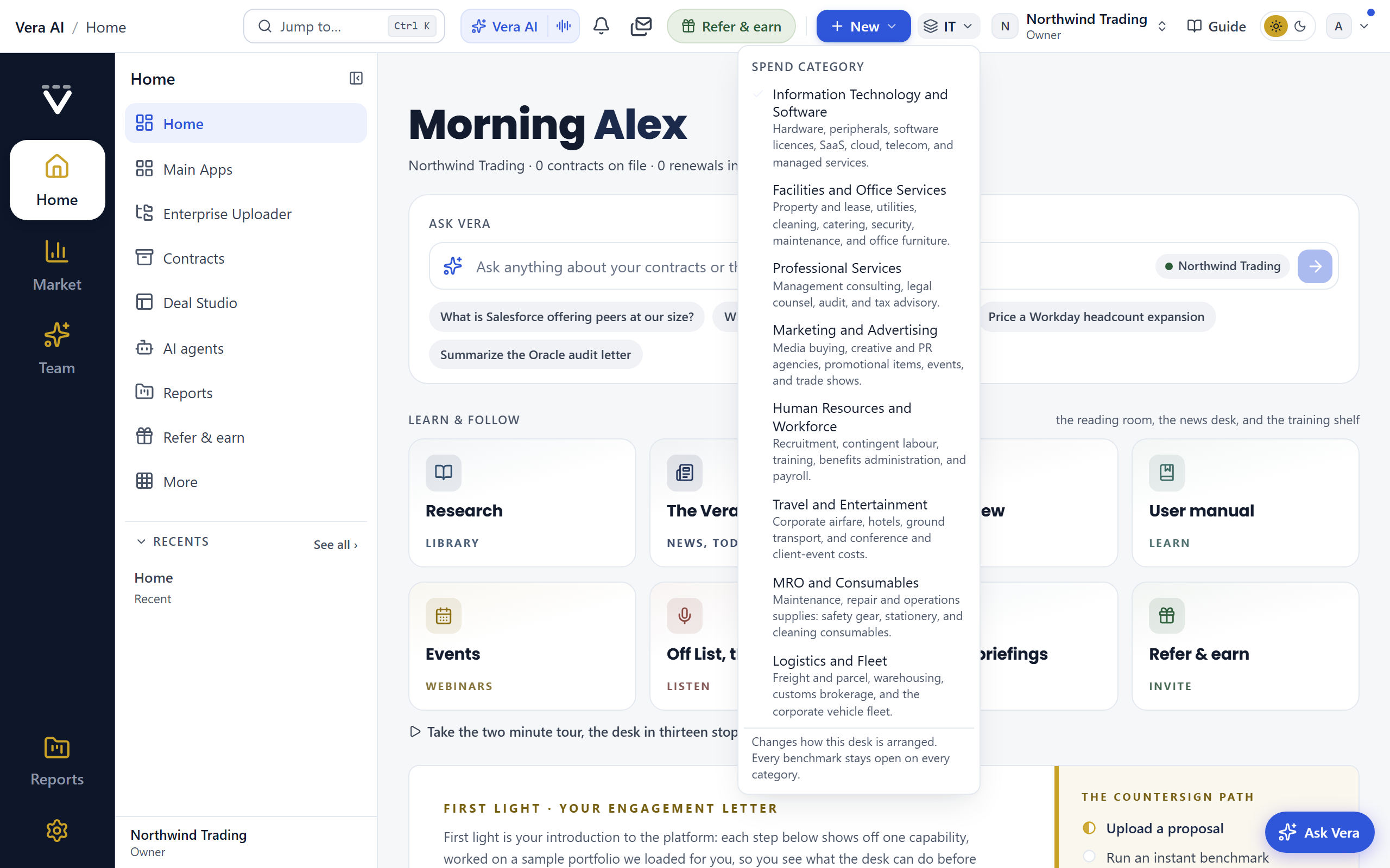
The eight categories
- Information Technology and Software — hardware, peripherals, software licences, SaaS, cloud, telecom, and managed services. This is the category the platform opens on and the one every workspace starts in.
- Facilities and Office Services — property and lease, utilities, cleaning, catering, security, maintenance, and office furniture.
- Professional Services — management consulting, legal counsel, audit, and tax advisory.
- Marketing and Advertising — media buying, creative and PR agencies, promotional items, events, and trade shows.
- Human Resources and Workforce — recruitment, contingent labour, training, benefits administration, and payroll.
- Travel and Entertainment — corporate airfare, hotels, ground transport, and conference and client-event costs.
- MRO and Consumables — maintenance, repair and operations supplies: safety gear, stationery, and cleaning consumables.
- Logistics and Fleet — freight and parcel, warehousing, customs brokerage, and the corporate vehicle fleet.
What changes when you switch
- Your home screen opens on that category. The photograph behind the greeting changes to the category you buy: a container yard for Logistics and Fleet, an airport walkway for Travel and Entertainment, a parts storeroom for MRO and Consumables, a lit studio for Marketing and Advertising, a corporate lobby for Facilities, a quiet meeting room for Professional Services, an open-plan breakout for Human Resources. Information Technology keeps the desk at the window.
- The line under the greeting counts your category. It names the category and then counts what that category has on file, in that category's own words, so a logistics desk reads "3 carrier and fleet agreements on file" rather than "3 contracts". A contract the platform cannot place in a category is not counted under any category's name, because a figure with a name on it has to be true. It stays visible everywhere else, so nothing you have filed vanishes from view. On a category you have not filed anything under yet, the line says so plainly and then names what the whole workspace holds, so an empty category reads as an opening rather than as a broken page. The renewal figure beside it counts your category's own renewals in the next 90 days, and where your category has none due it says so rather than printing a zero. Beside the counts, every category except Information Technology carries a gold link, Read the <category> negotiation playbook, which opens that category's playbook in the research library: where the money actually moves in that category, which clauses carry it, which suppliers can concede at all, and how to read it beside the supplier curves.
- The benchmark shelf leads with your category's real suppliers. Facilities opens on ISS, Sodexo, Compass, CBRE, JLL and Aramark; Logistics and Fleet on DHL, Kuehne and Nagel, DSV and Maersk; Marketing on WPP, Omnicom, Publicis and Dentsu; Human Resources on Randstad, Adecco and ManpowerGroup; MRO on Grainger, Fastenal, RS and Bunzl; Travel on Marriott, Hilton and Accor. Each of those carries its own curve.
The band sits at the top of the shelf in the benchmark window, above the A to Z, and every vendor still keeps its row at its own letter below it. Nothing is moved out of reach.
- The upload picker learns your vocabulary. The contract type list gains the shapes your category actually files, so a freight forwarding agreement, a cleaning services agreement or an audit engagement letter has its own name instead of landing in Other. The vendor list gains every supplier that category benchmarks, from Kuehne and Nagel and DHL to ISS, Sodexo, CBRE, Grainger, WPP, Randstad and Deloitte, so a supplier you can benchmark is always one you can pick.
- The screen help speaks your category. The Guide and the screen assistant describe what a page does for the spend you actually buy: a facilities desk reads "helps you buy facilities services at the right price", a freight desk "logistics and fleet". Help for tools that genuinely are about software, the Microsoft 365 optimizer or the SAM export, keeps its own vocabulary, because swapping the word there would make it wrong rather than inclusive.
- Tools that only make sense for software leave the navigation. Vera Licensing, the cloud cost optimizer, M365 optimization, the Agentforce optimizer and VCF licensing appear on Information Technology and Software only, because an M365 optimizer is the wrong instrument for a cleaning contract rather than a lower priority one. They keep their place in All apps & tools, in the command palette and on their group pages, so nothing is harder to reach.
- The bench offers the specialists your category can use. The eight vendor negotiators and the three seats built on software's own mechanics (licence audit defence, cloud consumption, AI pricing) appear only on the categories that buy them, so a facilities desk is not offered an Oracle negotiator for a cleaning contract. The seats that are about the deal rather than the product stay on every desk: the lead negotiator, contract counsel, the renewal project manager, the value and business case, security and data protection, the benchmark analyst, vendor intelligence, the executive sponsor and the vendor's chair. A vendor seat shows on every category that buys that vendor, so an HR desk keeps its Workday negotiator. The full roster is always available under Staff your next call.
- The Learn wall opens the research library on your category. The Research tile carries the category you are working in, so the library opens on the papers written about that category's suppliers, read from each paper's vendor. Clearing the cut in the window returns the whole library. Where a category has no research yet, and several do not, the library says so plainly and shows the whole shelf rather than an empty one.
- Vera's openers speak your category. The six suggested questions in Vera conversations change to your category's jobs: a facilities manager is offered "I want to benchmark a cleaning contract" and "I want to review a lease", a logistics desk "I want to benchmark freight rates" and "I want to check a fleet lease", Professional Services "I want to review a statement of work". Information Technology keeps the six it always had. They sat under the ask bar on Home until 31 August 2026 and moved into her window with it.
- The tools that lead change, on the home screen and in the launcher. Your apps on the home screen reorder so your category's tools come first: Professional Services opens on the SOW and MSA decoders, because a consulting rate is negotiated once and then leaks away through scope; Logistics and Fleet and MRO and Consumables open on sourcing, because those categories re-tender rather than renew in place; Facilities and Travel open on the spend optimizer. Three tools that have no card on the home screen by default (compare proposals, the spend optimizer, and sourcing) gain one when your category leads with them. Nothing is removed: every card you had stays, and Information Technology sees the grid it always saw.
- The rail opens on different groups, and the dashboard orders its cards for that category. Your own folds and your own saved dashboard order always win over both.
- The five setup questions the desk asks a new user change to that category's, so a facilities manager is asked about property and utilities rather than about cloud optimization.
What does not change
- Every benchmark stays open on every category. The software benchmark library is universal: switching to Facilities does not close the Microsoft or AWS benchmarks, it only stops them leading the shelf. The find field, Ctrl/⌘ K and search keep reaching everything from wherever you are standing.
- Nothing you have already filed moves. A contract keeps its type, its vendor and its place. The switch is a lens over the workspace, never a filter on your records.
- It is yours, not the organization's. Your colleagues keep whatever category they chose. Switching does not change anyone else's desk, and it changes nothing about permissions.
How to use it
- Press the category chip in the top bar, beside the New menu. It carries the photograph of the category you are on.
- The gallery opens: eight cards, one per category, each with its own photograph and what it covers, and the one you are on marked Current. Pick a card and the workspace rearranges behind it.
- Open the benchmark window and read the band at the top of the shelf: it is your category's vendors, first.
- Switch back at any time. The choice is remembered per user and follows you to your next sign-in.
Notes
- The chip is hidden when a workspace is deliberately narrowed to a single category, in the same way the organization chip is hidden for people who belong to only one organization.
- Category owners who buy across several categories should switch rather than split: one workspace holding every contract is what makes the portfolio and spend views worth reading.
The app window
Any destination can open as an application window over the page you are on, instead of navigating away. The window is a near full screen surface with one navy titlebar and nothing else: the page inside it runs edge to edge, exactly as it does as a full page. The titlebar names where you are (the destination's icon, its group in gold, and the page name), and carries three buttons: Apps lists every application the window can hold, so moving from one tool to another is one press; Jump to opens the palette (Ctrl/⌘ K) that reaches every tool; and Ask Vera opens the same assistant dialog you have everywhere else, right over the window, with its Forward, Collaborate, and What next toolbar on the popup's outer edge, each option docking a panel to the popup's right. There is no side menu and no tool rail inside the window; you move with Apps, Jump to, and the doors on the pages themselves, so moving tool to tool never loses the page underneath.
Six workspaces at a time
The window holds up to six open workspaces at once (three until 9 September 2026, when live tabs raised it). Open a second destination while one is already up and it takes its place beside it on the strip along the top rather than replacing it, each tab named after what is in it (the deal, the record, the desk) rather than after its route. Click a tab to switch. Nothing restarts when you do; each workspace keeps its scroll, its half-written text and any analysis still running, so you can leave a benchmark working in one and read an agreement in another. Each tab has its own close, and closing the last one closes the window. Past six, the app you looked at longest ago parks back to the strip and reopens on its next press.
Open a destination you already have open and the window brings that workspace forward instead of starting a second copy of it. At three, opening a fourth takes over the workspace you are looking at, never one of the other two.
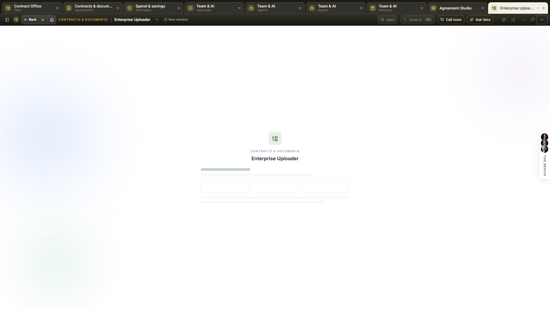
Opening one
- From the desk — the Your apps cards, the launch tiles on the group pages, and the window button on any panel row all open their destination in the window. Resting the pointer on any of them first warms the window's own address, so a window you hovered for a moment opens with almost no boot.
- From Jump to… (Ctrl/⌘ K) — highlight any destination and press Alt+Enter, or click the small window icon on the highlighted row, to open it as a window instead of navigating. Press Shift+Enter, or the hand icon beside it, to open it with Vera driving: the seat opens with the take the wheel opening already said.
- From a link — the window records itself in the address bar (
?app=), so a copied link restores the same window for a colleague on arrival. - Some destinations always open this way — the Enterprise Uploader, the Agreement Studio, the Contract Agent, one window for the contract, the MSA and the statement of work, are applications rather than pages, so they open as the window however you reach them: the rail, the Home panel, a link in What's new, a bookmark, a typed address, or a link a colleague sent you. Add
?full=1to the address if you ever want the plain full page instead. - Five destinations draw their own window — the Contract Management Portal, the Negotiation Agent, the Contract Reader, Document Agent and AI agents open straight into a window of their own, with nothing loading behind it. They carry their own titlebar rather than the frame described below, with a labelled Minimize beside Maximize and Close, and closing one returns you to Home.
The window controls
- Minimize, maximize, and close sit at the top right of the titlebar, in that order, as quiet monochrome buttons. They keep working while a dialog is open inside the window: the title bar stays above the dialog rather than being dimmed with the rest, so putting an app down never means dealing with the sheet in front of it first. There is exactly one close button, and it turns red only while you hover it, so nothing else on the bar can be mistaken for it. Maximize toggles between the near full screen default and a smaller restored size (double-clicking the titlebar does the same). Each destination remembers its own size, so a decoder you like small stays small even when you last left the Agreement Studio full screen. On the restored size a drag corner appears at the bottom right: drag it to set the size yourself, and that becomes the size that destination reopens at. On the phone the window always runs edge to edge.
- Minimize parks the window on the tab strip — a quarter-second flight carries the window up to its tab along the top of the screen, and the page underneath becomes fully usable again. Everything inside the window (scroll position, half-written text, a running analysis) stays exactly as you left it. While an AI run inside the window is still working, a quote scan or a Vera brief, its tab carries a small gold spinner, so you can watch it finish from outside. Press the tab to bring the window back; the tab's small cross discards it. See the taskbar below.
- Esc and clicking outside minimize too — neither closes the window. Your work parks on the taskbar with everything intact, and only the close button actually closes. With the palette or the Ask Vera dialog open, Esc closes that layer first and the window stays.
- Pop out — the arrow beside close moves the workspace into a window of its own: its own taskbar entry, snappable beside another application, and completely independent of the main window, so navigating, reloading, or closing the main window leaves it standing. The in-app window closes behind it, because this moves the workspace rather than copying it. In the desktop app it is a real application window; in a browser it is a separate browser window, and if your popup blocker refuses it you get the plain full page in a new tab as before. Pop back, at the right of the popped-out window's own slim bar, closes it and leaves you where you were. This is what to reach for when you are taking a call: see the call room.
- The menu button — first on the bar, at the far left. The window runs full bleed and has no navigation rail of its own, so this is where the whole map lives: every destination grouped the way the rail groups them, with where you are marked Here. An application opens as another tab beside what you were doing; an ordinary page opens in the tab you are standing in. Escape or a press outside closes it.
- The call room is on the bar — a named Call room button sits beside Ask Vera on every application window, and on the platform header on every other screen. It opens the room as another workspace in the strip beside what you were doing, so reaching for it mid task never costs you the task.
- New window — beside the plus on the title bar. It opens the platform in a tab of its own and leaves the workspace you were in as the tab beside it, so you can move between the two whenever you like. Opening an ordinary page any other way retargets the tab you are standing in, which is right when you mean to move on and wrong when you mean to look something up and come back.
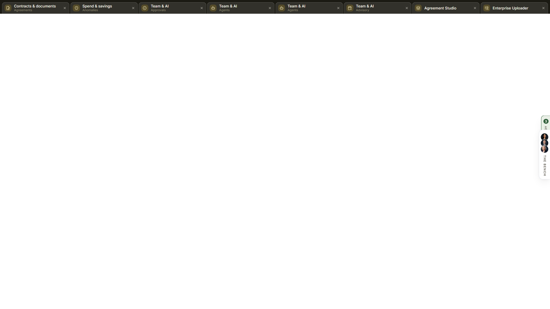
- Your reports, on the right edge — a shelf outside every window holds your ten most recent reports. It stays put when a window opens, closes or is minimized, so a brief that finished while you were somewhere else is one press away rather than something to go looking for. Anything written since you last opened the shelf is marked New, with the count on the handle, and the count clears when you open it rather than on a timer. A minimized window parks on the tab strip along the top of the screen instead, clear of this shelf.
- Tabs — every workspace the window holds is a tab on the strip along the top of the screen, beside every other app you have open (see the taskbar below). Each tab is a live workspace with its own frame, named after what is in it, and closable on its own, so a renewal and an intake run can sit side by side and you click between them on the strip. The title bar names the workspace in front and carries a + for opening another beside it. Until 4 September 2026 the window drew a second row of the same tabs on its own title bar.
- Moving inside the window — jumping to another destination from the palette is an instant in-window transition rather than a page reload, and while a page loads the window shows the destination's name and glyph on the navy stage instead of a blank canvas.
- Drop a paper on it — dragging a contract onto an open application window opens the same drop chooser you get everywhere else, and it works whether you land on the app itself, on the titlebar, on the navy stage around it, or on the taskbar. The chooser paints over the window, so what you pick is always the front thing on the screen. A screen that runs a drop lane of its own, the Enterprise Uploader among them, still takes the paper itself rather than opening the chooser.
The window menus
Since 1 September 2026 every workspace window that draws its own frame carries a menu row under its titlebar, the way a Windows application does: File, View, Team, Learn, and Help, opened by click or with Alt plus the underlined letter, sliding between menus on hover. Windows with their own verbs add them to these five (the Benchmark Library's Deal menu, the Research Agent's Alerts), and the five stay the same everywhere so your hands learn them once.
- File — open this window in its own browser tab, copy a link to it, print the view, close. Windows add their own file verbs above these: the bench adds Staff the room and the call room door, the Documents AI Agent adds copy a link to the current ask.
- View — maximize and dark mode, plus the window's own views where it has them: the Research window's coverage map and inspector live here.
- Team — the collaborative door, the same on every window: Copy a link for a teammate puts the exact screen in front of somebody, and Draft the email about this view writes the message for you rather than leaving you a blank compose window. The sheet offers a draft per reader, for a colleague (worth a look), for a teammate (take this from here), and for your manager (where this stands), and windows with something specific to say add their own, the briefings library leading with its newest film. Pick one, edit it in place, then Open in your mail app to send it from your own address, or Copy the email to paste it anywhere; nothing sends from the sheet itself. Ask the bench about this screen (it wears your advisor's name once you have named them) opens a specialist with your screen as the first line of the conversation; Team activity and Invite a teammate are one press each.
- Learn — what the platform holds about the thing you are looking at: the research library searched for this window's subject, the two or three briefing films that actually match it (press one and it plays), and this exact screen's section of the user manual. The matches come from the same picker the voice assistant uses, so the menu and the seat recommend the same film.
- Help — Walk me through this screen opens a live line where your advisor teaches the window the way a colleague at your elbow would: two minutes, one part at a time, on your own data, driving what the tools can drive and pointing at the rest, and it follows wherever you steer. Below it, this screen in the user manual, and About, which says in a paragraph what the window is for.
The first visit to any window makes one quiet offer, at the right of the menu row: *first time here, take the two minute walk-through*. Yes starts it, the cross declines it, and either answer is remembered per window on your profile, across devices, forever; the offer never repeats and never becomes a badge or an email.
Menu items act or navigate; none of them quietly changes a setting. Alerts and preferences stay doors to the screens that own them, so nothing is ever switched on by accident from a menu.
The taskbar
Along the top of the screen runs a dark strip of tabs, the way a browser's tab row does: every app you have open or have put down, side by side, so you can move from one to another. It appears as soon as there is something on it and disappears when the last tab goes, and the page and every window start below it rather than sliding underneath. Until 3 September 2026 it was a small bar along the foot of the screen.
- What is on it. The app you are looking at, drawn as the lit tab. Apps you minimized. Workspaces you closed, which stay as tabs until you shut them rather than vanishing after a few seconds. Up to eight at a time; the oldest drops off first.
- Press a tab to go to it. A minimized app comes back exactly where it stood, at the same report, the same paper, the same half-typed note. A closed workspace opens again at the address it was closed at. From the keyboard, g then the tab's position (1 to 8) does the same press, and g a brings back the last application window whether or not it has a tab.
- Press a tab and that app is what you see. The strip keeps one thing in front: opening a window from the strip puts the application window down first, and bringing a workspace forward parks the window you were standing in, so the lit tab is always the thing on the screen.
- A press is a swap, not a reload. Since 9 September 2026 the first press on an app's tab keeps that app alive behind the strip, exactly as it drew itself, and every later press swaps it in with no request and nothing rebuilt: the register you were reading, the paper on the desk and the search you typed are still there. Until then each press loaded the app again. Up to six apps stay live at once; past that, the one you looked at longest ago parks back to the strip and reopens on its next press. Minimize and Close inside a live app work as they always did, a link from one live app to another opens it live beside the first, and a typed address or a rail press still opens the app as a page until its tab is pressed.
- Tabs keep their place. A tab stays where it opened until you shut it, the way a browser's do: the lit tab moves to whichever app you are looking at, the row itself does not. A new app joins at the right end, and a tab you shut gives its place up, so the same app opened again arrives at the end rather than in the gap it left. The order is remembered on this device for each organization, so it is the same tomorrow. Until 7 September 2026 the app you were looking at jumped to the front of the row on every switch, so the tabs read as a different set depending on where you stood.
- Walking away keeps the tab. Leave an app for another by the rail, a link or Jump to and it stays on the strip where you left it; only its own Close, or the cross on its tab, takes it off. Opening a self-drawn window from inside a workspace no longer reloads the page, so the workspaces behind it keep running.
- A put-down tab looks like a tab. It sits as a lighter block on the strip with its own edge, and the app you are looking at is the white one.
- Press the tab you are on to put it down. The lit tab carries a small dash: pressing it is the same gesture as the Minimize button in the app's own header.
- Each tab is a real tab. The size a browser draws them: the app's icon, its name, and the report or paper under it, with its own small cross. Tabs narrow before the row scrolls, so a full strip still fits the screen.
- Press the small cross to close. That is the app's own close, so anything it would warn you about, it still warns you about.
- A tab with a run in it keeps a spinner. Minimizing a working surface is safe, and the tab says so.
- The strip sits above the windows. The top bar, the rail and every window start below it, so you can reach it from inside an app rather than only between them, and a tab is never covered by the thing it opens.
The strip is per browser and per organization: it is a record of what you have on the go on this device, so switching organization switches what is on it.
- Apps switches applications — the Apps button on the titlebar lists every application the window can hold: the desks, the three decoders, and Second opinion, grouped the way the rail groups them. The application you are standing in is marked Current, one already open in the strip is marked Open, and picking either brings it forward rather than opening a second copy. Picking a new one opens it as another workspace, so the tool you came from keeps your place. And the paper moves with you: a document you handed one tool in the last few hours is offered by the next tool's drop stage, read with one press and no new upload. On the phone the palette carries this job.
- Jump to opens on your own work — press Ctrl/⌘ K inside the window and it opens on three short sections before you type a thing: Carry on, the last few screens you worked in and how long ago; Your vendors, the suppliers you hold agreements with, each showing when it next renews; and the rest of the group you are standing in, so the neighbouring tools are one press away. The row you are already on is marked Current. Start typing and the whole platform is reachable again, every tool, report, page and vendor benchmark. Matches are counted beside the box, and the keys are written along the foot: arrows to move, Enter to open, Esc to close.
- On a phone — the title bar carries the page name and four full sized controls: Jump to, Ask Vera, minimize and close. There is no keyboard shortcut hint and no pop out, because neither belongs on a touch device.
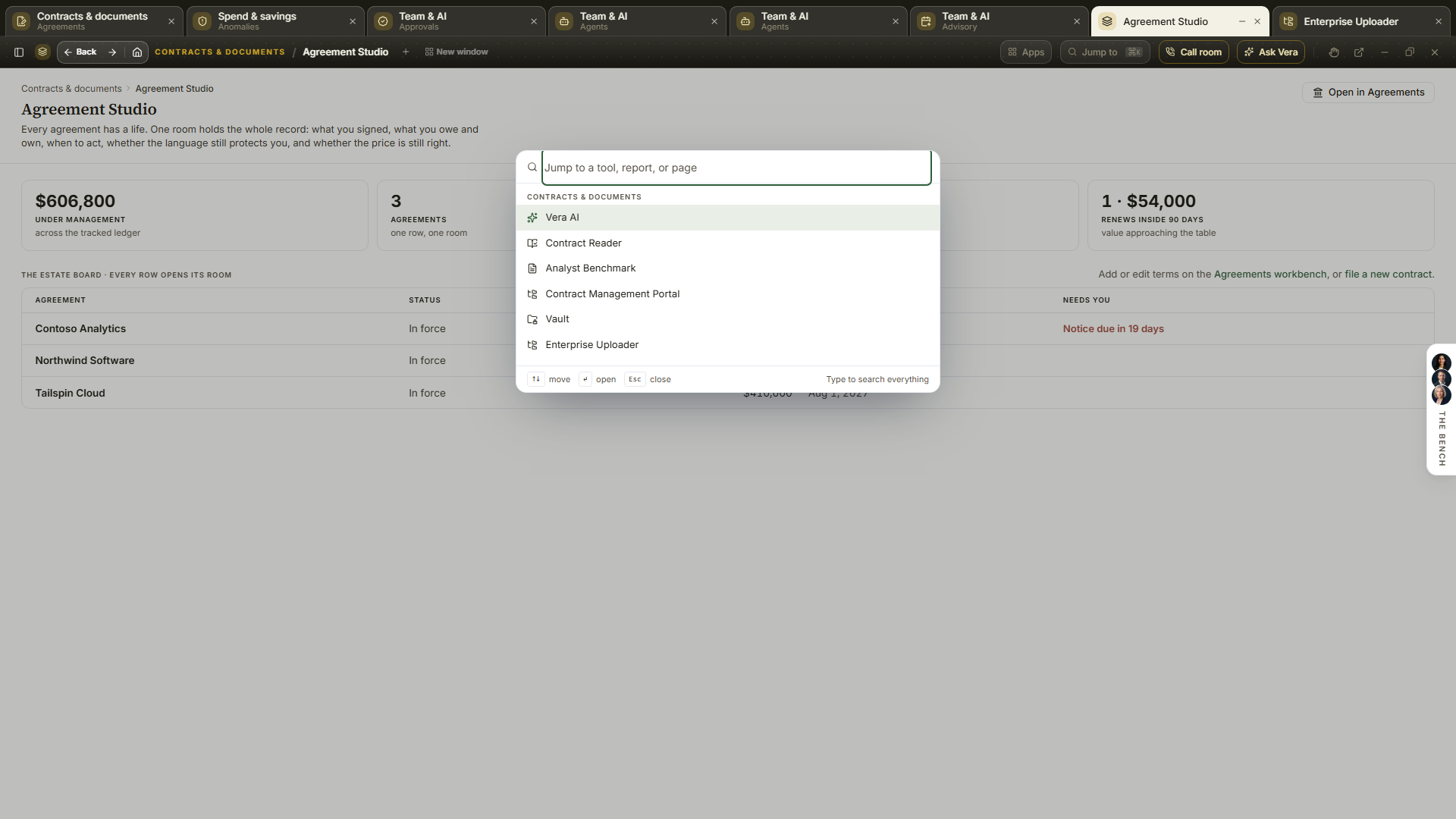
- The way back — once you have moved off the screen the window opened on, a second line appears under the titlebar reading Agreement Studio / where you are. The desk name is pressable and returns you to it, so you never have to leave the window to get back to where you came in. On the window's own front screen the line is not there, and the bar stays as one clean band.
- Back and forward work — your browser's back button steps back through the screens you visited inside the window, one at a time, and forward returns. It only leaves the application from the first screen, so back is never the thing that closes your work.
- Closing takes you somewhere — close returns you to wherever you opened the window from, or to your home screen if you arrived by a link. It does not leave you on the same screen without its chrome.
- Closing asks when there is something to lose — if the workspace holds unsaved work or a run that is still going, closing asks once and names what it is, so you can keep it open. When there is nothing to lose it closes straight away without a dialog in the way.
- Reopen what you just closed — for a few seconds after closing, a chip at the bottom of the screen offers the workspace back by name. The same offer leads Jump to, so Ctrl/⌘ K then Enter takes it back as well.
- The browser tab names the workspace — while a window is open the tab reads the name of the workspace in front of you, so two open windows are tellable apart and a bookmark says what it points at.
- When a workspace does not load — if something inside fails to start, the window says so by name and offers three ways on: try again, open it as an ordinary page, or close just that workspace and keep the others running.
- Reopening picks up where you left off — come back to a desk and it opens on the screen you were last working on rather than its front door, with a line saying so and Start at the front beside it. A link that names a particular room, act or record always wins over what was remembered.
The studio shell
The workspace is the studio shell: a slim icon rail carrying the map, with a white panel beside it listing the active group's destinations, so the workspace reads like a desktop application: bigger content, shorter menus. (It replaced the wide grouped rail in August 2026; everything that rail reached, this shell reaches, drawn from the same navigation.)
- The panel — click a rail icon to show that group's destinations; every panel also carries your Recent screens. Hover any row for a window button that opens that destination as an app window.
- Group pages — an icon press also lands the group's own page (
/browse/contracts,/browse/renewals,/browse/market,/browse/spend,/browse/tooling,/browse/team). The header leads with the group's stake in your own workspace, computed from your records: Contracts states your agreements on file and the money under management, Renewals the renewals due and the value renewing inside 90 days, Spend the tracked spend and the savings proven so far, and so on per group; while the workspace is still empty the header falls back to counting the tools instead. One primary action sits beside it, the group's most useful door (Open your contracts, Start a sourcing event, Open the renewal runway, Benchmark a contract, Open the portfolio, Decode a contract, or Open your tasks). Below, every destination in the group as a launch tile, the same quiet white cards as home with each tool's icon chip tinted in its own color (a tool keeps one color on every screen), each opening as an app window. Two groups do not use that page at all:/browse/marketopens the photographic app stage, and/browse/teamopens the Team & AI desk as its own window. - Fold a category — the category headings inside the panel are controls of their own. Press one to fold that category away and press it again to bring it back, so a long panel shows only the categories you are working in. A folded heading carries the number of destinations inside it, each category is remembered on its own, and Recents folds the same way.
- Collapse — the panel opens folded since 25 August 2026, so the workspace greets you with the icon rail and the full width for content. The panel button sits at the top of the icon rail, directly under the brand mark: press it to bring the panel out and press it again to fold it away. Pressing any rail icon opens the panel too, and the collapse control at the panel's head still folds it. Expanding lasts your visit, and the next sign-in opens quiet again.
- The foot — your organization and role stay visible at the panel foot, so you always know which tenant you are in.
- On the phone — the menu button opens the grouped drawer, the same navigation in phone form.
Home
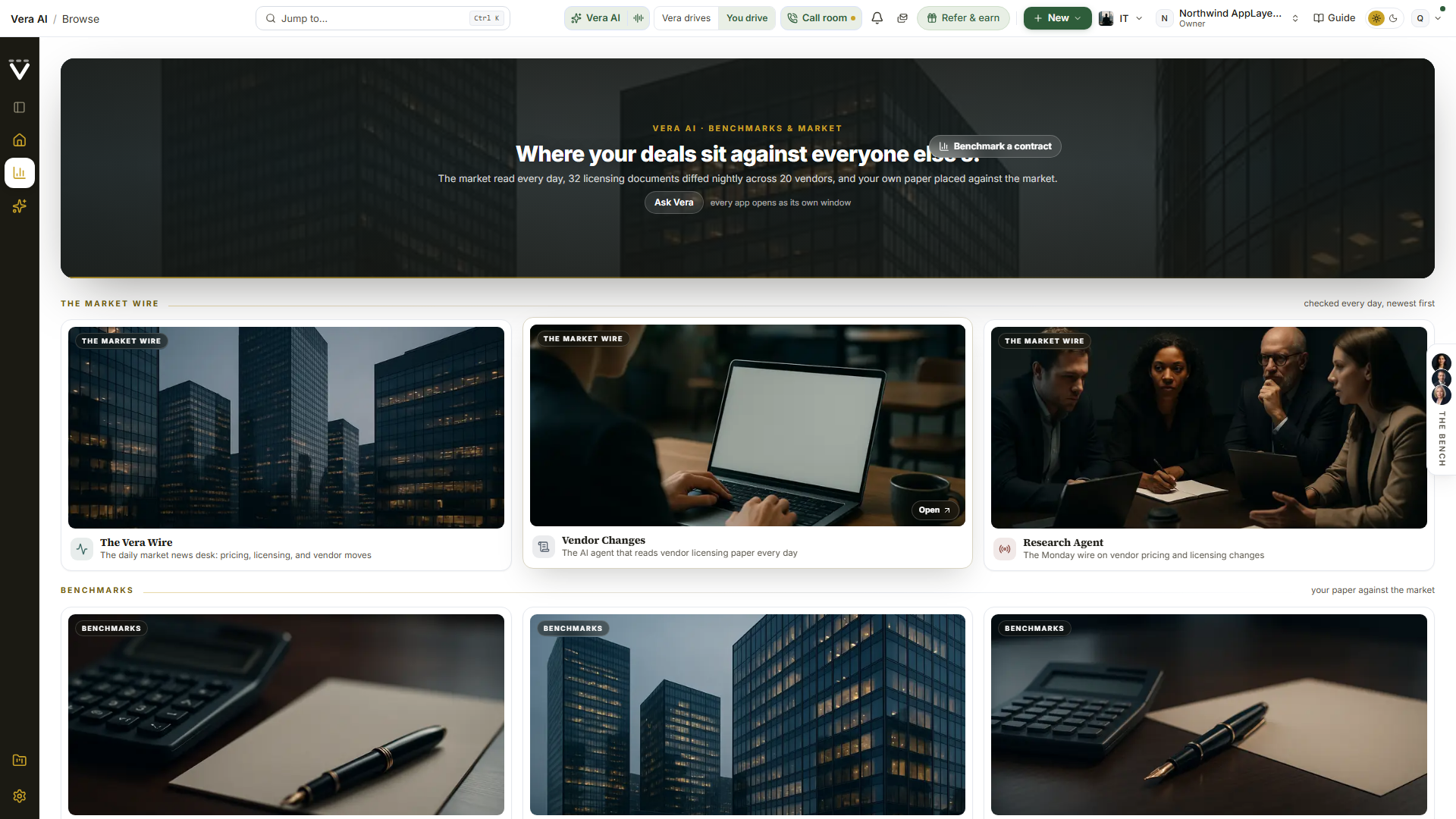
Sign-ins land here, and since 25 August 2026 the page opens on a photographed stage: the date, your greeting, and the workspace counts sit on one dark picture, closed by a thin gold rule.
Since 2 September 2026 your chief of staff stands under the greeting, where two presses stood before. Once you have named them, it is their portrait, large, and two doors, and nothing else. Agent Driven Experience (called Agent chaired until 3 September 2026), the gold press, hands them the wheel full screen: the conversation takes the left column, the top bar steps aside, and the films, the research, the mail and the tools open on the stage as you ask. They open nothing on their own: they say what needs you and where you left off, then wait for your word or your press. When your chief of staff is Vera herself, the chair is a tour instead (since 11 September 2026): she introduces herself, asks how you are, asks what you would like to see, benchmarking, contracts, document search, research or contract management, and walks the screen you choose slowly, one part at a time (see Vera shows you around). Talk to their name opens their card in the call window with the first word yours. Press the portrait and they say the morning on a live line; the printed morning open and the sit-down about the quarter's goal live on the advisor page under Settings › Your advisor. If you skipped the naming, the same place carries one gold press, Set up your chief of staff, with the reason attached: naming them is what opens the Agent Driven Experience on Home, and everything else on the desk works without it. Chat with Vera and Drop a contract stood here from 31 August 2026 until 2 September 2026; Vera conversations is still one press away in the rail, and the Benchmark Agent, the door that reads a dropped contract, quote or invoice and comes back with the benchmark, sits under Your apps. The ask bar itself stood on the stage from 25 August 2026 until 31 August 2026.
The bench sits under the panel: your advisor at its head (Vera, until you name them) and the twenty specialists you can bring onto a live vendor call, as faces rather than a list of job titles, with the seats your spend category can actually use. The row is deliberately small and packed close: since 3 September 2026 two rows of portraits a finger apart on a desktop, eleven and ten with the shorter row centred, with the name under each (three rows of seven on a narrower window, three across on a phone). Rest on a face and a card above it names the speciality, Oracle negotiator, Contract counsel, the guide, with what the seat is for under it; press the face to open that seat in the call window, with its line, what it opens with, and Talk. The full record, the craft, the standing library and the briefing pack, is one press further on under What they are trained on; a middle click or a ctrl click on a face opens it directly. Staff your next call opens the whole roster. It stood further down the page, between Your apps and Learn & follow, until 31 August 2026, and moved up rather than being duplicated.
The overnight drive's morning appears between the stage and the app cards on the days it has something to say: one card with what last night's drive found, the renewals inside your window worst first, each with its verdict line, a Replay of the night's moves, and Pick it up, which opens your advisor with that renewal as your first word. It renders only when you have turned the overnight drive on under Settings › AI personalization and a night has run; everyone else never sees it.
The human benchmark band sits between the bench and Your apps since 4 September 2026: one dark band that says *Humans are still more accurate than AI*, with two presses. Ask a human, not a model opens the Human benchmark window, where you drop the paper, answer ten short questions about the deal, choose a benchmark, a negotiation strategy, a research report or a call, and send it to a VendorBenchmark analyst. Schedule a call opens the same window with the call already asked for. Both open as a window over Home, and Close brings you back here.
Your apps follows the stage: the fifteen doors of the desk as photographed cards, documented just below. Then the Learn & follow wall, six tiles three across, for Research, The Vera Wire, What's new, events, the Off List podcast, and the analyst briefings, exactly as before. Every one of these opens inside the app, not a new browser tab: events and the podcast are in-app pages (documented just below), and the analyst briefings open as their own window. The user manual and Refer & earn were tiles here until 25 August 2026 and now live in the account menu at the top right, one press either way.
The feed closes the page: everything the workspace should hear about in the last 30 days in one stream, what we shipped, what we published, and the licensing, pricing and vendor moves the market made, with lenses, an estate filter and a search that all run without a round trip. Your own trail moved to Activity in the left rail on 31 August 2026: Recent activity, the signed ledger of the workspace's latest uploads and deliveries with its Everyone or Mine lens, Pick up where you left off, your unfinished drafts and the rooms you were reading, each one press from resuming, and the open commitments. When your workspace buys in more than one spend category, each row also names the category it belongs to, so you can see at a glance which desk a movement came from. The ledger itself is never filtered by category: it stays newest first across the whole workspace, because a feed that hides other categories would show a colleague a dead desk on a day their own category was quiet. A row the platform cannot place in a category carries no label rather than a guess. Both stood down from the page briefly on 25 August 2026 and returned the same day with the redesign. The old /dashboard and /front-of-desk addresses both redirect here, links and bookmarks included.
Your apps
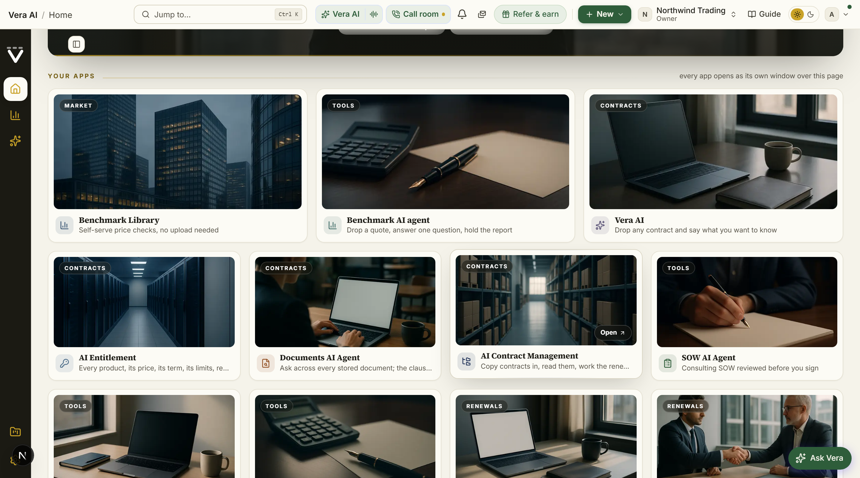
Your apps is a section of the Home page rather than a page of its own, so the greeting, the bench and everything work starts from are on one screen. It replaced the Main Apps index on 25 August 2026: the same doors, now as photographed cards.
Fifteen cards, three featured across the top and twelve in the grid beneath, in a fixed order: Benchmark Library, the Benchmark Agent (the Benchmark tool under its new name), and Vera AI lead; then Entitlement Agent, the Document Agent, Contract Management Portal, the SOW Agent, the Contract Agent, the MSA Agent, the Renewals Agent (the renewal calendar), the Negotiation Agent, Playbooks, Vendor Changes, and the Research Agent, closed by All apps & tools, the full searchable catalog. Each card carries a real photograph with the family named on the picture, the app's mark tinted in its own color, and its one line job. A card's name and description are the rail's own, so a rename there renames the card here, and a door your organization does not have (Contract Management is switched on per organization) simply does not render.
Every card opens its destination as an app window over the page, so the desk stays where you left it, and hovering one quietly loads its destination in the background, so the window opens nearly instantly when you press it. Under the grid, one quiet Workflows row keeps the six doors that were icons on the studio rail until August 2026: the two operating paths (Contract lifecycle and the Negotiation Workflow) and the four workspace sections (Contracts & documents, Sourcing, Renewals & deals, and Spend & savings). These open as full pages rather than app windows, because a path and a section are places to work from; the tiles inside them open the windows.
Reports
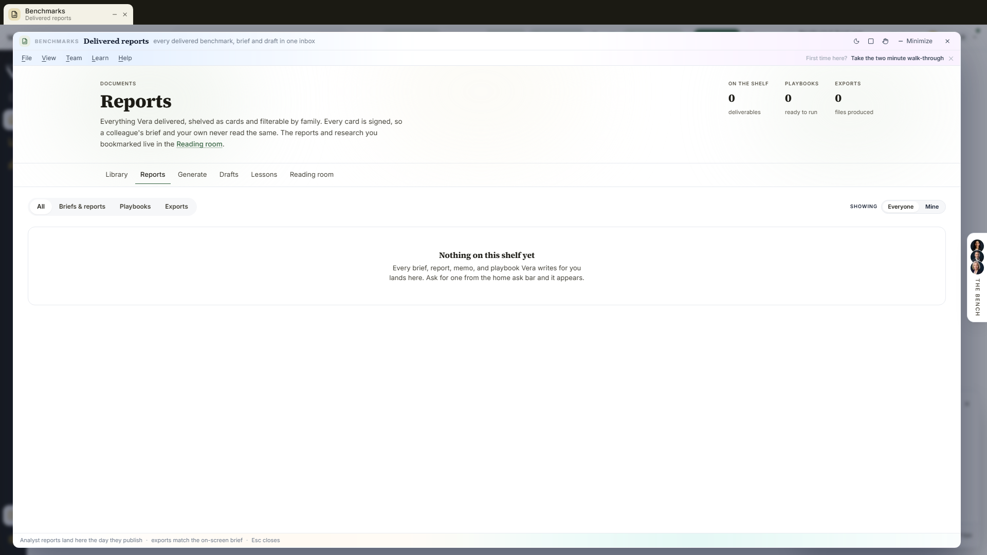
Everything Vera delivered, shelved as cards with drawn document thumbnails and filterable by family: Briefs & reports, Playbooks, Exports. A card opens the Deliverables hub as an app window. An empty shelf tells you how to fill it.
Each card is signed on its foot line, after the date and the kind, with the person who asked Vera for it: You for your own, a colleague by name for theirs. The Showing control sits beside the family tabs: Everyone is the whole workspace and the default, Mine narrows the shelf to the documents whose current version you asked for. Your choice is remembered and carries to the other screens that offer it, so you only set it once. It is a view and never a permission: switching to Mine hides nothing from anyone else, and switching to Everyone reveals nothing that was private. The count in On the shelf follows the lens and reads Yours while you are in Mine, so the number always matches what you can see.
The Learn & follow shelves
The reading and watching tiles on the home wall each open as a real page inside the app. You browse, filter, and read or play without leaving the workspace, and the app's own navigation (the rail, the breadcrumb, or your browser's back) returns you.
Events
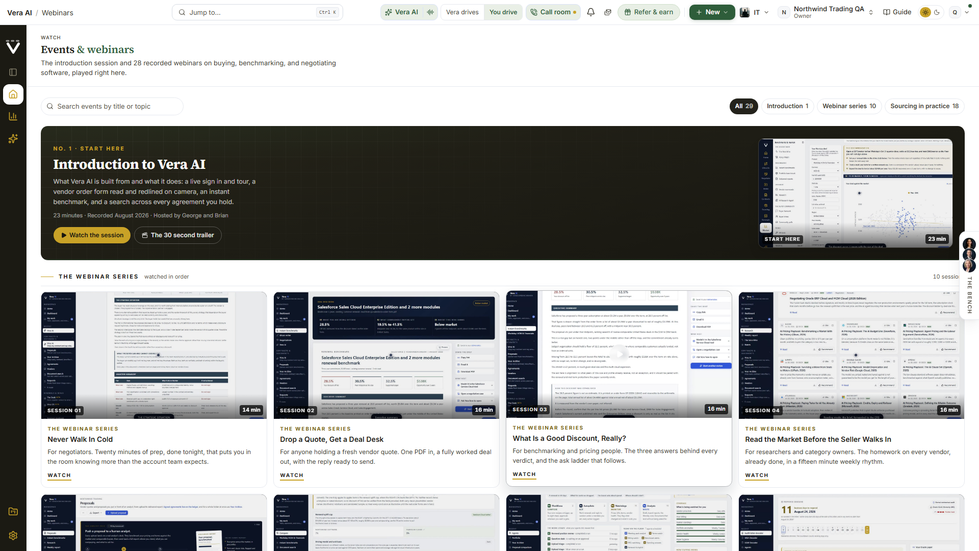
The events gallery opens on the introduction session, on the navy stage with its own picture from inside the recording as the framed screen. Introduction to Vera AI runs twenty two minutes: what the platform is built from, a live sign in and walk of the workspace, a vendor order form read and redlined on camera with the replacement language drafted, an instant benchmark, and one question asked across every agreement you hold, with short briefings from the advisory desk between the demos. The first three minutes play for everyone before the access card appears. Press Watch the session to play it inline, or The 30 second trailer for the countdown teaser. Below it, the ten session webinar series follows in broadcast order, and beneath that, Sourcing in practice, the problem sessions, each one a sourcing or procurement problem worked live on the sample workspace. That run opens with The ServiceNow Renewal and ten vendor sessions, then turns to the challenges themselves rather than a named vendor's paper: being brought in too late, the category strategy on one page, should-cost, the bake-off that creates leverage, savings that survive the year, and holding the line with your own building. Every card wears a real frame from inside its own session, so each recording looks like itself, with the session number and its runtime printed on the picture; sessions play inline in the cinema player, and an Up next rail under the player carries the rest of the series in order, so one session rolls into the next.
A search box and a series filter sit above the shelves. Type a vendor name or a topic like renewal or discount to narrow to the matching sessions across both series, or press one of the filter chips (All, Introduction, Webinar series, Sourcing in practice, each with its count) to show a single series. While you search or filter, the gallery collapses to one dense grid with a count of how many of the sessions match; clear the box and return to All to bring back the introduction session and the full shelves.
Blog
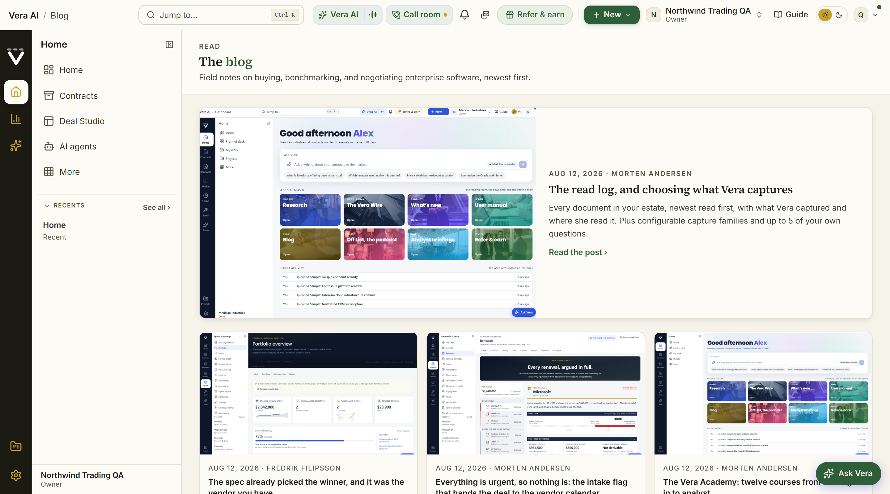
The field notes on buying, benchmarking, and negotiating software, newest first, as a card index with a lead story on top. Open any card to read the full post on its own in-app page (/blog/<post>), with Back to the blog and your browser's back both returning to the index.
Off List, the podcast
These shelves follow your spend category, and keep almost everything. Most of the podcast and most of the recorded sessions are about the craft rather than about a vendor, and that work is worth as much on a cleaning contract as on a licence, so it reaches every desk: 6 of the 14 episodes and 20 of the 29 sessions are on every shelf. Only the ones whose subject is a named software vendor, the Microsoft EA, RISE with SAP, the AWS commit, VMware after Broadcom, sit on the software desk alone. Information Technology and Software keeps every one.
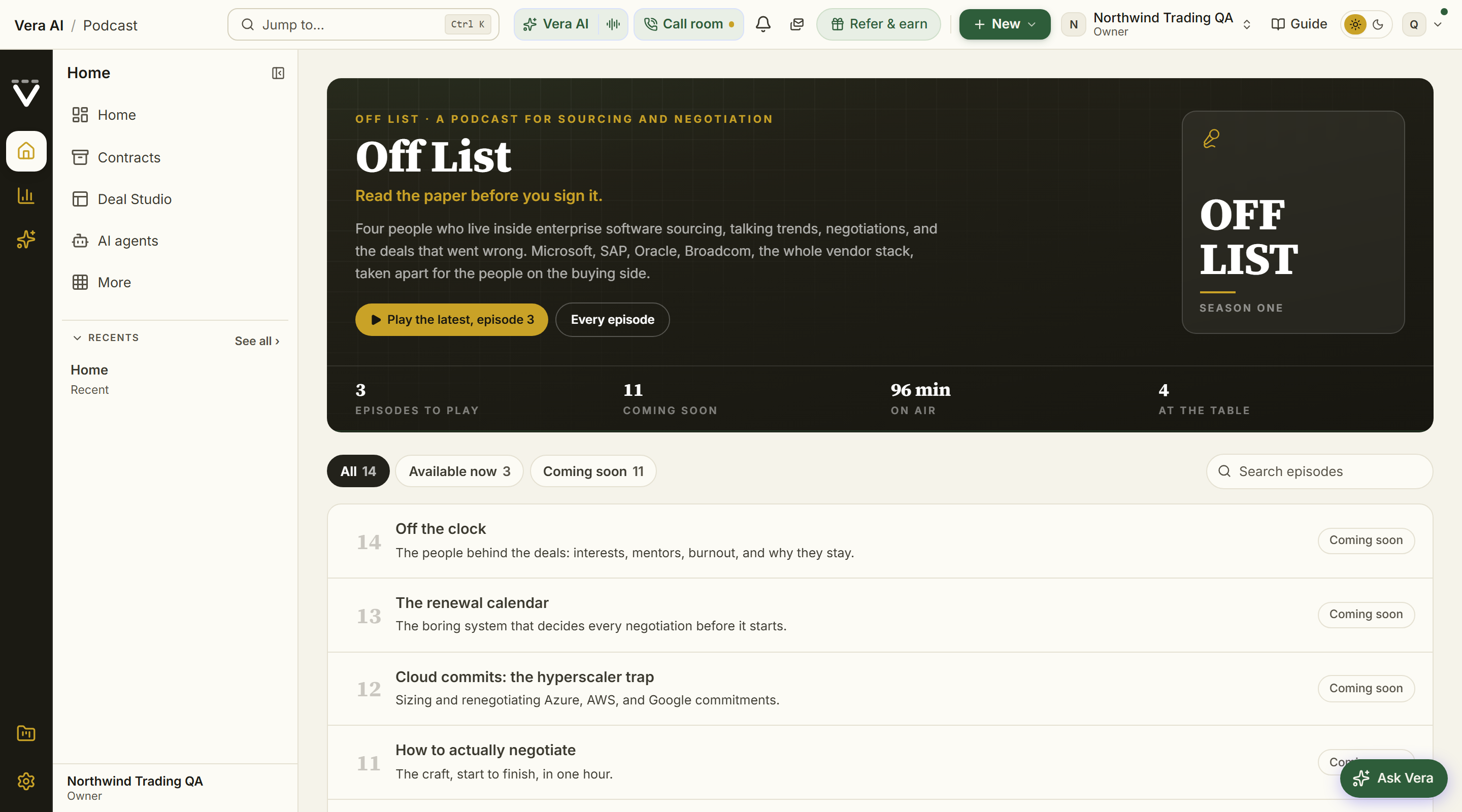
The Off List show on its own stage: the mark, the tagline, Play the latest one press away, and the season's figures at the stage foot, episodes to play, what is coming, the minutes on air, and the four at the table. The season reads as a ledger beneath it, every episode numbered with its title, summary, and runtime; press Play on any episode with a recording and it plays in the cinema player with the next episodes waiting under the audio bar, so the season plays through. Episodes still in production read as coming soon, so the run of the season stays honest. The recurring hosts are introduced at the foot of the page.
Analyst briefings
The negotiation film gallery: 174 films across 23 vendors, in its own window. Each one walks the moves that decide a renewal, the same three questions every deal turns on: what discount you are being offered, what comparable buyers get, and where a deal ranks. Opening Analyst briefings from anywhere, the Learn wall, a vendor page, a link in a renewal, lands you straight in the screening room window rather than a workspace page: the titlebar carries a rail toggle, Maximize, and Close (which returns you to Home), the library rail sits on frosted glass down the left, and the film wall renders on a solid pane so posters and type stay sharp. Under the titlebar sits the standard menu row, File, Watch, View, Team, Learn and Help, reached with Alt plus the underlined letter: Watch holds the whole shelf and every series so any run is one press away, View carries the rail toggle and the sort, Team holds the share doors described below plus the workspace's own (a link for a teammate, team activity, the invite), and Learn links the research and this manual.
The films cover software vendors today. Every briefing in the library is about a software vendor, so the gallery opens only on the Information Technology and Software desk. On the other seven the page says so and sends you to the written analyst work for your category, which is on the shelf now: every supplier we benchmark has a paper behind it in the research library. Films are filed by the vendor they are about, so a briefing filmed on a facilities or freight supplier will appear on that desk without anything being reconfigured.
The library rail. The frosted panel on the left is the fastest way around the shelf: All briefings, then every series with its episode count, then every vendor with a count that tracks your search. The active row wears a small accent pill; pressing an active vendor clears it, and the rail's foot totals the library. On phones, and whenever you hide the rail, the vendor chips carry the same filter in the gallery itself. The newest briefing still leads on the navy stage at the top, with its runtime and chapter count, a Watch now button, and the library's figures beneath it: films, vendors, series, and the hours of analysis on the shelf. Search by vendor or topic, and sort by newest or A to Z from the Sort flyout. Every film card on the wall carries the vendor, the runtime, the episode mark when it belongs to a series, and its chapter count; click one to play it.
Right click a film. Any film, on the wall, in an episode list, or on the stage poster, answers a right click with its own menu: Play the briefing, Open the series when it belongs to a run, then the share group (Send to a teammate, Draft the email, Copy the film link, Copy the vendor link), and the library group (Only that vendor's films, and Open the vendor record when that vendor is on your estate, so the film sits one press from the paper, the renewal, and the benchmark).
Share a briefing. The share sheet opens from the film menu, from the share button beside Watch now on the stage, or from the Team menu, and it has two doors. To a teammate is the hand off: pick the colleague, add a line if you want one, and send; a watch task lands on their desk with the film one press from playing, and the link goes to their inbox with your note. Send it to yourself and it is the email alone, the "email me the link" move. Draft the email is for when the words should travel under your own name: the desk writes the message from the film itself, the runtime, the chapter list, the link, and its series when it belongs to one, and then it is yours: edit it in place, Copy the email, or Open in your mail app. Nothing sends from that tab, so what goes out is exactly what you approved, from your own address. The picker at the top of the sheet moves the same send or draft to any other film without starting over.
Series. The 11 multi episode runs hang as a rail of title cards above the wall, each wearing its opening film as the poster with the episode count and the run's total time. Each is a single negotiation taken from the opening proposal to signature: the SAP RISE migration, Negotiating Broadcom, the Salesforce negotiation and SELA runs, the Oracle ULA, Java employee and EBS series, the Microsoft EA 2027 renewal, the ServiceNow renewal, and Negotiating AWS and Google. Open one and you land in its screening room: the run introduced on the stage with Play episode 1, then the episodes as numbered rows, held in order so a series is watched as a course rather than shuffled by the sort. All briefings returns you to the library.
The player. Films play in a cinema player over the window. Chapters are listed under the film with their timestamps: select one to jump straight to that point, and the chapter you are in stays marked as the film plays, so you can watch a briefing for the one move you came for instead of starting from the top. Beneath the chapters sits Up next: the rest of the run when you are inside a series, the vendor's other films when you are not. Selecting one plays it in place, so one briefing rolls into the next without closing the player.
Where else they appear. You do not have to come here to find the right film. A renewal record and a renewal playbook each carry the briefings for that vendor under Watch before you negotiate, playing in place, with the full series for that vendor listed underneath and a link to the rest of the library. A vendor record goes further and carries the whole shelf on its Watch tab, films, series, recorded sessions and podcast episodes together (The vendor record). The match reads the vendor name on your own paper, so VMware paper finds the Broadcom films and an Amazon Web Services entity finds the AWS ones.
Back to the vendor. Narrow the library to a vendor your workspace actually buys from and a line under the vendor chips offers the hop to that vendor's record, where the same films sit beside the paper, the renewal, and the benchmark.
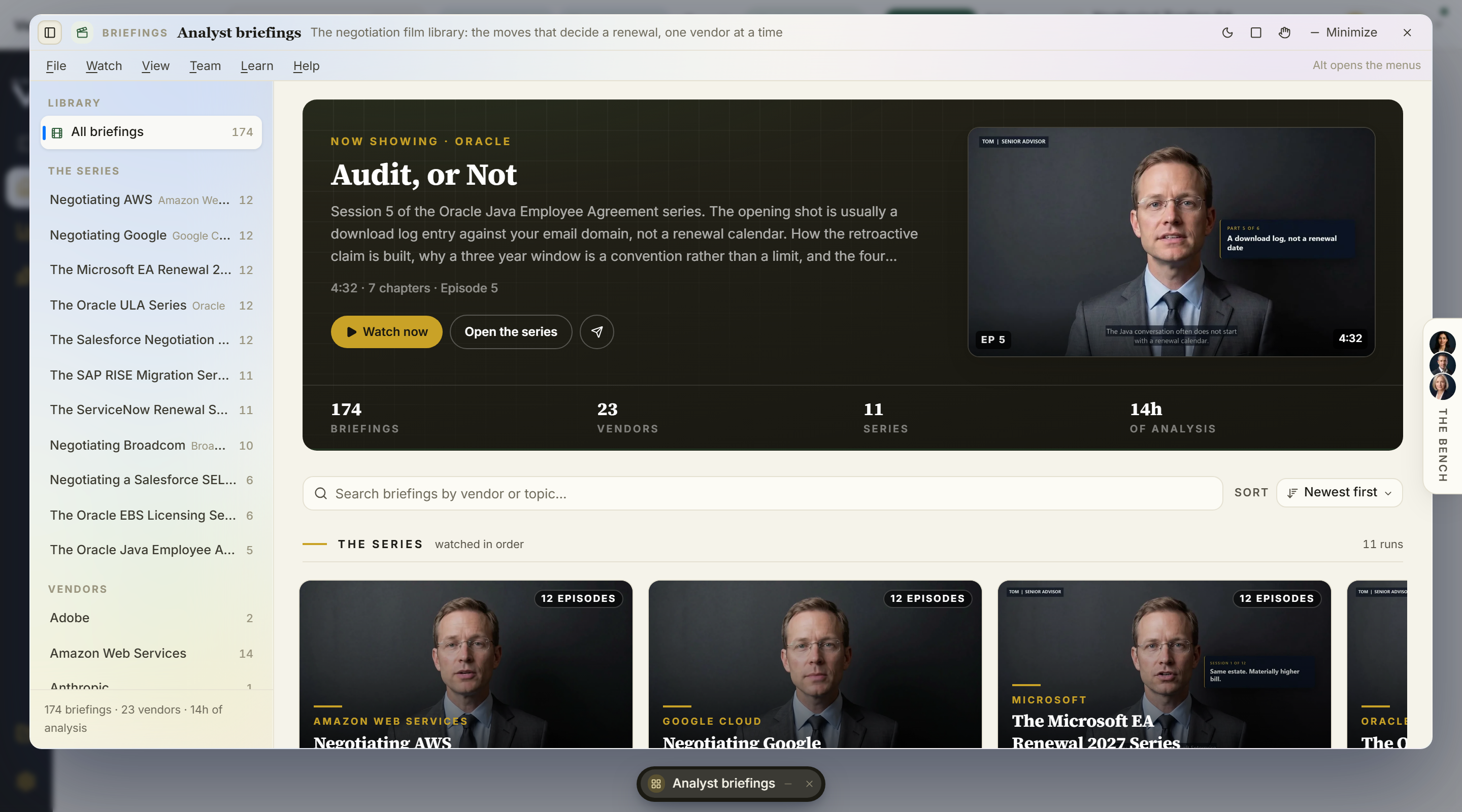
Demo videos
The narrated demo library, in the app. Search it, or filter by function and by role, then play any film inline. Every video shows its length and narrator; closing the player returns you to the gallery.
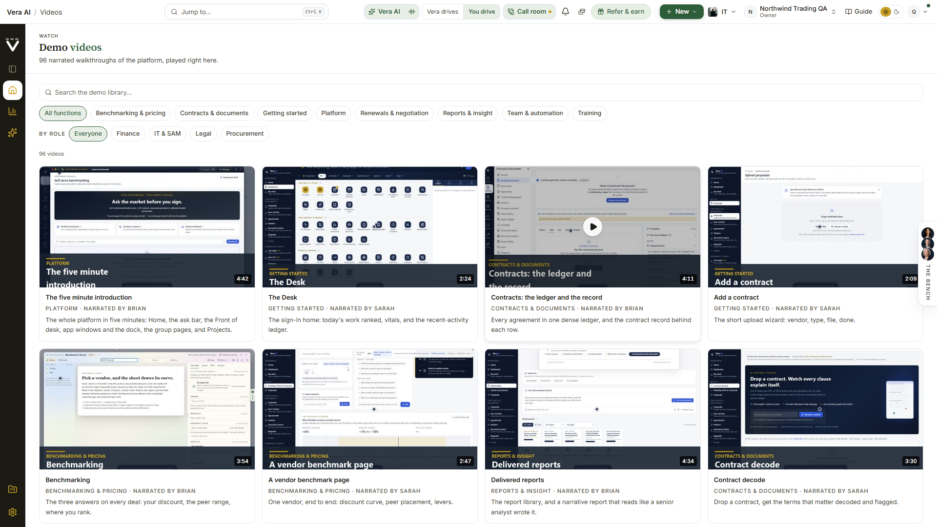
Help and feedback (in the account menu)
Every item in the menu carries a small colour tile, the same hue as the door it opens, and the help dialogs open as studio windows: the promise on a colour panel, the form on white beside it.
- Platform introduction — replays the welcome film (see The welcome film) any time, it is a good way to show a new colleague around.
- Report a bug — pick how badly it hurts (blocking, annoying, or minor), describe what happened and what you expected, and send. The page you were on, your browser, viewport, and timezone are attached automatically and shown to you before sending, so nothing is captured invisibly. You get a reference code to quote in follow-ups; bugs are typically fixed within 24 hours.
- Suggest a feature — tell the product team what to build: the area it belongs to, the idea, the problem it solves, and how much it would matter to your work. Every suggestion is read, and shipped ideas are announced in What's new. The dialog opens as a full window.
- Help center & manual — this manual, opened in the app window over the page you were on, so reading a chapter never means leaving your work.
- Academy — the narrated demo library at Demo videos, played inside the app.
Saved views
A saved view is a filter you keep: name the way you have a list set up, and it becomes a one-click chip in the Views row beside that list's filters. Views are personal and saved to your account, so they follow you across browsers and devices, and each list keeps its own (an Analyst Benchmark view never turns up on Vendors). They live on the list page itself; the rail does not carry them.
On the screen
- The Views row — every view saved for this list, each a chip. Click one to apply it; the view matching what is on screen is highlighted. The row shows once you have saved a view or set a filter.
- Save this view — appears at the end of the row while filters are active and that exact setup is not saved yet. Press it, name the view (up to 60 characters), and confirm. What is saved is the list as it reads right now: everything the filters have put in the page address.
- Shared — an organization owner can share a view with the whole team using the people icon on its chip. A shared view appears on that list for everyone, carries a Shared marker, and stays owner-managed: only an owner can unshare or delete it.
- Delete — the × on a chip removes a view, with an Undo in the toast that puts it back.
How to use it
- Filter the list the way you actually check it, for example Analyst Benchmark on In review, or the audit log on downloads.
- Press Save this view, name it, and confirm. The chip joins the Views row.
- Next time, open the list and click the chip. The filters apply and the page address updates, so a view is also a link you can send a colleague.
- Owners: the people icon on a chip shares the view with your team, or makes it personal again.
Tips
- The lists that carry the row: Analyst Benchmark, Agreements, Vendors, and the audit log.
- A teammate cannot remove a shared view, only an owner can; save your own copy under a new name if you need a variant (see Troubleshooting).
Related: The studio shell
Vera suggests, on a right click
Anything in the product that is a real thing, a vendor on the Benchmark Library shelf or the Vendors list, a product line on the sheet, a proposal row, a renewal, a negotiation thread, a sourcing project, a search result, a research paper's vendor, answers a right click with a small menu: the entity's name, Vera suggests, and the doors that already lead somewhere (open the record, open it in the Benchmark Library, the vendor page). Everywhere else the browser's own menu is untouched, and on the phone the same menu opens with a half second press.
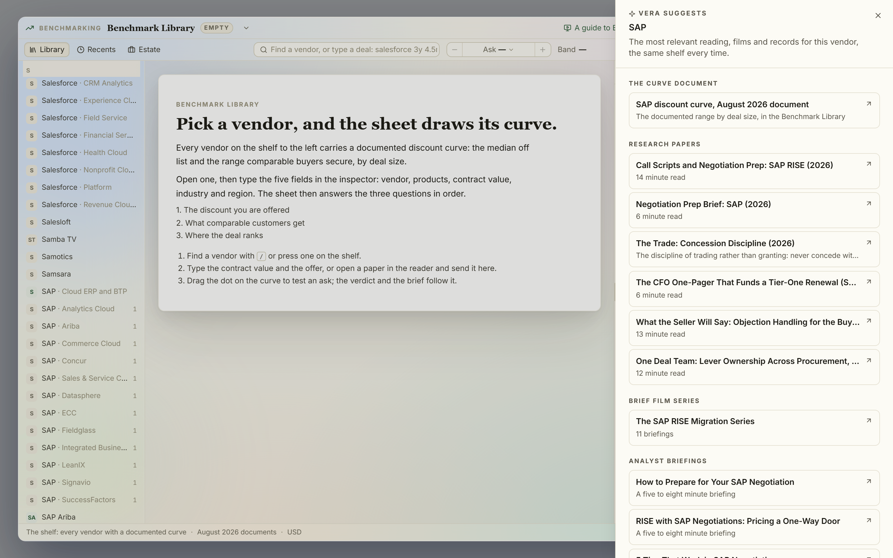
On the screen
- The entity menu — right click a marked row and the menu opens at your pointer: the kind (Vendor, Product line, Contract, Renewal, Negotiation), the name, Vera suggests first, then the doors. The same menu opens with a half second press on touch, from the ✦ chip that appears when you rest on a row, or with Shift+F10 on a row you have focused from the keyboard.
- Vera suggests — opens the gallery: the most relevant research papers with their reading time, the brief film series, the analyst briefings, the vendor's discount curve document, recorded sessions, and your own related records (proposals in your book, saved benchmark positions). The same entity always shows the same shelf, every card opens where the work happens (the research reader, the briefings player, the Benchmark Library placed on the line), and each section orders by what buyers across the platform actually open, refreshed once a night.
- When the library has nothing — the gallery says so plainly, offers nearby reading from the same category when there is any, and carries one button that asks the research library agent to write the missing brief. New papers land in the research library as they are written.
- Your reading allowance — on plans with a research reading cap the papers section states the allowance and what is used, in words. A paper you have already opened never counts twice.
- Go deeper with Vera — one press and Vera reads the shelf and orders it: the three to five items to open first, each with one plain sentence on what you get from it. Every pick is a card the shelf already shows, never an invention, and the same vendor reads the same for everyone for the day. Beside it, Ask Vera about this opens the conversation window with the question already written. Both run inside your workspace's AI allowance; when AI is off or the allowance is used, the gallery says so in words and the shelf stands on its own.
How to use it
- Right click any vendor on the Benchmark Library shelf, or any proposal row on Analyst Benchmark.
- Press Vera suggests and read the shelf. Every card is a door; the gallery closes and the destination opens placed.
- On a vendor with no research yet, press Ask the library agent to write the brief and check the research library in the coming days.
Tips
- The keyboard route: focus a row, press Shift+F10, then walk the menu with the arrow keys.
- The gallery is deterministic on purpose: it reads the library and your own records, never a guess, so what it shows a colleague is what it shows you.
Related: Benchmark Library · Research · Analyst briefings
Five minutes to oriented
The shell in prose, for reading once rather than referencing. The dark rail on the left is the map and only the map, with the active group's destinations and your recent pages in the white panel beside it; the paths and the working sections live on the Workflows row under Your apps, and when a page seems missing it is in the More catalog or one keystroke away in the palette, never gone. The white bar across the top holds exactly one of each thing that matters: one search (Jump to…, which is the command palette wearing a field), one AI door (the Vera cluster), one inbox (the bell), one New menu for starting things, one Guide door into this manual, and your organization and account chips so you always know which tenant you are in. Everything rarer lives in the account menu.
Moving around rewards two habits. Ctrl/⌘ K then typing beats any amount of rail-hunting: pages, tools, vendors, and actions all answer to it. And the keyboard grammar, g then a letter, jumps without the palette (g r renewals, g d dashboard, g b benchmarking; press ? anywhere for the full card). When a screen itself confuses you, its help is layered: the round assistant button explains the screen in place, the Guide door opens this manual at that screen's section, and Ctrl/⌘ J puts the question to Vera directly. The order to try them when stuck is written up as Get unstuck.
If you remember three things from this page: Ctrl/⌘ K to go anywhere, Ctrl/⌘ J to ask anything, Guide to read about wherever you are.
The contract lifecycle
Watch: The contract lifecycle (2:24)
The whole platform as one operating path: three phases and ten steps, in the order they pay off. Phase 1 loads the estate (upload, indexing, benchmarks, the renewal calendar), phase 2 finds the money (the overspend review, a play per major renewal), phase 3 wins the renewals (tiering with the agent on the tail, deal rooms, the negotiation), and the loop proves the savings against invoices and rolls the calendar forward. Every step names the tools that do it and carries one action.
*In plain words: where to start, what comes next, and how far you have come, on one page.*
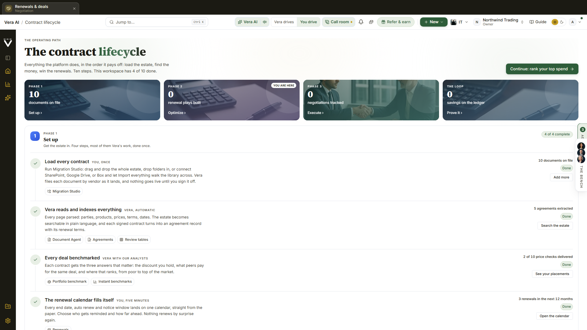
On the screen
- The phase wall — four photo tiles in the home page's own dress: Set up, Optimize, Execute, and the loop, each with one real number from your workspace and a marker on the phase you are in. Clicking a tile jumps to that phase.
- The steps — ten numbered rows. Each names who does it (you, Vera, or both), links the tools it runs on, shows what your workspace has produced so far, and carries one button. The step you are on is washed in blue. Loading contracts points at Migration Studio, the one door built to carry a whole estate.
- The loop — the tenth step closes the page as a navy band: savings proven against invoices, and the calendar rolling forward.
- Continue — the header button jumps to the first step that is not done, which is always the right next thing to do.
How to use it
- Press the Lifecycle icon on the left rail. The side panel lists the path's tools grouped by phase; the page carries the full path.
- Read the tracker to see which phase you are in, then press Continue and do the step it lands on. Opening a step's tool keeps the Lifecycle panel beside you with your place on the path highlighted, and the destination shows a small Step N of 10 chip naming the next step, one press from continuing. The panel only changes section when you pick another icon on the rail.
- Come back whenever the question is "what should we do next". The page recomputes from what the workspace actually holds; sample data never counts as progress.
Tips
- Done is measured honestly: a step shows Done only when the workspace holds the thing it produces (documents, agreements, delivered benchmarks, savings on the ledger).
- The path ends where it starts: an awarded sourcing project and a signed renewal both land back in Documents and on the calendar, and the loop begins again.
Related: Contracts · Renewals · Portfolio
The screens you will use most
The welcome film
Three minutes from the advisory desk, played once when you first sign in: a ten second countdown, then Claire, Marcus, and Daniel take turns on what the platform reads, what it knows about the market, how it prepares a negotiation, and why your feedback shapes what gets built. Go to my desk closes it for good, Skip for now does the same without finishing, and you can rewatch any time from the account menu. It replaced the five minute narrated tour in August 2026; nothing else about the first days changed, your first result still comes before any survey or offer.
The desk survey
Six quick questions that arrange your desk around your work. The survey never blocks a sign-in: it is offered as a link on Home and waits until you take it. Answer once and it never repeats unless you retake it.
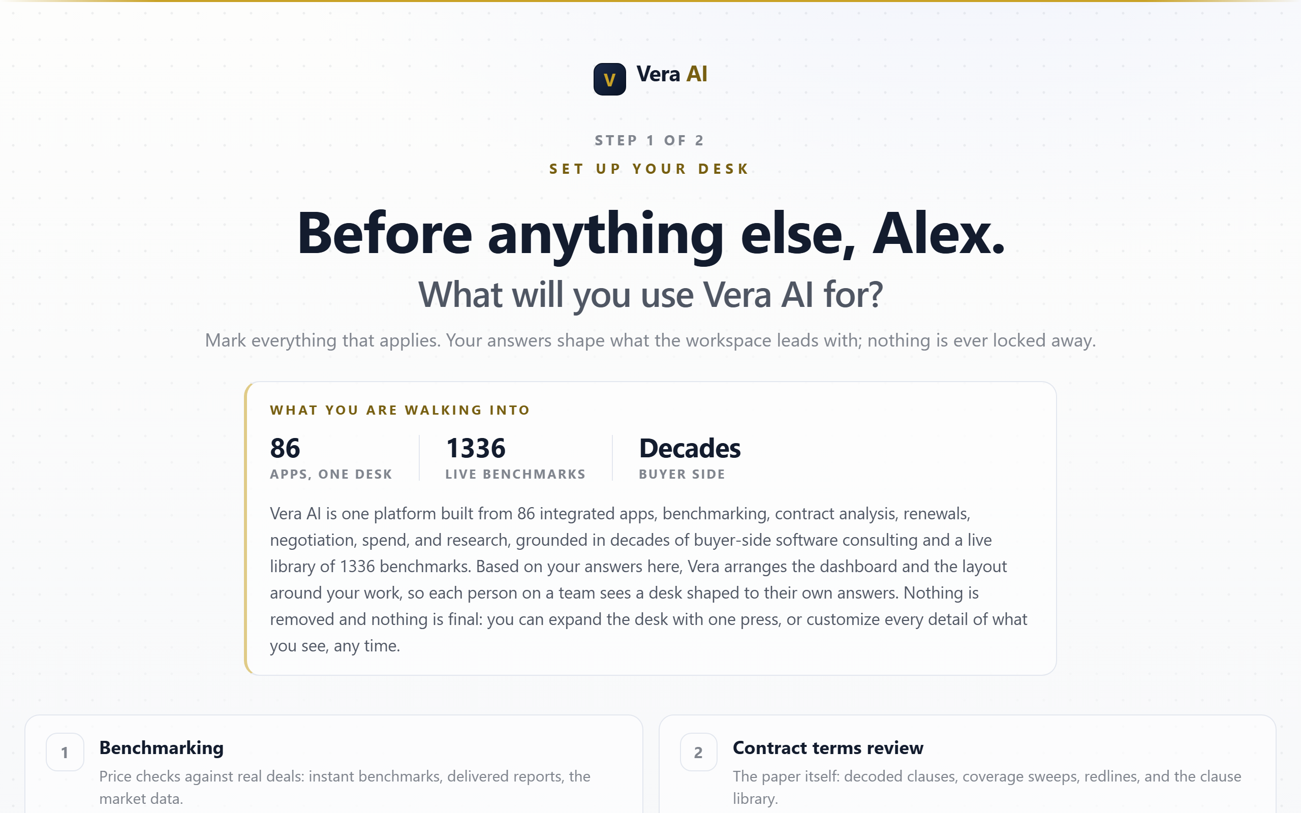
On the screen
- Step 1, the six questions — mark everything that applies: benchmarking, contract terms review, which vendors you are interested in (tap the chips, or type any vendor and press Add), IT cost optimization, cloud optimization, and optimization tools. The vendors you pick go on watch: they light up on your desk with live benchmark coverage and their fiscal calendars feed your alerts.
- Step 2, the three views — three previews of your navigation rail, each built live from your own answers (gold sections are the ones you lit up). Pick how the desk should treat everything else:
- Focused desk — hides what is not relevant; one press on Show all sections in the rail brings everything back.
- Relevant first — your sections lead the rail, open; the rest stays visible but folded.
- The full desk — every section open from the start; you fold what you do not need.
How to use it
- Mark your interests and vendors, then press Continue.
- Compare the three previews, press the one you want, then Continue to your workspace.
Tips
- Nothing is ever locked away: whichever view you choose, the command palette (Ctrl/⌘ K) and the More catalog always search the whole platform.
- Change your mind later from Getting started, Retake the desk survey, or just use the rail's own Show all sections.
The launcher home (retired)
The concierge launcher retired in August 2026: its address lands on Home, and Your apps and the group pages carry every door it held.
The classic home screen (the Estate Report)
The screen that was the sign-in landing before July 2026, kept one press away and rebuilt in July 2026 as a daily report on your estate. Signing in now opens Home.
It reads like a report because that is what it is. The wire leads it, since the market is the only part of this screen that changed since yesterday: the lead signal gets a headline and Vera's read of it. Your workspace figures sit beneath. Every one of your apps runs down the right hand side as a directory, so nothing is hidden below the fold and any tool is one press away. Use an app, press Home in the rail (or the brand mark in the corner), and you are back here.
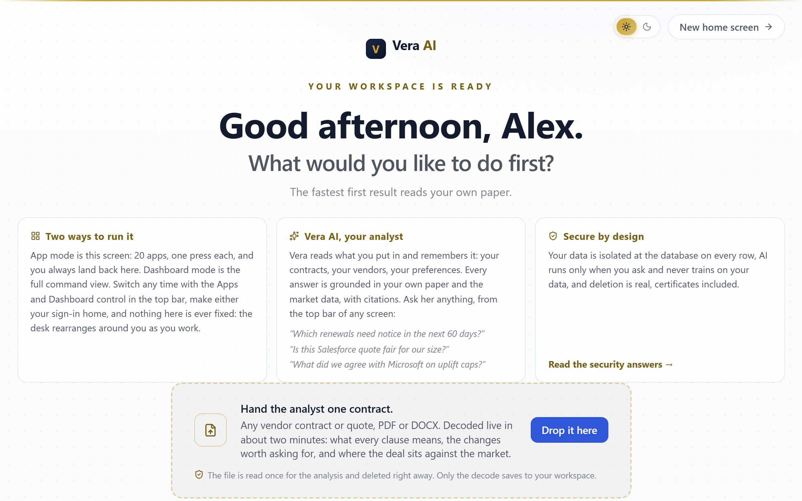
On the screen
- Masthead — Vera AI over Estate Report, then your organization, today's date, and who the report is prepared for. It stays put while you read: on a desktop screen the masthead never scrolls away, so the way through to your dashboard is always in the same place.
- The lead signal — the most significant thing on the wire today, with its headline, Vera's read of what it means for you, and a byline naming the category, the vendor, when it was filed, and how many of today's signals touch a vendor you actually hold. Press the headline to open it in the Wire.
- Key figures — four live numbers in a ruled band: contracts on file, renewals closing inside 90 days, unread alerts, and the number of tools on your desk. Each is a link straight to its page; the renewals figure turns gold when something is on the clock.
- Signals against your vendors — the rest of today's wire under the figures, each named by vendor with its category, the time it was filed, a Caution or Risk tag where one applies, and a Touches you marker on the ones that concern a vendor in your estate. Open the Wire leads to the full feed.
- The directory (right) — every app on your home screen as a ruled list, grouped under Your apps, each with what it does and a live count where one applies (Renewal calendar carries what is closing in). Every door opens in app mode: the navigation rail disappears and the tool owns the screen, with Back to apps on the left and the app's name as a gold label. The tool keeps your appearance setting, light stays light and dark stays dark. Hover any entry (or tab to it) and a small card tells you when to use that app.
- Run the introduction — the cream strip at the top of the directory starts First Light, the guided walkthrough that builds the desk around you. It is a first-days affordance, not furniture: it retires on its own once you run the introduction, or 30 days after your workspace opens, whichever comes first. Hover it and it says exactly that.
- Light and dark switch (masthead) — the sun and moon capsule flips the whole workspace between light and dark, revealed as a circle of the new theme growing out from the switch. The choice is your account's appearance setting: every app follows it, it travels across devices, and it applies before first paint on your next sign-in. The same setting lives in the account menu under Theme, alongside the System option that follows your operating system.
- Dashboard link (masthead) — a standing shortcut to the full command view.
- Edit this screen — compose the directory itself: press an app to remove it, press Add apps to put any tool or page on the platform here (searchable), and Restore defaults brings the original set back. Every tool also carries an Add to apps button in its top bar.
- Choose dashboard apps — flip the directory into a picker, highlight the apps you want, and your dashboard carries exactly that clean set as a Your apps band. No customization means all of them; a Change link on the dashboard band leads back here.
- Apps and Dashboard switch (top bar) — every screen carries the mode switch in the top bar: Apps opens this screen, Dashboard opens the full command view, and the active mode is highlighted. Either one can be your sign-in home.
- What about security? — a control at the foot of the directory that opens the security answers in a popup right here: tenant isolation, file handling, the AI data flow, deletion, sign-in security, and SOC 2 status, taken word for word from the full security FAQ. A button inside opens all 60 answers in a new tab, so you never lose your place.
- The two minute tour — a quiet line under the report opens the tour as a film in a centered dialog: Claire, Tom, and Daniel, the same advisors who present the webinar series, walk the desk and its fifteen apps over live product footage. The film runs a little over two minutes and keeps the desk's thirteen stops as a chapter rail under the player: Welcome, Home and the ask bar, Benchmark Library, the deal apps (Benchmark Agent, Negotiation Agent, Renewals), the reading apps (Contract Agent, Document Agent, Contract Management Portal), the market agents, and Your desk. Press any chapter chip to jump straight to that beat, turn on captions with the player's CC control, and use Escape or Close to leave at any point; Go to the desk closes the show onto your desk. Every figure on screen is labeled sample data; your numbers take over the moment you upload.
- Optional follow-ups — until taken or dismissed, this screen offers the welcome film replay and the desk survey as quiet links under the report. Links, never gates: they wait as long as you like.
- Footer choice — "Prefer the dashboard? Make it your sign-in home" turns this screen off as your landing: from then on, sign-ins go straight to the dashboard. If you have already done that, the same footer offers to make this screen your home again.
- One-time asks — the screen asks two questions, once each and never together: where money-critical alerts should reach you, and whether you want the weekly briefings by email (price list updates per vendor, vendor licensing news, the knowledge summary). Both are strictly opt-in, both stay adjustable in Settings › Notifications, and every briefing email carries a one-click unsubscribe.
- On a narrow screen — below a laptop width the report becomes a single column: masthead, the lead signal and figures, then the directory underneath as a grid. Nothing is dropped.
How to use it
- Read the lead signal and the byline. If it says signals touch your estate, that is usually your first stop.
- Check the figures: a gold renewals number means something is on the clock.
- Press the app you came to use in the directory. When you are done, press Home in the rail to come back.
- Want the full picture instead? The dashboard is in the masthead, or g d on the keyboard.
Tips
- Your very first visit looks different: before your first result, this screen is a springboard rather than a report, and the door you choose there also arranges your workspace. Once you have a first win it becomes the Estate Report described above.
- If you turn this screen off as your landing and miss it, the command palette (Ctrl/⌘ K) still finds "Home".
- Holding a document and want proof before you explore anything else? Open the Benchmark Agent under Your apps on Home and drop the file on its desk: the paper is read on the drop, and the benchmark runs the moment you have checked the fact sheet and pressed Run. To ask about it in your own words instead, open Vera from the rail and attach it in her window, where it stays in hand for the next three questions and survives a reload.
The example report
A complete, illustrative benchmark report on a fictional Workday agreement, so you can see exactly what an analyst deliverable contains before you upload anything of your own. The Present button in its header plays the report screen by screen, from the masthead to the bottom line, which is the fastest way to show a colleague what a delivered report looks like; the show starts from the first screen on every open.
Related: Delivered reports · The benchmark report
Dashboard
The dashboard's job moved to Home in August 2026, and the old address redirects there with links, bookmarks, and window deep links intact. The feed it carried appears for new workspaces inside First Light; the market stream lives on The Vera Wire.
On the screen
- Your greeting — the hello on the launcher masthead, beside the Ask Vera kicker, with today's date on the right. It changes with the day and the hour.
- Ask Vera — the AI front door, directly under the greeting: ask a question about your portfolio, search every application by name, or attach a contract. Typing here also filters the application grid below, so the same field is both the question and the search.
- Main Apps — the band at the top of the applications: the eight instruments most work starts from (Vera AI, Compare contracts, Benchmark Library, Document Agent, Research, Contract Agent, SOW Agent, MSA Agent), each with its own mark, a one line description, and its family label. Hover one and a small explanation of what it does pops up; click to open it. The band steps aside while you search or filter, so results are never pushed down the page.
- The applications — below the band, every app you have as a ledger: each family under its gold kicker and navy rule, and every app on its own row with its icon, its name, and a one line description of its job. Hover any row and a tooltip explains the app in full before you spend a click. A gold badge on a row is a live count of things that need you (proposals in review, open tasks, renewals inside 90 days). Press the star on a row to keep the app under Favourites, and use the group pills across the masthead (Favourites, All, Contracts, Renewals, Benchmarks, Spend, Tools, Team) to narrow the ledger. Arrow keys move through the rows, Enter opens one.
- Your context — the rail on the right, in four tabs: Recent (the pages you last opened), Saved (research and reports you bookmarked), Wire (the newest market signals), and New (what shipped and what was published).
- The feed — one scroll down, the last 30 days in one stream: what we shipped, the research we published, and the licensing, pricing, and vendor news the market made. See below.
The feed
- Lenses — the filter row across the head: Everything, New in the product, Research, Licensing, Pricing, Vendor news. Each carries its own count for the window, so you can see what is in there before spending a click. A lens with nothing in it is not shown.
- Your vendors — a gold filter beside the lenses that narrows the feed to items touching a vendor you hold a contract with. It appears only when at least one item does.
- Filter the feed — free text search across every title, summary, and vendor in the window.
- The rows — grouped by day, newest first, each with its lens colour, the vendor, a Your estate flag where it applies, and the wire's verdict (Favorable, Caution, Risk) where the item carries one. Click any row to open it: the summary in full, the one line worth acting on (Vera's read on a market item, the "try it" on a new feature), the source where the item is a verified market signal, and a link to the item itself.
- Show more — the feed loads 25 rows at a time and tells you how many are left. At the foot, links to the complete record: every release note, the research library, and the full wire.
How to use it
- Start at the top: ask Vera a question, or press the application you came for.
- Star the four or five applications you open every day so Favourites becomes your working set.
- Scroll once to the feed and read it with the Your vendors filter on. That is the shortest version of "does anything this month affect my contracts".
- Switch to the New in the product lens when you want to catch up on what we shipped, and open a row for the one thing to try.
Tips
- Sign-ins land on Home; this page stays reachable from the Home footer of old links and the palette.
- On a brand-new account, load sample data first so every screen has something to show while you explore. Remove it before you start entering real contracts.
Control room
The second reading of the same workspace: where the Dashboard is built to start work, the control room is built to supervise it. Open it when you want to know what is about to stop being possible, what is waiting on a person, and what your agents are currently allowed to do. Your Dashboard is untouched and stays the default.
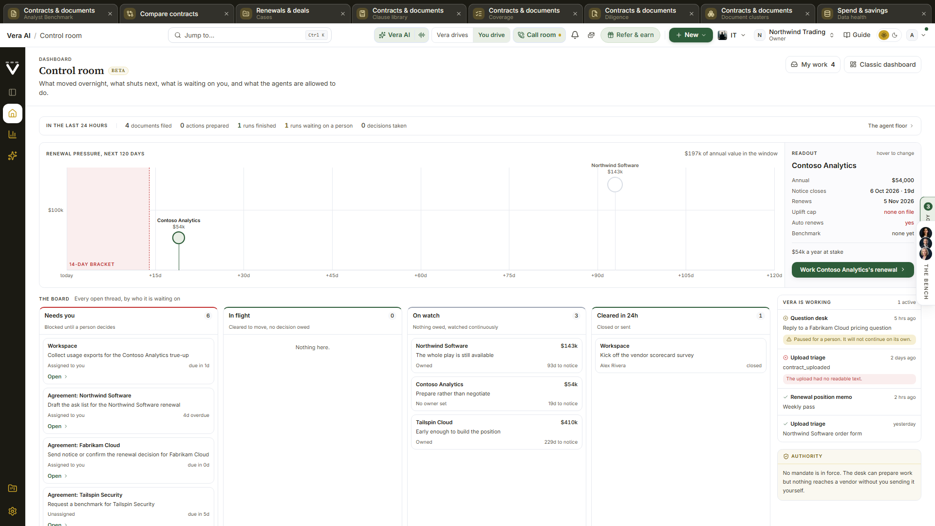
On the screen
- The last 24 hours — a single strip of counts across the top: documents filed, actions prepared, workflow runs finished, runs waiting on a person, and decisions taken. A zero is never coloured as movement, so a quiet night reads as quiet rather than as bad news.
- Renewal pressure — every notice window shutting inside the next 120 days on two axes: days until it shuts across, annual value up. Marker size follows the same money, so the renewal that is nearest and biggest is the largest circle furthest left. The red band on the left is the 14-day bracket, the fortnight inside which noticing a deadline later stops helping you. Only agreements that carry both an expiry date and a notice period appear, because only those have a window to miss.
- Readout — the panel beside the timeline, driven by whichever marker your cursor is on: annual value, the notice and renewal dates, the uplift cap or the absence of one, whether it renews itself, what the vendor has asked for as a percentage, and whether a benchmark exists. Click a marker to pin it so the readout survives the mouse leaving.
- The board — every open thread in four lanes, sorted by who it is waiting on rather than by what kind of thing it is. Needs you holds prepared actions the guardian escalated or blocked, actions awaiting your approval, and tasks assigned to you. In flight holds actions cleared to send. On watch holds ranked vendors with a real deadline and nothing owed today. Cleared in 24h holds what was sent or closed since yesterday.
- Vera is working — the workflow runs that have actually executed in the last seven days, newest and most urgent first. A run paused for a person is flagged in gold and will not continue on its own; a failed run shows its error.
- Authority — the mandates in force, the rope they give (advise, check with me, or just run it), the target, the largest single amount an agent may commit, the first expiry, and how many prepared actions are waiting on you. With no mandate signed it says so plainly: the desk can prepare work, but nothing reaches a vendor unless you send it.
- The dock — every app one press away at the foot, honouring the same picks as Choose dashboard apps on your home screen.
How to use it
- Read the timeline left to right and stop at the first circle inside the red bracket: that is the deadline with the least room left.
- Hover it to fill the readout, and check the uplift cap line. No cap on file means nothing bounds what they can ask for at renewal.
- Click Work \<vendor\> on the desk to open it, or clear the Needs you lane first if something there is blocking a send.
- Glance at Authority before you leave: if Waiting on you shows actions, nothing in that queue moves until you approve or decide.
Tips
- Nothing here is estimated. An empty control room means the rows are missing, not that nothing is happening: add an agreement with an expiry date and a notice period and the window appears on the timeline.
- The board reads your desk's own guardian verdicts, so an action lands in Needs you exactly when the mandate you signed says a person has to decide.
Related: Dashboard · Renewals · Workflow agents
Getting started (the course)
The page opens with an onboarding spine: four ticks covering the platform introduction, the desk survey, the engagement letter, and first light, each linked, with one line naming your next undone step.
A guided tour matched to why you are here: benchmarking one contract, understanding a single contract, connecting your data sources, or running the full platform. Pick a path and tick steps off as you go; progress is saved to your account and syncs across your devices.
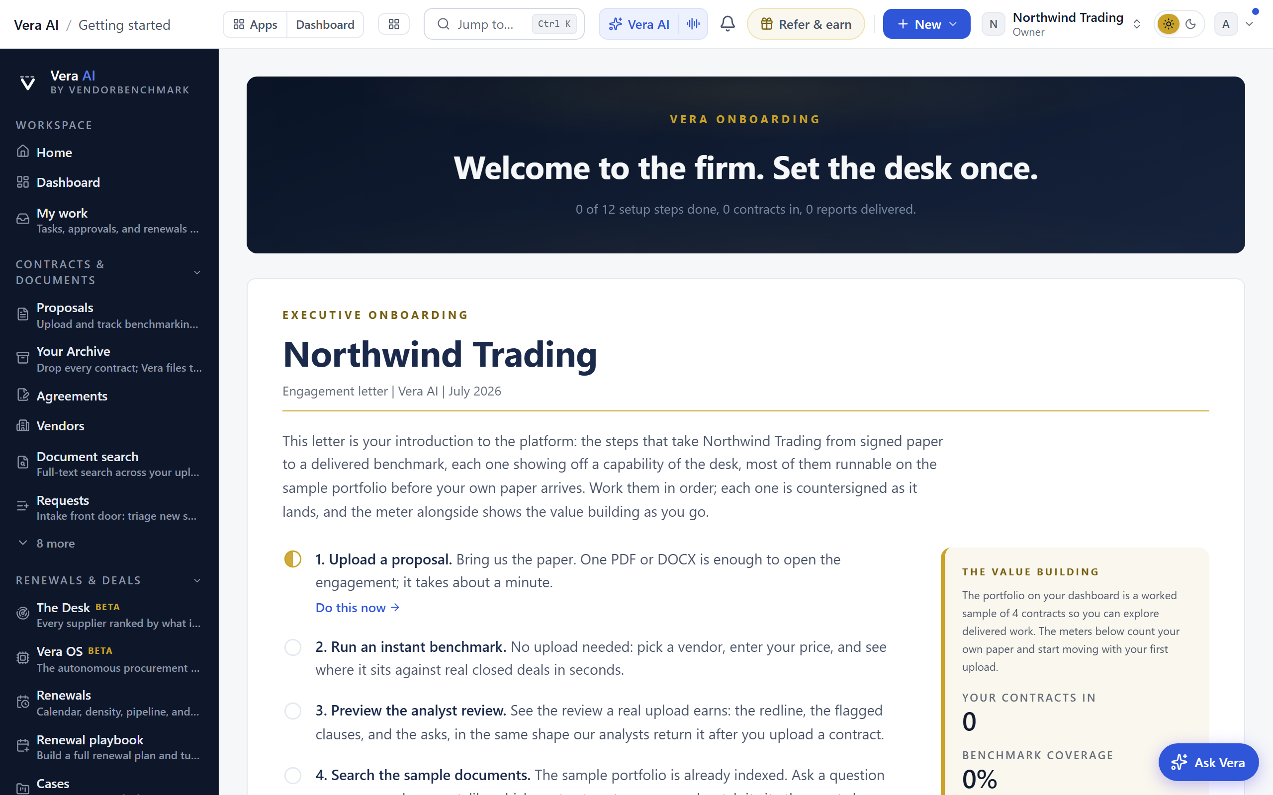
On the screen
- Your workspace (preset picker) — four arrangements of the same workspace: Renewal desk (one or two vendors, a renewal on the clock), Deal check (pressure-test a quote), Portfolio command (the whole estate), and Explore everything. Your pick decides which rail sections start open, whether the rail begins simple or full, which tools are pinned to your dashboard, and where the course begins. If you answered the goal question at signup, the matching preset carries a Suggested marker. A preset only changes emphasis: every feature stays available in search and the More catalog, and you can switch presets anytime here or from the foot of the rail.
- Four doors — benchmark one contract, understand a contract, connect your data, or run the full platform. Change paths anytime with Change path.
- Role and use-case questions — the full-platform path asks your role and what you want to get done, then builds a personal track from your answers.
- Progress path — the row of numbered dots shows your whole track: green dots are done, the blue one is your next step.
- Next up card — your single next step, promoted to the top with what you get out of it.
- Your own vendor, carried through — the vendors you named when you set up the workspace steer three steps. The Benchmark Library step opens the grid already filtered to your vendor, the research step opens the library filtered the same way, and the Meet Vera step opens with the question about your renewal already written in the composer, ready to send or change. The step text is the same either way: only the destination arrives knowing who you buy from.
How to use it
- Check the Your desk card: if the rail does not fit how you work anymore, retake the desk survey from there.
- Pick the workspace preset that matches your situation; the sidebar and dashboard rearrange immediately.
- Pick the door that matches why you are here.
- Answer the role and use-case questions if prompted.
- Do the "Next up" step, then mark it done. Repeat down the track.
The training tour
A training workspace is a classroom copy of the desk on sample paper, provisioned by the VendorBenchmark team for a training cohort (see Training workspaces). Inside it, one card walks you through eleven stops in order, and stays with you from screen to screen until the eleventh is done.
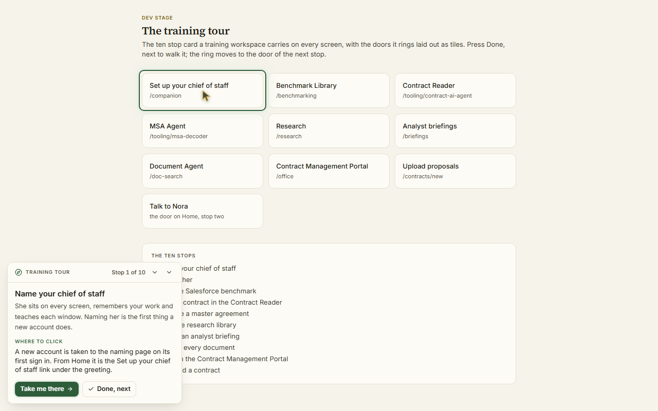
On the screen
- The stop — the heading names the stop you are on and the count, Stop 3 of 11, with one line on why the stop matters.
- Where to click — one sentence naming the door: the tile on Home, the link in the rail, or Jump to with the words to type. The same door wears a ring on the screen, and a small pointer sets off from your own and arrives before you do. When no door is on the screen, the ring stands on Jump to.
- Take me there — opens the stop's destination the way you would have, as its own window or as a page.
- You are here — once the destination is on the desk the card switches to the two to four things to do there, numbered, and the ring moves to the control the first move names.
- Done, next — closes the stop and opens the next. Two stops close themselves: naming your chief of staff, and uploading a contract, which closes when the proposal page opens.
- Back and the list — Back reopens the previous stop without losing its tick; the chevron in the header opens all eleven stops with their ticks, and any stop can be reopened from there.
- The collapse control — folds the card to a pill reading Training tour, 4 of 11. The pill reopens it.
The eleven stops
- Name your chief of staff, on the naming page a new account is taken to.
- Talk to her, from the Talk to door under her portrait on Home.
- Talk it through with Vera Demo: the call room opens with the demo persona on the line, the voice a prospect meets. Press Start talking, tell her what you buy and which renewal is next, and ask what the platform can do for you and whether it replaces anyone (see The call room).
- Run the Salesforce Sales and Service Cloud benchmark in the Benchmark Library. Every other vendor on the shelf wears a lock in a training workspace.
- Read a contract in the Contract Reader, on the Salesforce renewal quote already on file.
- Decode a master agreement in the MSA Agent, opened on the sample SaaS master agreement.
- Visit the research library and open a paper.
- Watch an analyst briefing.
- Search every document with the Document Agent.
- Work in the Contract Management Portal, through its ten rooms.
- Upload a contract: the sample Salesforce quote is one link away on the card.
How to use it
- Sign in. The first thing you meet is the naming page, which is stop one; the card at the foot of Home is on stop one as well.
- Read Where to click and follow the ring, or press Take me there.
- On arrival, do the numbered moves, then press Done, next.
- Repeat to the eleventh stop. The last card says the tour is done and offers Start the tour again.
Tips
- Your place is kept on your account, so a reload, a route window and tomorrow's sign in all reopen the same stop.
- Everything in a training workspace is sample paper. Nothing you try there can go wrong, and the workspace can be reset by the team between cohorts.
Related: Naming your advisor · The Benchmark Library · Training workspaces
My work
Everything assigned to you personally: tasks, renewals you own, and approvals waiting on you. This is your answer to "what needs me?"
On the screen
- Queues — your open items grouped by type, so you can clear them in one sitting.
- The all clear — when nothing waits on you, the page shows one forward move: the next renewal to reach its notice window, with links to the renewal record and Ask Vera, or a price check prompt when none is upcoming.
How to use it
- Open My work at the start of the day and clear each queue.
- For team-wide to-dos rather than just yours, see Tasks.
The More catalog
The full, searchable catalog of every tool and page, including everything the short rail hides. When you cannot remember where something lives, this is the place to browse or search.
How to use it
- Open More and search, or browse by group.
- Faster still: press Ctrl/⌘ K anywhere and type what you want.
Search (the card catalog)
Global search across everything the platform holds for your organization: proposals, vendors, agreements and renewals, benchmark metrics, contract clauses, tasks, and AI deliverables. The command palette answers "take me to a page"; this screen answers "find me a record".
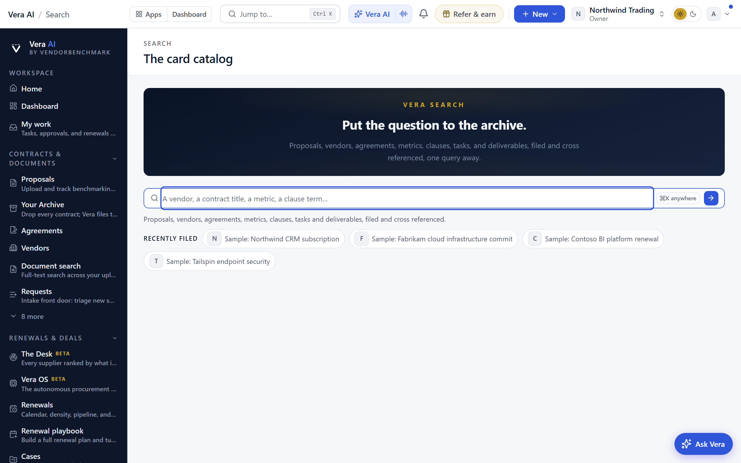
On the screen
- The search toolbar — the field, and under it a line telling you how many cards were pulled from how many drawers. Before you type, Recently filed lists the records you last touched as chips, so the proposals you were working on are one click away rather than a blank box.
- Best match — when one record clearly answers the query, it floats above the rest with a one line, fully grounded verdict.
- Result drawers — matches grouped by type (Vendors, Analyst Benchmark, Agreements & renewals, Benchmark metrics, Clauses, Tasks, AI deliverables), each row linking straight to the record. A spine rail on the left shows how many of each type matched before you scroll.
- Ask Vera about these results — the line that closes the page. The records answer *where*; this asks what they mean, opening Vera with the question already written about that term across your agreements, and running it straight away. It shows even when nothing matched, because an empty result is often the most useful thing to ask about.
How to use it
- Press Ctrl/⌘ K, type your term, and choose the search row; or open the Instant search door on Home.
- Open the group that matches what you are hunting: a clause term lands in Clauses, a vendor name in Vendors and Analyst Benchmark.
- Nothing filed under your term? Press Ask Vera about these results, or try a vendor name, a contract title, or a clause term like "auto renewal" or "liability".
Tips
- For full-text search inside the documents themselves, use Document Agent; this screen searches the records the platform keeps about them.
Related: Document Agent · The More catalog
Enterprise Uploader
The Enterprise Uploader is the one door for bringing an entire contract estate onto the platform in one guided run. Use it once, at the start, when you have hundreds or thousands of agreements to bring across. For a handful of documents use Upload a proposal, and for a folder you want read and filed straight away use Contracts.
The part worth understanding before you begin: everything a migration loads is held in staging. While the run is in progress it is invisible to the rest of the platform. No renewal alert fires, no digest counts it, and no agent reads it. Your estate becomes real only when you sign it off.
The whole run is one page: /migration is whatever the run needs next. The run's documents are the page itself: a table of every file with its size, its SHA-256, its transfer and its status, above whatever the run needs next, so the paper never hides behind a fold. The table works like a file manager: a click selects a row, and the document opens in the reader four ways, all one gesture: press the file's own name, press the View button at the row's end, double click the row, or press Enter on the selected row. A right click on any filed row offers the rest of what the explorer offers: open in the reader, Benchmark this contract, and Send this contract to Contract Agent, the MSA Agent, the SOW Agent, the Benchmark tool, or the Vera Workspace, each opening already loaded with that exact paper. The reader is a document analysis window in the Mica dress, not a viewer. The titlebar names the paper, its vendor, and its lane (Staged or Live), and carries a Recents switcher that reopens any of the last five papers you read in one press. The command bar under it holds Find in document (Ctrl+F or /, a live count such as 3 of 14, Enter and Shift+Enter walk the hits, every hit painted amber on the page), the zoom cluster (minus and plus, presets Fit width, Fit page, 100, 150, 200), a page box you can type into, Night reading, the reading Ruler, Rotate, Send to (two people doors first, Send by email to any address and Send to a colleague, which puts a task on their desk and emails them; then the tools, Contract Agent, the MSA and SOW Agents, the Benchmark tool and the Vera Workspace, for a staged paper, since a live document's tools open from its own room so the record travels with the paper), and fresh links for Download, Print, and Open in new tab, a Share link that opens the room with the reader already on this paper, and ? for the keyboard sheet. Pages and Outline open a rail on the left: page thumbnails (the current one lit, find hits ticked) or the document's headings. The inspector on the right reads the paper five ways. The read carries the paper's full deep read once Entitlement Agent has read it: seventeen answers, the parties, the term, the renewal and its notice window, the money, the uplift cap, the audit clause and the rest, each with the verbatim line it was read from, the page it sits on when the index locates it, and a Show on the paper door that jumps to the line and flashes it; beneath them, every product line priced from the paper's own table, quantities, units and unit prices intact, with the table exactly as printed one press from its page, then the standing questions. A paper verified in the Entitlement Office wears its Verified by a person chip here, the coverage line states how many answers were read and at which read version, and a paper the deep read has not reached keeps the plain figure sheet, term, annual and total value, currency, notice, renewal and the standing questions; a figure the paper does not carry reads "not stated on the paper". Notes holds the marks you leave: select any passage, right click it, and choose Comment, Highlight, Redline, or Copy as citation from the offer that opens at your cursor (Escape closes it, and a right click anywhere else opens your browser's own menu; on a phone or tablet the offer opens on the selection itself, because there is no right click to give it); a mark anchors to the words themselves, paints on the page (comments violet, highlights amber, redlines brick), and lists here with its page, author, and date, a Jump, and Delete for your own. AI carries Vera's read (what the paper is, what it costs, what binds you, what to do first) and Ask this document, a question box that answers from this paper only and shows the passages the answer rests on, each one a door to the page. Redline is where the work happens: press Mark up this contract and Vera returns the changes worth asking for, worst first, each with the clause it governs, their exact words quoted from the paper and painted brick on the page (press a finding to jump to it), what it costs you if it stands, and the language to put in its place. Every suggestion is an editable field, and each finding takes Ask for this or Let it stand. Save changes keeps the markup against that contract as a version, so you can close the window and carry on tomorrow. Send the redline picks teammates, adds a line for them, and puts it on their desk as a task and in their inbox as an email carrying the asks in order, sent under your name so their reply reaches you. Only people in your workspace can be picked. Properties states the file name, pages, size, the full SHA-256 with a copy button, the upload date, the vendor, the lane, and the record's Reading Room link when one exists. The keys run the room: j and k or PageDown and PageUp move pages, Home and End jump to the ends, plus and minus zoom, 0 fits the width, / finds, t and o open the rails, n and r toggle night and the ruler, Escape closes the find bar and then the window, and ? shows the sheet. Under the titlebar the window carries its rooms as tabs, keys 1 to 9, a and 0: Reader (the paper and the inspector above), Contract Agent, MSA Agent and SOW Agent (the platform's decoders run on this paper, in the window: press Decode this paper and the report lands beside the paper with every clause to change painted on the page, the ask list with its triage, the second lens on demand, your own redlines, Redlined file for the paper itself with the accepted changes tracked, and PDF or Word exports of the report; a read from the last hour is reused rather than paid for twice, and Run again reads from scratch), Compare (seat any live paper beside this one from the B picker, press Compare these two, and every differing term is painted on both pages in the tone of whoever holds the edge, with the verdict, the findings term by term, the watch-outs and the options; press either side of a finding to land on its passage; a staged paper waits for its run to be signed off, because the scan reads live papers), Comments (one ledger of everything you did on this paper: the marks, the redline asks and what you left standing, and the thread, each with a door back to the passage, and a Copy that hands you the digest as plain text; a mark you make on the paper beside it appears here the moment it saves), Ask Vera (a conversation about this paper that answers from its text and shows the passages each answer rests on), Collaboration (three panes on the one question of who is on this paper: People lists everyone in your workspace who can open it, ranked by what they have actually done to it, with their role, their marks and posts and when they were last on it, plus the seats asked for and not yet taken up; an organization owner invites somebody straight onto the document by email, picking their role, and the invitation carries the link to this paper rather than to the workspace in general, while anyone else is offered the two sends instead, because a seat is a billing decision; Chat is the document's thread with @mentions, in the window; History is the full record of the paper, every mark, redline, read, send, invitation and post, newest first, each line naming who did it and when, filterable by person), Vera AI (the workspace page itself, with Generate from this contract to start a brief on this paper in one press), Agent, key a (an agent that works this paper to an assignment: say what you need out of the document in one sentence, or take one of the four standing assignments, and it plans the three to six things it has to settle, works them one at a time against the text, and closes with the finding, the moves in the order they are worth doing, and what the paper leaves open; each step shows the verbatim passages it rests on and pressing one opens it on the page, Pause after this step stops it where it stands and Carry on resumes from the step it reached, and the runs are kept, so the room offers the earlier runs on this paper in a list and New run sets the current one aside rather than throwing it away), and Search, key 0 (type a term and every document in the workspace that carries it lists with the lines that matched, the terms marked, quotes matching a phrase; press a line to land on it in this paper, or to open the paper it belongs to in the same window on that passage; Ask Vera reads the matches across the documents and answers with citations; documents not yet read into the index say so, with a press to read the next batch). The Share menu at the end of the tab row opens the same two sends the command bar's Send to does, forwards the paper by email or sends it to a colleague as a task and an email, copies the direct URL of the document's room or a reader link that opens the window on this paper, and drafts an email from the paper for the reader you pick. The inspector collapses from the titlebar and resizes by its edge, and the reader remembers both. The reader opens from any window in the Contract Management Portal, documents of a run that has not gone live open exactly like live ones, and every opening is on your audit log. Every paper also has a reading address of its own, /read/<contract>: the reader opens on arrival with the paper's card behind it rather than a record page, which is the address to send someone when the document is the point, and the one the desktop app's Reading room opens.
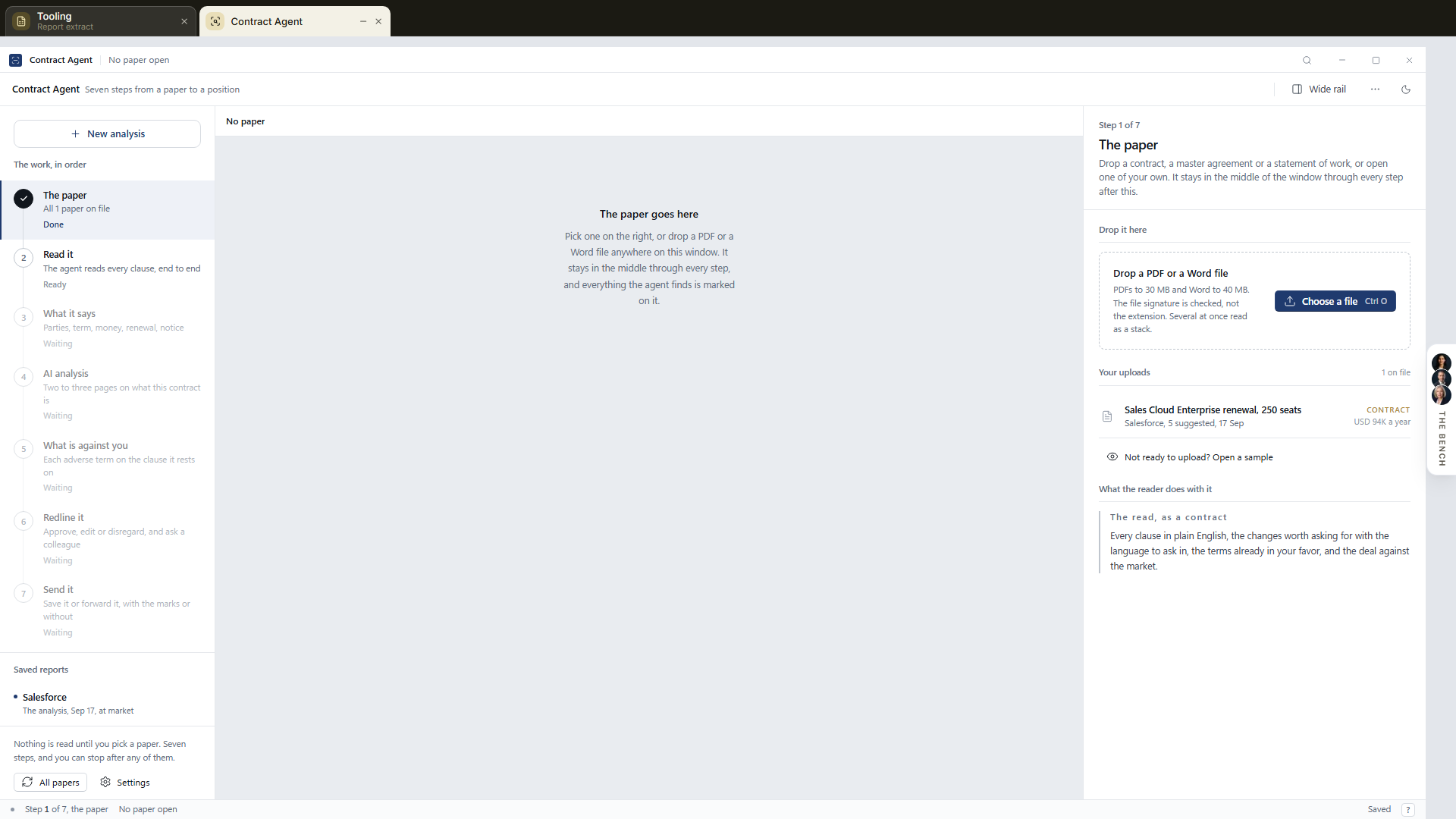 A row that was skipped or refused says so instead of opening, because nothing was filed behind it. It is the uploader when the run is empty, the estate explorer filling in while Vera reads, and the sign-off the moment the estate is readable, moving between those states by itself; there are no steps to walk and no Continue buttons to find. Once you have signed an estate off and no new run is open, the desk asks which you want first: read the acceptance certificate of the estate you brought in, or start a new run. While a run is in flight it never asks, because there is only one thing to do: continue it. The Enterprise Uploader entry in the Contracts & documents group on the left rail opens the run itself, and its hub sits in the left panel beside it: The run, Files, and the Certificate, one press each, with your recent pages beneath. An upload keeps running while you move between pages, with a progress chip that follows you and the tab title reporting progress from the background; and while a run is open, one quiet card on your home feed says exactly where it stands. The only two things a person does are load paper and sign.
The Uploader is a room of the Contract Management Portal, one application for the whole contract estate: a navy titlebar carries the same four tabs everywhere, Contract Management, Uploader, File Explorer, and Ledger (the Certificate joins them when one is open), so moving between bringing paper in, reading it, and managing it is one press, never a navigation hunt. On a wide screen the run page is a three pane application. The Sources rail on the left states where paper can come from: this computer with the run's live count, the three connected doors (SharePoint, Google Drive, and Box, marked live when connected and one press to connect when not), and your earlier runs with their dates. Pressing a door opens it in place: the drive doors ask for their credentials in a dialog over the run, Email in connects in one press and hands you the address with a copy button, and API intake creates a key and shows it once. Each dialog keeps a link to the full settings page. A figures band across the top of the stage carries the run's live numbers: how many are in the queue, the volume in megabytes, how many are filed, and the current throughput. The Inspector on the right states this run's counts (queued, filed, duplicates caught, failed), the door every file passes (SHA-256 in your browser, bytes straight to encrypted storage and never through the app server, PDF and DOCX only with everything else refused by name, archives unpacked in the run, signatures checked at the door on the stored bytes and again at the read), and what this stage deliberately does not do. A status bar closes the window with the live transfer state, the megabytes moved, and the standing note that everything is encrypted at rest. The titlebar carries File, View, and Help menus: File adds files or a folder, plays the demo drop, and opens Files or Your Archive; View shows or hides the Sources rail and the Inspector (the choice is remembered) and lists the app's rooms; Help opens the manual and the release notes. A toolbar above the stage carries the same presses as buttons, Add files, Add a folder, Play a demo drop when the run is empty, and Pause while a transfer is moving, and a dashed drop strip under the figures band takes more paper mid run, folders and ZIP archives included. At sign off the run's files stay on the stage: the same file explorer the load state leads with sits under the verdict, so confirming never means losing sight of the paper. The stage itself is flat: the window is the frame, so the panes inside it are white blocks running the full width and divided by a single line, never cards floating in gaps. Menus and the go live ceremony keep their shadow, because those things genuinely float.
Before you begin
- You need the owner role in your organization to start a run, because it writes thousands of records. Ask an owner to start the migration; they can hand you the work afterwards.
- Know where the documents live. A folder tree drags straight in; a SharePoint library, Google Drive folder, or Box folder connects from inside the run; and your contract register (the master spreadsheet, CSV or XLSX) simply rides in the same drop and maps itself; documents alone still produce a portfolio.
Load: drop everything, connect anything
Press the Intake icon on the left rail, or open Migration Studio from Ctrl/⌘ K. With no run open, the front page is the File Window: a file manager and nothing else. The window states the four columns your estate will fill (name, last updated, type, size), carries Upload files and Choose a folder in its toolbar, and closes with a big dashed drop bay along its foot; the demo estate is one press inside the empty listing, and one quiet row under the window holds the other ways in (connect a drive, the forwarding address, the register guide). The scan brief sits below the window, so the read runs under your choices from the very first drop. Drag files, whole folders, or a ZIP archive anywhere on the window, press Upload files for a handful, or Choose a folder for the tree, in any order and as many times as you like. The drop is the add: an archive unpacks in your own browser first (its internal folders filing exactly like the same folders dropped loose, and an archive that will not open, a password or a truncation, is named rather than swallowed), documents go straight to encrypted staging the moment they land, the run opens itself on the first drop, and Vera starts reading as they arrive; there is no confirmation card in the way. Your register spreadsheet (CSV or XLSX) goes in the same drop and maps itself after the documents land. The empty listing also offers Run it on the demo estate first: six demonstration papers, staged and read exactly like real paper, so you can walk the whole flow risk free and clear them with the reset afterwards.
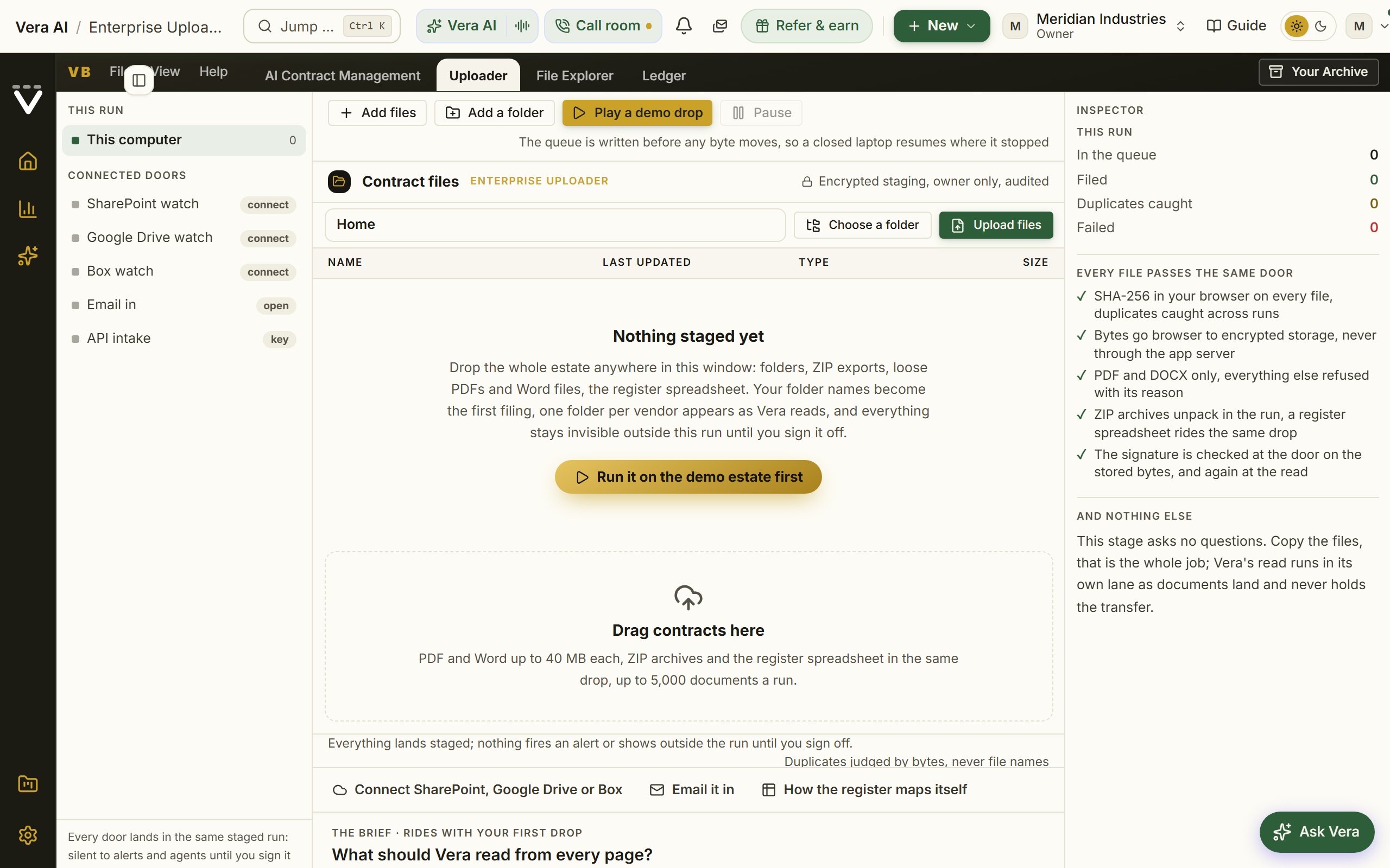
Each drop is still surveyed on your own machine first, and the survey only speaks when it has something to say: a strip above the drop zone appears solely when files stayed behind or an archive would not open, naming how many and why (unsupported types, files over the size limit, each listed). Everything taken appears at once in the estate explorer, which leads the page and is the run's one file surface: one folder per vendor, with the columns a file manager would show, packed left. Each row carries the document's name, its vendor, its end date (Perpetual when the paper says the licence never expires, N/A when a read paper states none), its total contract value over the stated term (derived in code from the annual figure and the term, or the fee schedule summed; a figure marked /yr means the paper gave only the annual value and no term to total it over), its size, and its live state: waiting to transfer, transferring, under the beam, then a green Indexed tick the moment the paper is read. A document only says transferring while its bytes are actually moving; one still in the queue says waiting to transfer, and says waiting for a re-pick when the run needs you to choose the folder again. The value cell always answers with one of three things: the figure, reading… once the paper has landed, or a Needs you chip when a read paper states no value; tapping the chip opens the paper with a small form beside it, your typed figure settles the row, resolves the matching sign-off card by itself, and stands over any later re-read.
The explorer behaves like the file manager you already know, because it is one: a window with its own titlebar, an address bar showing where you stand, the folder tree down the left (The estate at the top, then every vendor folder with its document count, the one you are in lit), the listing under Name, Last updated, Type and Size with the read's status beside them, and a status line counting what you hold. The listing wears the run table's own type scale, so the two rooms read as one application, and there is no drop bay here: loading paper is the Uploader's job, and dropping files anywhere on the listing (or Upload files in the Actions menu) still takes them in. Press a name in the tree to open that folder, and drop files straight onto a name to file them under that vendor without opening it first. Folders follow the company, not the signing entity: papers signed with Salesforce UK Limited, salesforce.com inc and Salesforce all file under one Salesforce folder, because that is the company you negotiate with. A folder you make or move a paper into keeps exactly the name you gave it. Search covers the whole run by name, vendor, and the path you dropped; every column header sorts (press it again to flip the direction); a right-click on any row or folder offers exactly what it can do; and clicking a stored file opens it in the preview pane beside the listing (more on the pane under Files below), while the View button at the row's end, a double click, or Open in the reader on the right-click menu opens it in the reader: the same full window the run table opens, the paper on the left with the AI read, the document's comment thread, and the redline door beside it. Select rows for the bulk bar: Move to… another folder, a New folder, back to Unfiled (filing is two-way; unfiling clears the folder hint so the document genuinely returns to the tray), Re-read, Benchmark (up to 20 at a time), Download, or Remove (armed before it deletes, like every destructive control here). Dropping files straight onto a folder row uploads them filed under that vendor. A skipped duplicate names the exact file it matched, Duplicate of Main Contract.pdf; skipped., with Import anyway beside it when the copy is genuinely wanted (a kept copy is never re-questioned at sign-off), and a failed row keeps its reason with a Retry in place: a failed read queues for reading again, a failed transfer rejoins the upload queue. Every move, rename, removal, and download is audited.
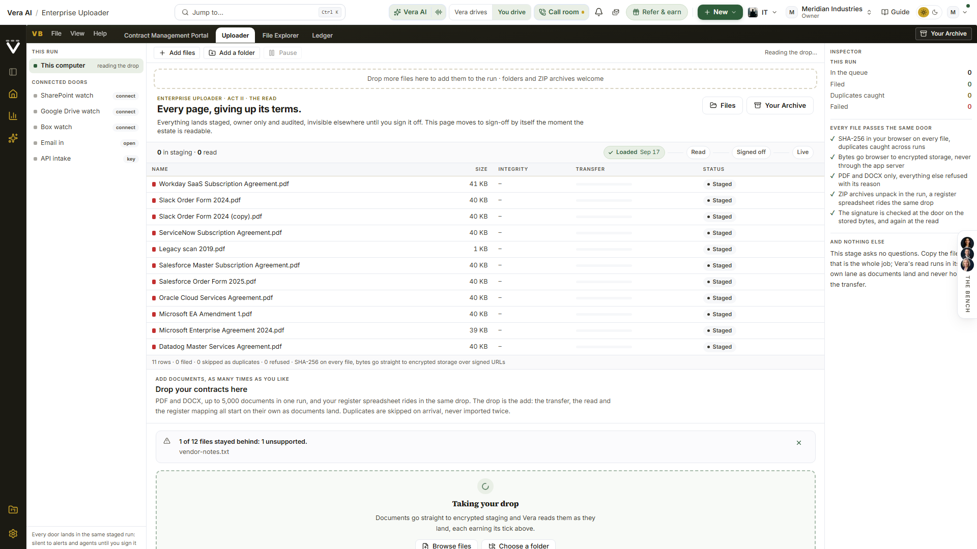
Under the drop zone sits Scan options, a quiet disclosure whose defaults are what almost everyone wants. Untick a renewal field (price increase cap, auto renew, notice window, seats) and it is honoured for real, never rolled up onto a contract; set how dates read on your papers (work it out per document, day first, or month first). Below those sit eight standing questions asked of every document, ticked by default and yours to untick: the customer legal entity the paper is made out to, use restrictions ("limited use", "may only be used for"), annual uplift or renewal price protection and what a stated 0% applies to, special rights such as most favoured pricing or true-down, the term length as written, the product types covered, the vendor audit right, and divestment or assignment rights. You can then add up to eight questions of your own, for example termination for convenience or data residency. Every question, standing or yours, is asked of every document and answered with the verbatim passage the answer was read from, and the answers land beside each paper in the document library. The choices travel with each drop, so the read always runs under what was on screen when you dropped, and they are remembered per organization: a later run opens under your saved defaults, with the disclosure saying so and Change one press away.
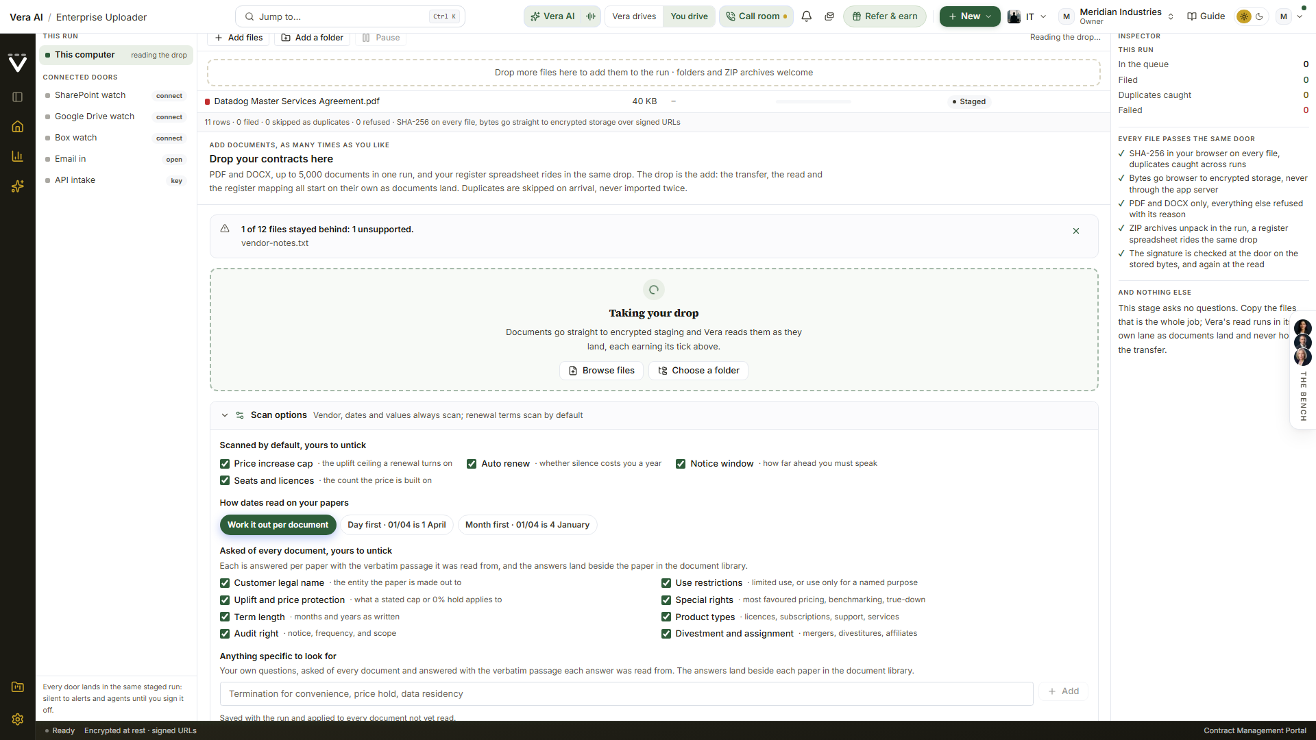
While documents move, the console leads the page like a countdown: the percentage over the bytes actually moved, the time left ticking down at the pace your connection is holding, and duplicates skipped on arrival. A failure never hides in a side panel: the failed row sits in the explorer itself with its reason and its Retry. Once the queue rests, the console collapses to one quiet line: how many documents are in staging, the bytes across, and the skipped duplicates, downloadable as a CSV. Pause and resume at will, or close the tab entirely; the work list is held on our side. Returning in a new tab, press Re-pick the folder so the browser can find your files again; a partial re-pick moves everything the new tab holds, and the count that remains is exactly what still waits.
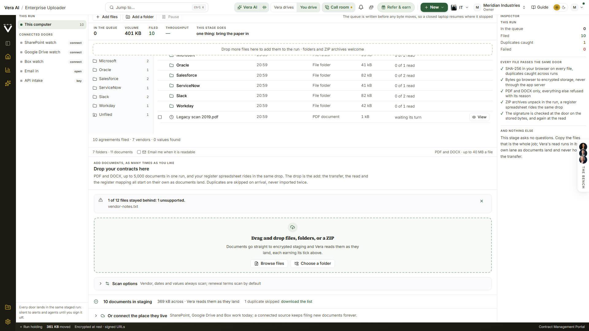
Two more doors: email it in, or post it
Not every estate arrives as a folder on somebody's laptop, so the Uploader has two doors beside the drop. Both are listed on the Sources rail with their true state, and both file documents into your run staged and silent, read as they arrive, and live only when you sign the estate off.
- Email in. Under Settings, Integrations, connect Email-in for the Enterprise Uploader and it gives your organization a private address. Forward contracts to it from anywhere, up to ten attachments a message, and they land in the run; the run opens itself if none is in flight. By default only mail sent from a teammate's address is accepted, and you can widen that to anyone in the card's settings. The address copies with one press from the Sources rail. If your deployment has not enabled inbound email the card says so plainly rather than showing an address that goes nowhere.
- API intake. With an organization API key (Settings, API),
POST /api/v1/intakefiles up to five documents a request, base64 encoded, 3 MB each. The answer is per document: what was filed, what was a duplicate of paper you already hold, and what was refused with the reason. Because a key can file documents as well as read them, only an owner can issue one, and every call is on your audit log.
Both doors pass exactly the same checks as a drop: the file must prove it is a real PDF or DOCX by its own bytes whatever it is called, the malware scan runs before anything is written, identical paper is caught as a duplicate, and your plan's contract limit is respected. A refusal is always named, never silent.
At the foot of the page one quiet line, Or connect the place they live, opens the connector shelf: SharePoint, Google Drive, and Box connect once and keep filing new documents forever. A connected source shows Import everything into this run: the whole library, subfolders included, walks into the run's staging in background chunks that survive the browser closing, deduplicated by content on arrival, with the read starting itself as documents land. A team's Files tab in Teams is a SharePoint library underneath, so it arrives through the SharePoint connector, and a private forwarding address files anything you email in. Add more whenever you find more; the page itself moves on when the estate is readable.
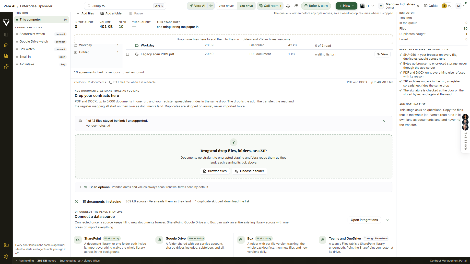
The ambient read: nothing to watch, nowhere to go
Reading is not a step, and it is not a separate page: the estate explorer simply fills in. A centered strip at its head shows how far the read has got, the paper under the beam, and the time left at the observed pace (several documents read side by side, so a small estate is readable in minutes), and says plainly that your part is done: Vera reads on the server, files each paper under its vendor as terms land, and the page moves to sign-off by itself. Hovering the Starting or Scanning chip explains what is running at that moment. Each row flips to its green Indexed tick as its paper is read, end dates and values appearing beside the names. One quiet line under the listing keeps the running totals: agreements filed, vendors identified, values found, and one annual value in USD at today's rate, converted from every signing currency. It is safe to close the tab; the read runs on the server in passes, scans read as images, the tab title reports the percentage from the background, and an unticked box offers exactly one email when the estate is readable, sent once, only if you tick it. Watch the read on the strip is the door into the full-screen theatre; the drop itself always stays on the filing view, so the work you just started never leaves the screen. The theatre: the paper under the beam is the file being read at that moment, finished documents land on a gold-lit ledger with their values, and a vendor wall fills folder by folder; Escape returns to the explorer. The moment the read finishes, the page moves to sign-off by itself.
Every document row works like a desk of its own. A View button at the row's end opens the paper beside the listing (the row itself stays clickable too), and a Comments column takes a typed note directly in the table, saved as you leave the field and kept on the contract itself. Right-click any file for the full menu, including Send this contract to: hand the paper to Contract Agent, the MSA Agent, the SOW Agent, the Benchmark tool (which opens its fact sheet on the paper and writes the full reference-format report), the Vera Workspace (the paper lands on the desk beside the conversation), a Second opinion, or Ask Vera, or pick Compare against another contract and choose the second paper from the estate; the chosen tool opens in its own application window with the document already loaded. And the whole listing takes a drop: drag files or folders from your desktop anywhere onto the table and they upload into the run and file themselves, under the folder you are standing in or by vendor at the root.
A document the paper cannot fully explain is never a dead end. A stated term length becomes an end date, derived in code from the start date (an agreement signed for three years dates itself, with the verbatim passage as evidence); a vendor a scan hides is read from the file name or the folder you filed it under, carrying its source on the record; and a half-read scan queues its own transcription and fills in when the pages have been read image by image.
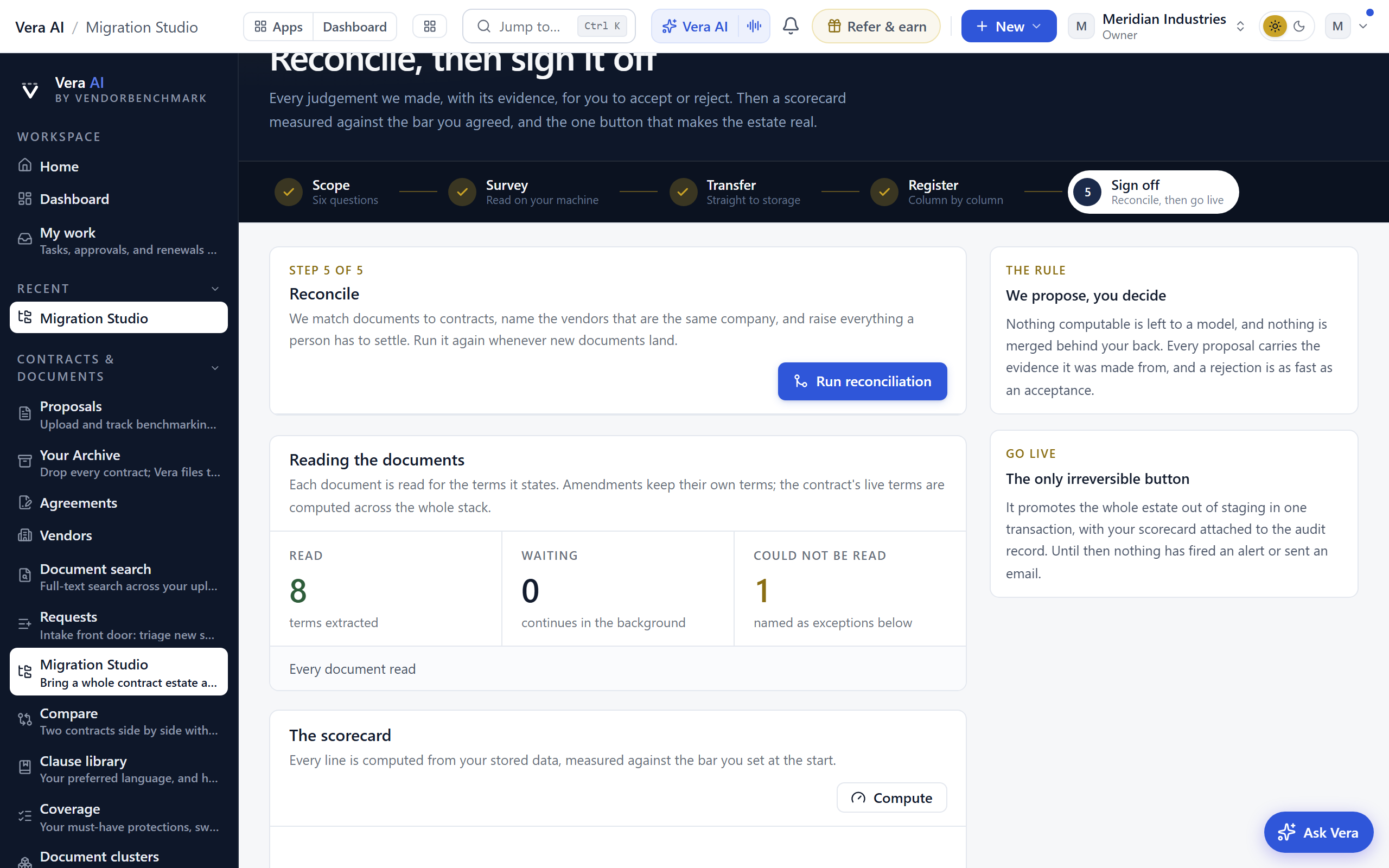
Files: the paper beside the list
The separate library page is gone; there is one surface. Files (/migration/documents) hosts the same estate explorer full page, sized to fill the window whatever the estate holds, kept reachable while the run page is showing sign-off, and every Open the paper link lands there as an immersive window on the exact paper. The listing carries a Last updated column beside the size, and an Actions menu beside New folder holds every move it can make: new folder, upload files, upload a whole folder, move, download, read again, benchmark, and delete last after a rule (the moves that need a selection stay visible and inert until you tick some rows). Uploads from the menu take the same path a drop takes, so a picked folder files itself under its vendors exactly as a dragged one does. Click any stored file, on either page, and it opens in the preview pane beside the listing, the index collapsing to a slim name-and-status rail so the paper takes the width: PDFs in the house paper viewer with zoom steps and selectable text, Word documents through the Office view, previous and next (or j and k on the keyboard) walking the folder, and Escape closing the pane. Every link the pane hands out is minted fresh at the moment of the press, so open in a new tab never lands on an expired one.
The pane is also where a paper turns into action. Where the figures came from shows the read's values with the verbatim lines they cite, and when the scan carried your own questions, each paper shows its answers behind one press. The header menu renames the document (its title follows), downloads it, reads it again, removes it for good (armed first, staged documents only, audited), or sends it to a tool with the paper attached: Contract Agent, the MSA or SOW Agent, the Benchmark tool, and the Vera Workspace each open already holding the exact file you were reading, never an empty upload box, with the tool's own limits and audit trail applying as if you had dropped the file there yourself.
The moment a row shows its green Indexed tick, the pane offers the move that proves the estate is worth having, safe while everything is still staged. Benchmark this contract places the deal against the market in about a minute: the five-band verdict, your position, the range comparable buyers land in with its midpoint, and the money between this deal and the supportable floor over the term, all kept inside the run (never a report or a notification) until you sign off. Renewals are not armed here: loading files is only loading files, and every end date the read finds travels with its contract to Contracts for the Renewals view to work once the estate is live.
Folders stay the explorer's spine: one per vendor, keyed on the company rather than the spelling, so all Oracle is one folder and all Salesforce is one folder, never two. Rename a folder (right-click it) and every contract inside follows; delete an empty one behind a confirmation; re-read or benchmark a whole folder from the same menu. Benchmark this folder places every read paper in it against the market, and the answer comes back where you pressed: the toolbar counts the run while it works, the folder row says how many of its papers are placed, and each document's row wears its verdict, Poor through Top of the market, with the whole placement in the preview pane when you press the row. A staged run keeps its verdicts inside the Studio, so they appear here rather than in your reports until the run goes live. The read confirms every vendor from the paper itself, which always wins; the folders are for browsing and correcting by hand, and every move is audited.
Sign off by exception: one number counting to zero
The moment the estate is readable, the page becomes the sign-off, and it leads with the verdict: what Vera read, the annual value at today's rate, and one number, how many decisions remain. The duplicate, bind, and gap checks run themselves the moment you arrive, and until they have finished the verdict says so plainly and holds go live rather than showing a clean pile; a check pass that stops midway names the step that failed and retries itself. Once they have run, the judgements above the confidence bar have already applied themselves: byte-identical duplicates, same-company vendor merges (one vendor per company, always: regional and legal entities like Salesforce UK or SFDC Ireland fold onto the parent for every vendor, stated on the ledger rather than asked about), the paper trail (documents of one company printing the same contract number file as one agreement, the number named in the evidence), confident binds, and loose documents with nothing of their vendor to bind to (kept as their own contracts) land on Vera's ledger, a one-line disclosure that opens to every judgement she filed with its evidence, who or what decided it, and Undo on anything reversible. An undone judgement returns to the inbox and asks a person forever after; a dropped duplicate says plainly that its bytes are gone and why that loses nothing. A paper that genuinely has no home says what it does state, the customer it is made out to and the contract number it carries, so the card reads as evidence rather than a shrug.
Everything that genuinely needs a person sits in one Needs-you inbox, one pile worked top down with the money at stake in front and the whole queue answering to the keyboard: j and k walk it, r resolves, w waives, e escalates. The register's one question comes first when it has one (which way its dates are written, answered with one press and applied on the spot); vendors read from filenames and folders fold into a single card confirmed in one press with inline corrections; an unknown vendor is named right on its card; a missing annual value argues from the paper itself: the card offers the document's own figures as one-press answers (the stated total over its term with the per-year figure already derived, and the largest money lines from the first page, each quoting the verbatim line it came from) plus a field to type the value straight off the page, and accepting either writes the figure onto the record with its evidence so the estate totals pick it up at once; and any card can press Read it again, which queues its document for a fresh read under the current reader, with Re-read the blocked papers doing the whole blocking queue at once. A card whose document the run never received says so plainly, Not uploaded, and offers the two honest moves: Upload it again (pick the readable file off your own disk and it uploads, reads, and clears the row by itself) or Remove from the run (armed with a second press; the counts stop including it). A copy that arrived but could not be opened, encrypted or oversized or a bad scan, offers Read it from this device the same way. And the pile clears in bulk: a checkbox on every card, Select all at the head of the inbox, then one press resolves or waives the whole selection, armed with a second press and recorded on the certificate as decided by you. The small tail is one decision: the estate proposes its own value floor from its distribution, one press with the reason recorded on every record, and the manual floor stays for a figure of your own.
Above the inbox, sign-off leads with the agreements that carry the money: the five largest, ninety seconds each. Each card shows what the read concluded with its source on every line, says not stated plainly where the paper stayed silent, takes your typed annual figure where only you know it (stamped as entered by you, it outranks every later re-read), and closes with one press, Looks right, recorded on the run and the acceptance certificate. The rest of the estate keeps its machine answers, every figure carrying its verbatim line.
Renewals are not armed during intake. Loading an estate is only loading an estate: the read captures every end date and notice window from the paper and carries them with each contract, and the moment you sign the estate off those dates land on the Renewals view in Contracts, which leads with the one renewal to take first and counts down every notice deadline. Alerts remain strictly opt-in per person under Notifications, so nothing you load can email anyone by itself.
The supporting material sits underneath as one disclosure each, present for the reader who wants it and never competing with the decision. The estate, as the paper states it opens the renewal table (soonest ending first, each row able to open its paper, vendors wearing their monograms); Go live in waves opens a ranked vendor table for big estates, where one press ticks the clean top ten and Promote N vendors now moves them out of staging in one transaction while the run stays open for the tail, a vendor with open blocking work saying so and unable to ride; Where the live terms come from opens every stack with Show the lineage expanding the full history of each live figure, including claims that were superseded and claims that never applied because governing paper outranked them; The scorecard, line by line opens every computed line with the stated-spend field it reconciles against; and Everything this run did opens the audit record event by event, every add, judgement, decision, wave, and sign-off with its name and time.
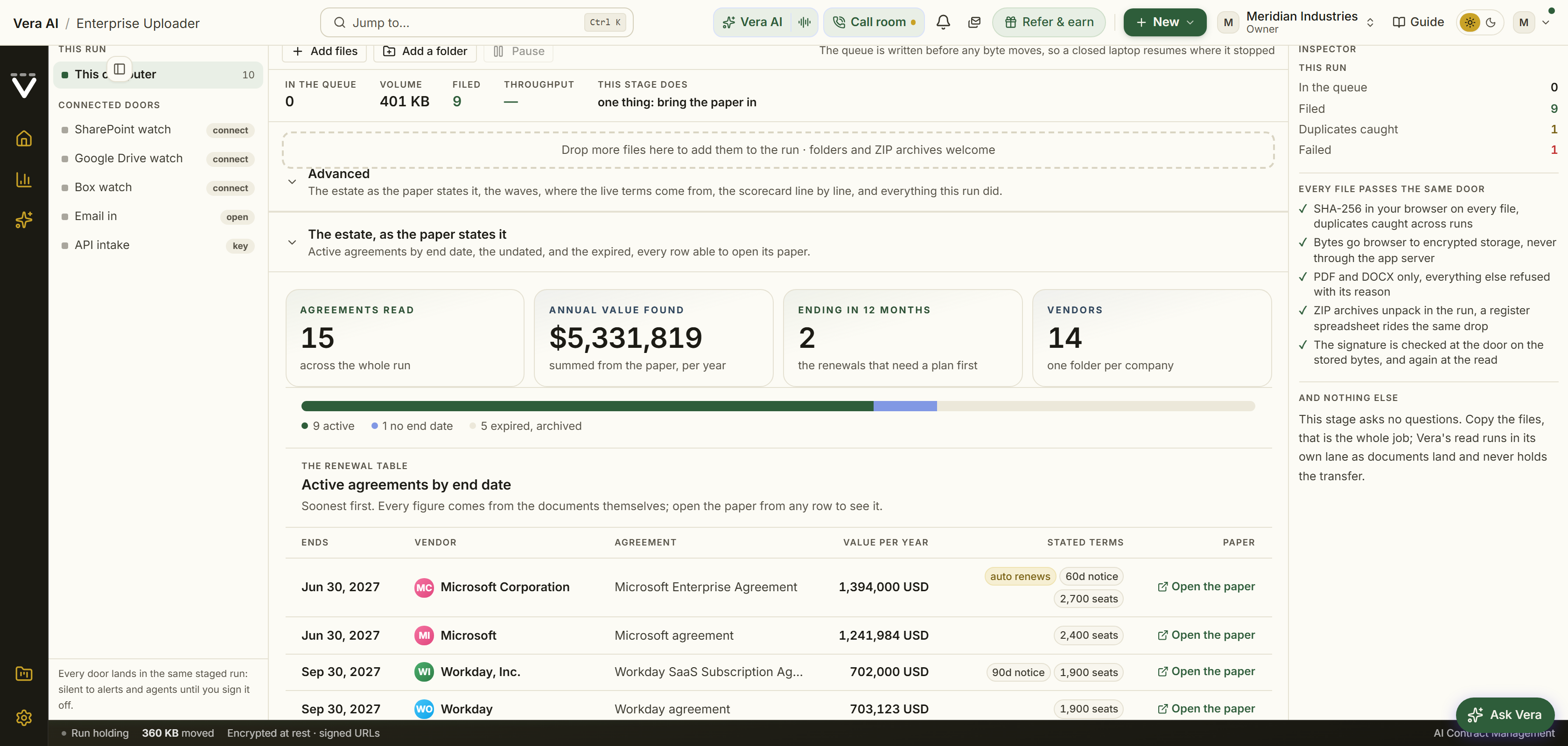
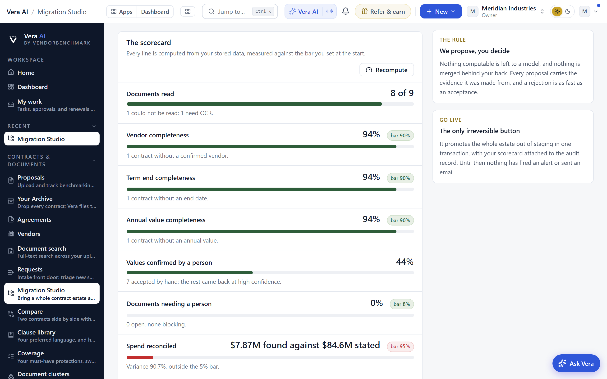
Then the one irreversible button, now at the top of the desk: Go live sits in the navy band beside Files and Contracts, with the pre-ticked promise, Benchmark the whole estate as it lands, as a small tick beside it. While the checks have not finished or the scorecard is still computing the button holds and says why on hover; when something blocks, the button's place is taken by a chip naming the count with Take me there jumping straight to the row that holds it, and a slim strip above the runway keeps the honest line: one press promotes the whole estate out of staging in a single transaction, and until that press nothing has fired an alert or been seen outside the run. The button only ever opens on a clean bill the checks actually issued, and the server refuses a sign-off or a vendor wave outright when no completed check pass is on record. The press is a small ceremony: the stage dims while the transaction commits, the confirmation counts its contracts and agreements up, and one honest line states what fired and what did not: your contracts are now visible everywhere, every end date is on the renewal calendar, the acceptance is on your audit log with the scorecard attached, and until that press nothing here had fired an alert or sent an email.
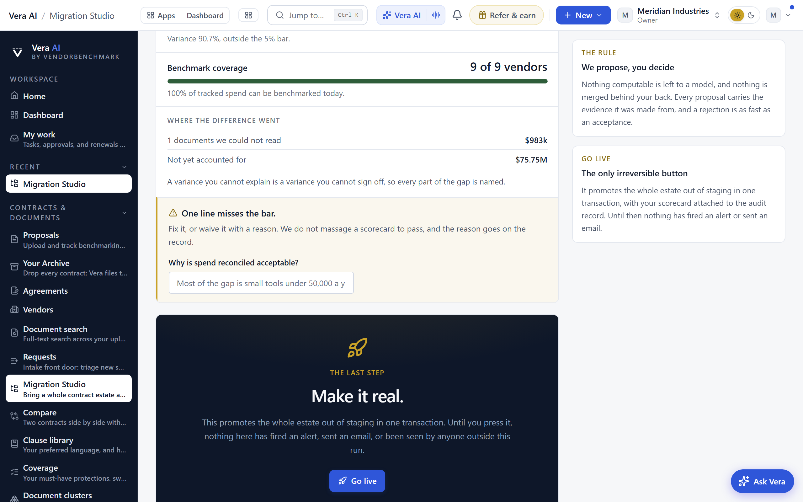
With the promise ticked, the confirmation shows the verdicts already landing: Vera places every agreement against the market in the background, from poor to top of the market, with the money on the table over the term, and the results land on your archive's Benchmark view. Where a paper cannot be placed, the verdict says so rather than inventing one.
After go live: the certificate and the rollback window
Every run produces its acceptance certificate at /migration/certificate: the scorecard exactly as signed with waivers named, verification coverage by spend tier (what share of contracts above $250K a year carry a confirmed vendor, an end date, and a value), the promotion history wave by wave, every exception with its disposition and the name that settled it, and the approver on the record. It carries a filing reference on its masthead, a real signature block with the approver's name and a countersign line, and prints clean in the house brief theme; Download as Word produces the same document through the shared deliverable theme, ready to file as the formal acceptance record.
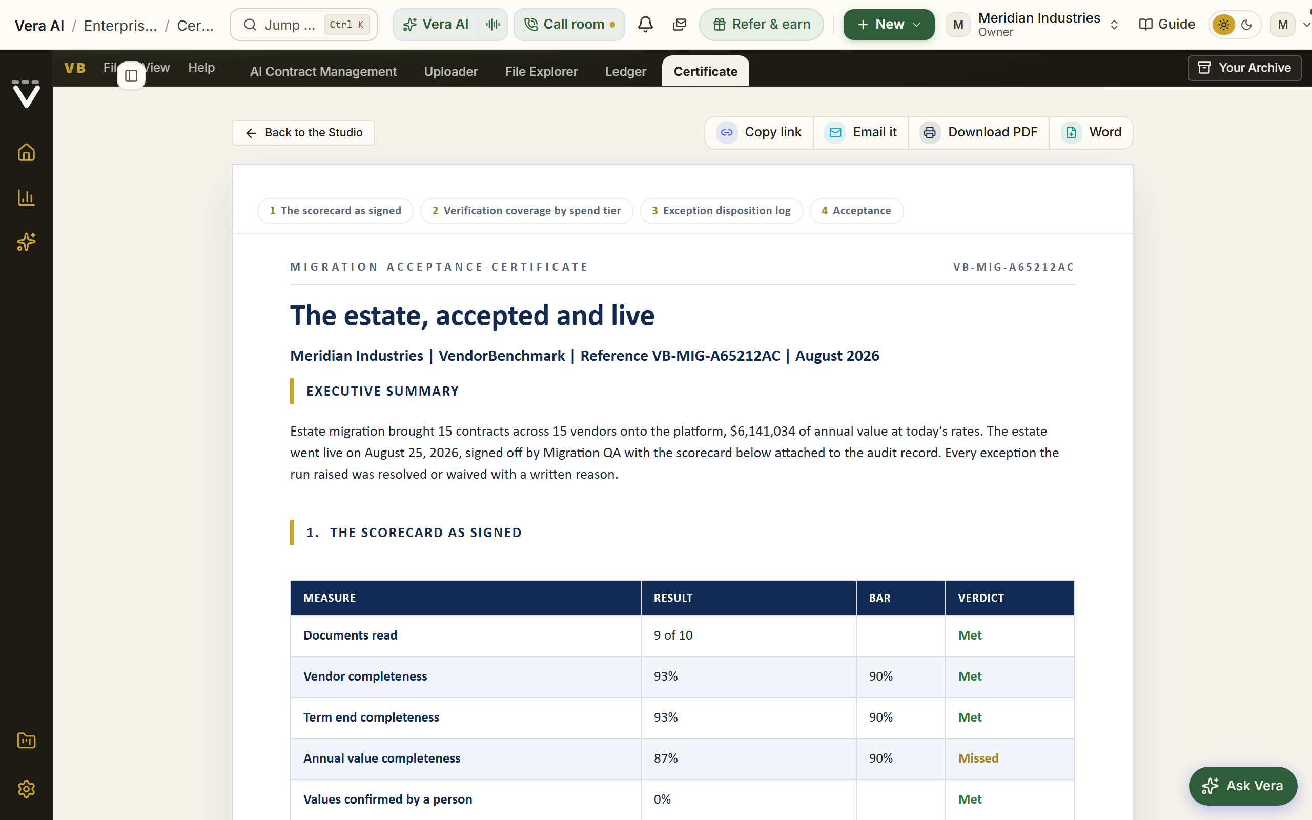
And going live never erases the run's memory: the loader keeps the finished run on record with a card naming when the estate went live and what it promoted, with doors to the acceptance certificate, your contracts, and the renewal calendar. The card stays even when the next run opens. For seven days after any go-live it also carries one reversible step: Roll back this go-live returns the whole promoted estate, waves included, to staging in a single transaction and reopens the run at sign-off. Alerts already sent stay sent; everything else is exactly as it was. When the window closes only the rollback goes; the record remains.
The reset
On the loader, under the run, sits Reset all contract data: owners only, armed by typing RESET, it removes every contract in the workspace for good, rows, stored documents, agreements, and any run in flight, which is how a test estate is cleared before the real one. The reset is audited and there is no undo.
Tips
- Duplicates are detected by content, not by file name, so re-exporting the same archive twice is safe. Identical documents are counted and skipped, never imported twice. Two order forms with the same name a week apart are two real order forms, and we leave them alone.
- Only PDF and DOCX are imported as documents, and each file must be under 40 MB. A CSV or XLSX in the drop is recognized as the register rather than rejected; everything else is named in the drop summary so you know what was left behind.
- The loader carries the run's timeline like a shipment tracker: Loaded, Read, Signed off, Live, with the rollback window counting down on the last stop.
- A browser cannot remember your files across a reload. The work list survives, but re-picking the folder is what lets a new tab carry on uploading. A partial re-pick moves everything it holds; the console then counts exactly what still waits for the rest.
- A column headed something like Contract Value is read as the total over the term, not the annual figure, and divided by the term to get the annual value. If it is already annual, map it to Annual value instead.
- Columns we do not recognise are kept on the contract as custom fields, exactly as you wrote them. Nothing in your register is thrown away.
- Binding is what makes a renewal date correct. A master agreement often says the term ends years before the amendment that extended it, and only the bound contract shows the real date. Binding is reversible: move a document to a different contract at any time and the terms in force recompute immediately.
- Overlapping agreements with one vendor are never proposed as superseded, because enterprises legitimately run several at once.
Related: Contracts · Upload a proposal · Plans, allowances & limits
What's new
Release notes in two levels: curated highlights in the journal, and the full changelog of every small change behind the Full changelog button in the header. The page wears the home page's look: the display face and the glow up top, the latest release leading as a boxed card with a colour scene beside it, and older releases grouped by month as colour coded cards whose hue and icon follow the work they describe. On large screens a month index on the left jumps to any month, and releases shipped since your last visit carry a blue New mark that clears once you have read them. Each entry links to the feature it describes and closes with a Try it line: one concrete first move to make with the feature, the control to press or the document to drop. The full changelog reads as a full width ledger: each ship day holds its date and change count in a left rail, with every change on one line showing its category, title, and detail, and a summary band on top counts the changes, ship days, and areas covered.
Next: Chapter 15 · Your first 30 days for the guided ramp, or Chapter 01 · Contracts & renewals to start the screen reference.
Was this page helpful?
Thank you. Your note goes straight to the team that writes this manual.